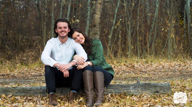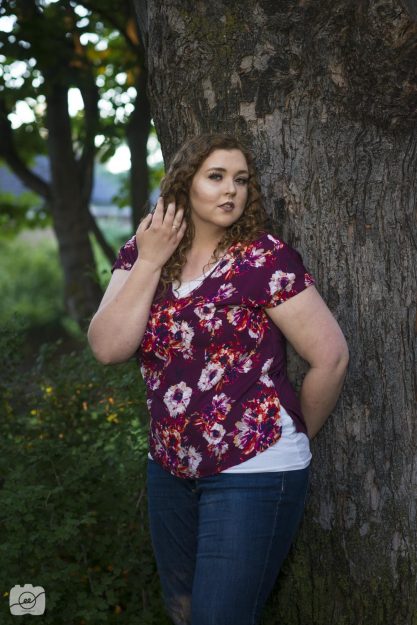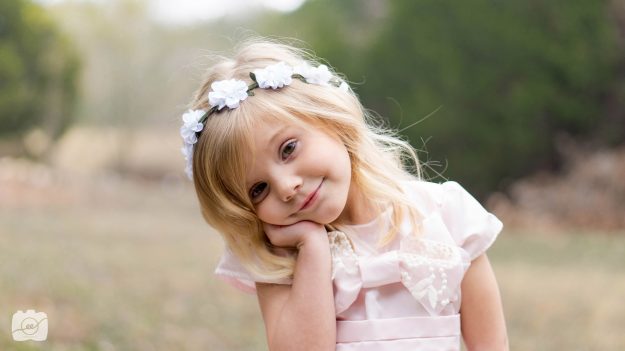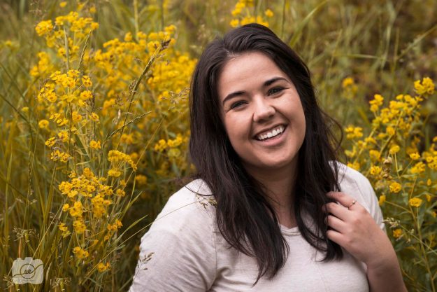
B L O G
Family Picture Outfits
5 Tips for Family Picture Outfits
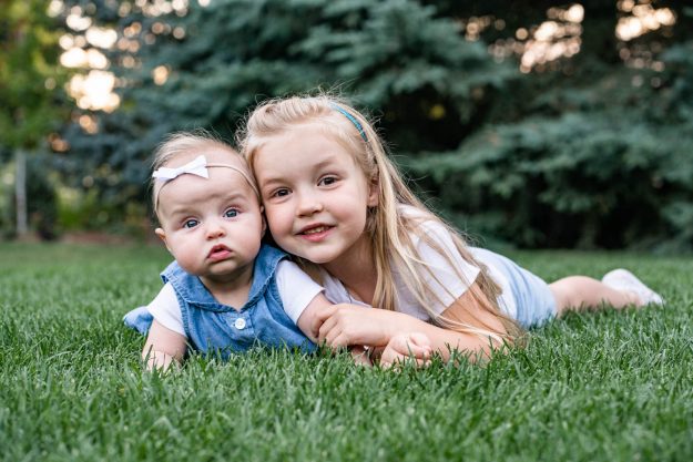
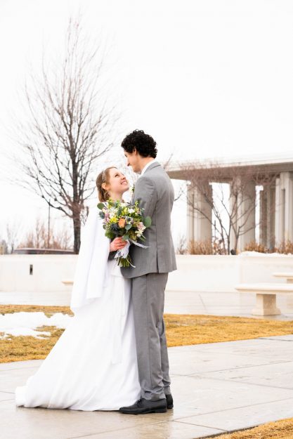
The holiday season is approaching and you really want to have family pictures done this year. The biggest concerns are probably dealing with how to round up everyone, finding coordinating outfits, and making sure everyone smiles. Finding the perfect family picture outfits is what keeps you up at night. I get your concerns and I’m here to help make your family picture day go as smoothly as possible.
One of my biggest priorities as a photographer is making sure that my clients look their very best in their family pictures. One of the best ways to ensure each smiling face stands out is to choose coordinating outfits. How do you go about choosing the best family picture outfits you ask? Well, it’s your lucky day, here are 5 tips for how to choose outfits for family pictures.
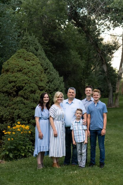 1. Mom chooses her outfit first!
Let’s be honest, mom loves the family pictures best out of everyone. She will look at them over and over again, take time to frame them, and tear up now and again seeing how her babies have grown. As much as you want everyone else to look their best it’s important for you to choose your outfit first and to be completely in love with how it makes you feel. I suggest finding a flowy dress with a fitted waist. If you’re not into dresses than choose a fitted skirt and a nice blouse. It’s okay to wear jeans if you want everyone to look more casual overall but keep in mind the fancier the better.
Avoid boxy, oversized clothing that has no shape. These types of clothes may be comfy and trendy but, honestly, will not photograph as well. If you are going to invest time and money into a photographer take full advantage of the experience. More than likely the photographer will take individual pictures and small group shots in addition to the family pictures. This is your chance to have an awesome profile picture for social media or networking sites. You’ll have to look at this picture every day if it’s hung in your home so take the time to pick something you LOVE. Check tip one off your list once you find a killer outfit!
 2. Think about the location
It’s important to discuss with your photographer where you want to take family pictures. The photographer will have already scouted out a few locations but speak up if you have a specific spot you want your family pictures to be taken! I love outdoor photos taken in a park with nice greenery or on a nature trail with beautiful mountains. The simpler the background the more your family will stand out.
Another thing to remember is to not have anyone wear brand new shoes that may be uncomfortable. You may have to walk to various locations and don’t anyone to be in pain. We want to avoid unhappy smiles and attitudes at all costs. If you want to wear heels bring a pair of flip flops to walk around in until you get to the specific area. It’s also important to avoid wearing tennis shoes/sneakers at all costs! They will look bulky, and unprofessional since logos will stand out and take away from your faces. Try simple dress shoes and sandals with neutral colors.
3. Only 2-3 colors in your palette
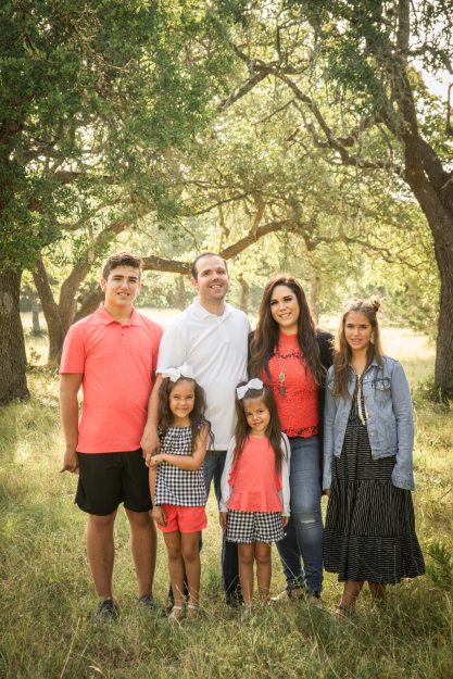
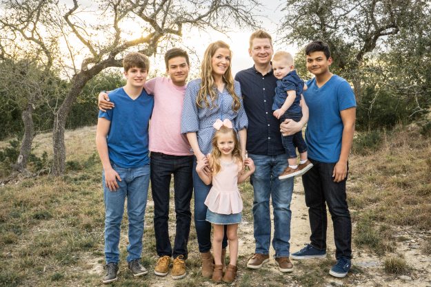
The most aesthetically pleasing thing to see in family picture outfits is a well-balanced color palette. It becomes too busy and distracting for the eye when there are too many colors, especially when there are too many bold colors. Typically, there could be one person wearing a bold color, and the other wears colors that fit within that palette. Repeat your colors with the different outfits each family member will wear so everyone looks like they complement each other. It’s okay if you have semi-matching outfits for twins or children who are very close in age but try to look for more variety to add more interest to outfits for family pictures.
Check out this Pinterest board for some color palette inspiration.
 4. Choose your patterns wisely
Try to stick to one pattern. The bolder the style the more attention it will grab so try to choose simple, classic patterns. If you want to incorporate plaid have various items with the pattern rather than everyone wearing the same plaid shorts. With a few in the pattern, everyone else should be wearing solid colors from the plaid palette. This will help balance the photograph overall. It’s important to note that small stripes and dots patterns do not photograph well since it sometimes makes the pattern look wavy. Also, do not wear clothes that have logos or words on them. As much as I love the Nike swoosh, it doesn’t belong in your family picture outfits no matter how athletic you are. 😉
If anything is uncomfortable or itchy for a child when you first put it on, it will continue to cause problems throughout the day so best to choose clothes that are fashionable yet very comfortable. Bring a spare outfit for smaller children who may have accidents and have baby’s wear a bib to avoid getting the top of their outfit wet or stained from spit-up.
Check out a photoshoot I did of some cute kiddos for Christmas. I loved how they implemented one pattern with solid colors.
5. Bring some incentives 😉
Kids can only be picture taking angels for so long. Bring a simple snack of some kind that doesn’t cause any messes to help keep them entertained. Some of my favorites would be fruit snacks, goldfish, tic tac, dry cereal, etc. A water bottle might be helpful if you have to walk around a bit and they need some refreshment. You could even fill it with Gatorade or a fun drink they can get a squirt of after giving a really good smile. Also, going out to dinner or dessert after the shoot is always a good motivator to have them look forward to something at the end of the session.
 You got this!
I want you to have the best time and to feel comfortable. Reach out to me or your photographer if you have any questions or concerns. I would be happy to look at things you’ve picked out or Pinterest board ideas that you have. Don’t feel stressed out if things are going exactly as planned. Remember that being silly and loving to your kids is what will bring out the best photos. Just get lost in the moment and let me capture the tender memories from the sidelines. I can’t wait to capture your memories!
Logo and Business Card Design
Logo and Business Card Design for ESPAR
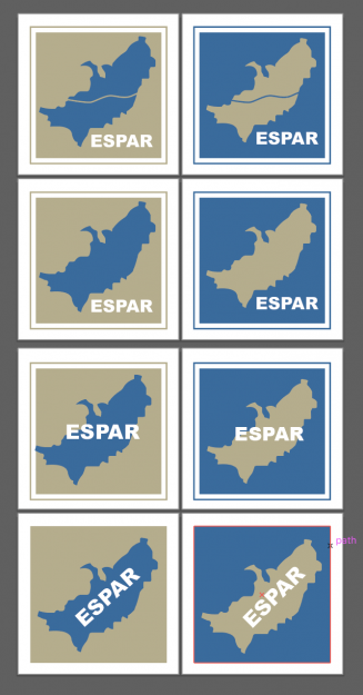
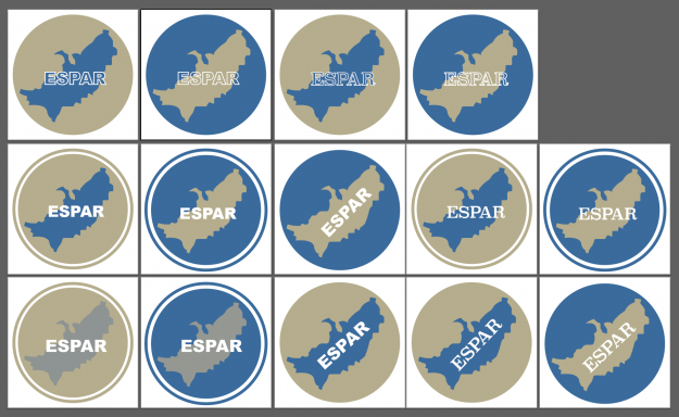
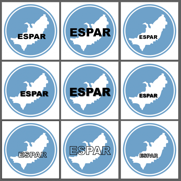
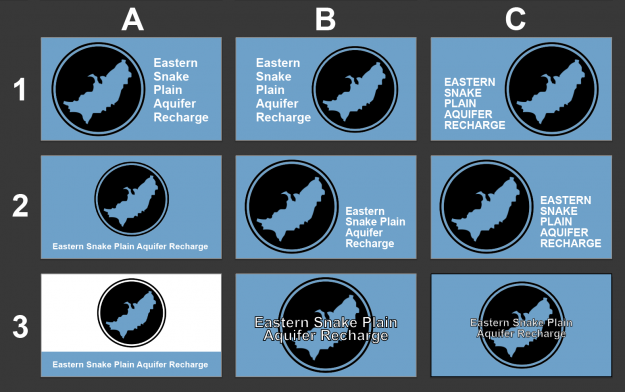
I was contracted by Eastern Snake Plain Aquifer Recharge (ESPAR) to design a logo for their growing business. They are in charge of understanding and regulating the aquifer water changes in the southeast Idaho area. A logo is a very important aspect of any business since it’s usually the first visual piece we are introduced to when learning more about a company. It should be simple and easy to read or distinguish. Try not to have too much text or tiny details because a logo needs to be versatile enough to fit on a small letterhead or to be printed larger on T-shirts or advertising material. Take a look at some of the first ideas I had below when starting to brainstorm.
I thought it would be good to highlight the area ESPAR covers in their logo since that is a distinguishing factor about their business. I used Adobe Illustrator to create a vector image of the land area and tried a few different color options. I was deciding between a tan color to represent the land or blue to represent water. In the first ideas, I was using a smaller font to fit within the land boundaries but decided with further iterations to use a bigger font to help the acronym stand out even more since that should be the focal point of the logo.
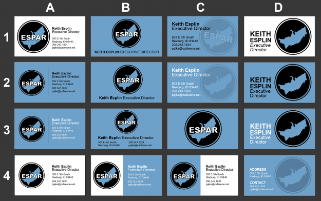
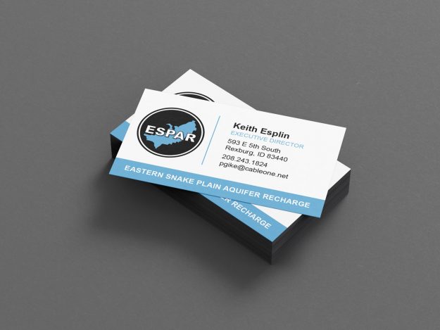
After designing the logo the executive director asked me to design a business card for him. I came up with various ideas for both one and two-sided cards. He preferred to have a one-sided card so it was important to find a way to adequately distribute the information and logo without the card looking too cluttered. I printed 100 cards from AlphaGraphics and got the back the same day and they turned out great! It’s also good to note when printing out logo or business card materials the colors will always print a little bit darker than what your screen displays, so be sure to bump up colors a little bit lighter/brighter than you think so it will print closer to what your screen displays. I usually have my screen brightness set around 75% when designing and editing photos.
If you’re looking for an online printer I would recommend working with MOO. I used them for my personal business cards. They have great customer service and deals throughout the year to provide you high-quality business cards. They also have a sample paper pack you can order that shows you the various sizes, shapes, and textures of paper they have available so you can feel and see each one in person before you purchase. They usually have a 1-2 week turnaround time. Check them out for your next project!
Toddler Christmas Pictures
Toddler Christmas Pictures and Outfits
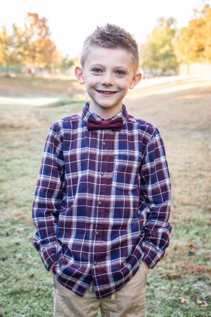
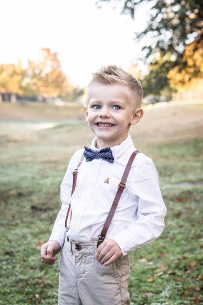
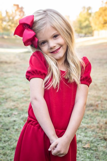
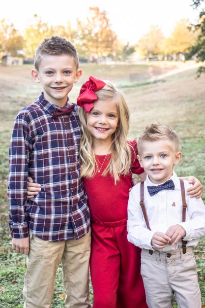
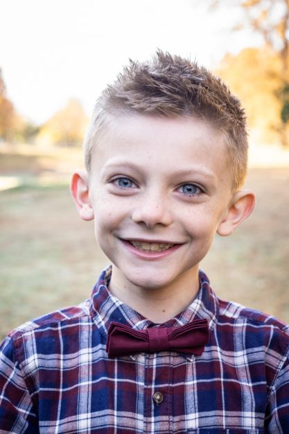
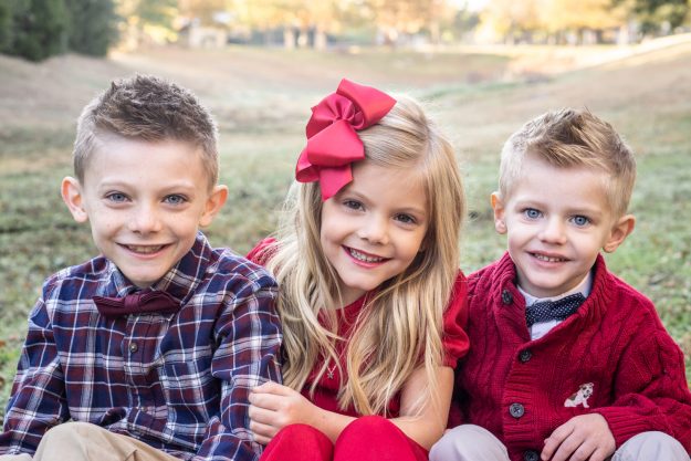
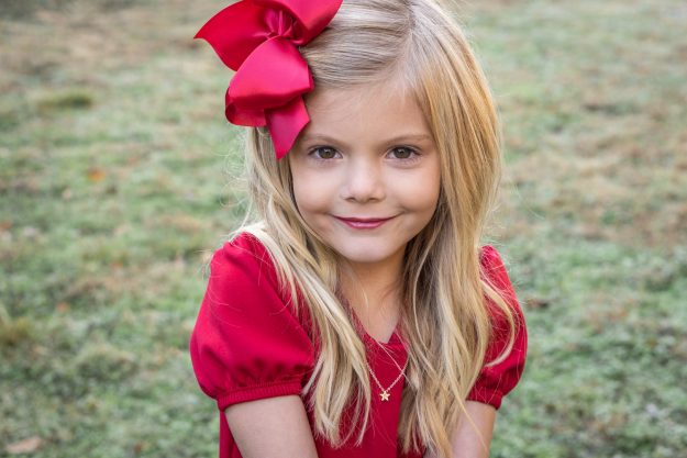
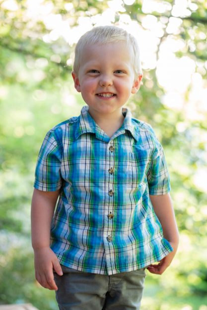
Christmas is by far my favorite time of the year! It’s also a great time of year to take group pictures for those fun Christmas cards! It can be stressful to pick the perfect outfits for everyone. In my experience, I like having similar solid colors and one distinct pattern looks rather than having everyone in the exact same pattern or having a random rainbow of colors. During Christmas time it’s definitely fitting to use reds and greens, but it’s fun to find a way to mix it up so you can then use the photos all year rather than it looking like the photos were taken on Santa’s front porch. We found a red solid outfit for cute Scotlynn and two button-up shirts for Boston and Bronson. Boston has a mix of the solid colors used in the other outfits in his plaid shirt. I thought it was a fun touch to have the bow ties also pull in the colors of the other sibling’s outfits to have a cohesive look overall.
When taking individual pictures, it’s important to start with the youngest first. Toddlers have a shorter attention span so it’s important to get those good smiles with help from big brother and sister making silly faces behind you before they run out of happy energy. To use our time wisely, we took pictures of Bronson first, group pictures of all three siblings, and then individuals of the two older kids.
Bronson also had a red sweater that we tried on for a few of the group shots to have a more red look overall. It would be too overwhelming with all of the red unless we had the blue/maroon plaid shirt to help mellow the warm tones. It’s also good to mix up the group shots with standing up and sitting down especially when working with a range of ages. Boston is 8 and a lot taller than his toddler brother who is 2 years old. Try sitting them down on a blanket to get them on a more equal plane. That way you can get in closer to their cute faces and highlight their unique characteristics.
Bonus tip! We took these pictures right before sunrise around 6:30 am. Although that seems really early, most kids are early risers and will be happier in the morning than waiting until later on in the day. You could tell them about making something yummy for breakfast or doing a fun activity later to keep them interested. Check out this Pinterest board of other ideas for Toddler Christmas Pictures and Outfits.
UI App Design
UI App Design with Mockups
I have had a lot of fun starting the 100 days of UI challenge! One of the UI challenges focused on creating an app login and another challenge for a direct messaging design. Messaging apps are some of the most popular among cell phone users so I thought I would come up with my own platform called “Let’s Talk” which focuses on connecting you to today. I used this app idea for both design challenges.
As I was brainstorming various icons and symbols of communication and talking with others I thought of speech bubbles. That became the logo or icon for my app login page. I used a blue palate of colors to keep things simple. As you can see in the process video, found at the bottom of this blog post, I was also able to create icons for the username, email, password, and password confirmation fields that the user will fill out in order to sign up for an account. It is important to keep things simple and to not draw too much attention and time away from the action of signing up.
For the direct messaging part of the design, I wanted to pull some of the colors and elements from the Let’s Talk login design into the direct messaging design to keep things consistent and familiar for the user. I liked the interesting shape the speech bubbles made not being perfectly square or circle. I like having the personalized picture to match the person you are talking to at the top. It was also a fun touch to add the time the message was sent on the sides of each bubble. If you want to try out some UI App mockups for your own UI designs check out this website.
Golden Hour Photoshoot
Golden Hour Photoshoot at Antelope Island
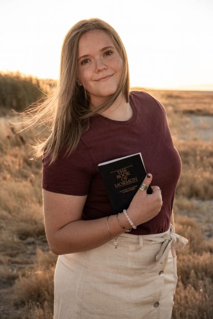
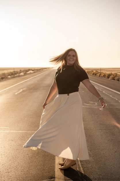
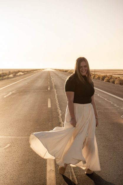
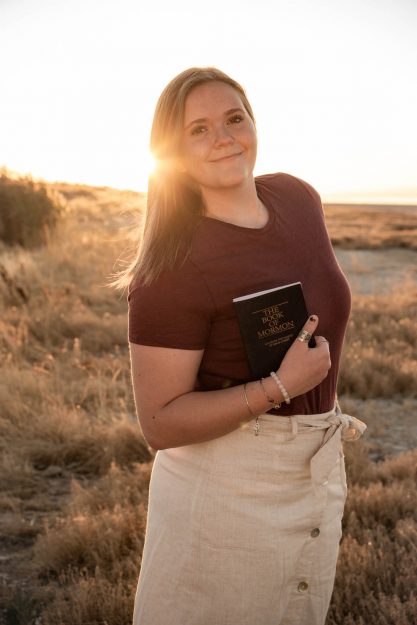
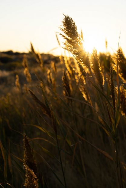
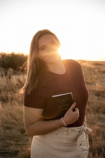
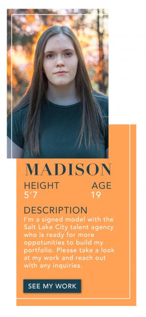
Golden hour is a magical time for a photoshoot. My sweet cousin Madi is leaving on a church service mission at the end of November and wanted to get some pictures done before heading to Arizona. We went to Antelope Island State Park which is north of Salt Lake City, Utah right before sunset to capture a few special moments for our last golden hour photoshoot together for a while. There are crazy amounts of mosquitos if you go into the tall wheat and around the marsh areas so bring bug spray!
I love candid shots of movement so I had Madi stand in the middle of the road and spin around while moving her long flowy skirt. I changed my camera speed to continuous shooting so that way I could get a variety of images during her movement. Make sure to clear your memory card before starting because you will be capturing a lot of images by using the continuous shoot mode. There will be a lot of blurry images, weird faces, and unflattering poses by capturing so many photos but you will also capture a few perfect candid moments too! Try it out!
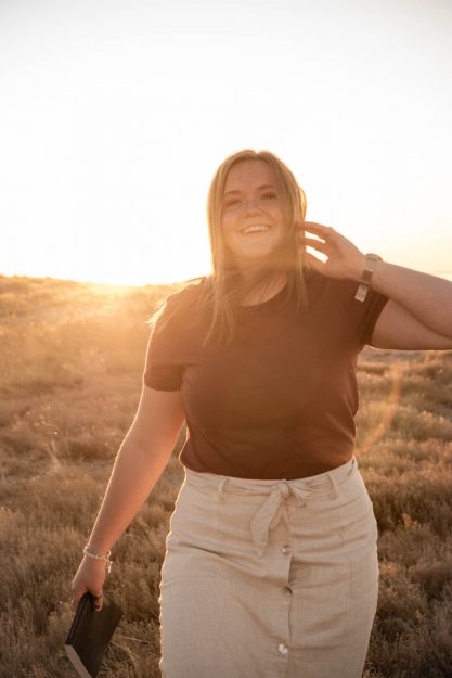
I also wanted to capture some cool sun flares during the end of our golden hour photoshoot right before the sun was going to dip behind the mountains. In order to create a sun flare, you need to increase your f/stop somewhere between 18-22. By doing this, your camera’s sensor will be taking in less light, which will make it harder to properly expose the face of your subject. It helps to partially cover the sun with your subject or a tree/mountain to help the sun flare show up more clearly. Have the sun come from different sides of your subject to see what you like best.I brought my 5-in-1 reflector in order to bounce the light back on to Madi’s face while still being able to capture the sun flare. It helps to have a friend who can come assist by holding the reflector, extra outfits, water, etc.
Check out this post by Borrow Lenses to get more information about golden hour photoshoots and how to get out at the right time for your location.
UI Landing Page
UI Landing Page Web Design
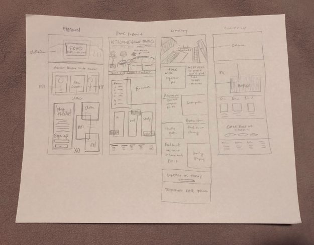
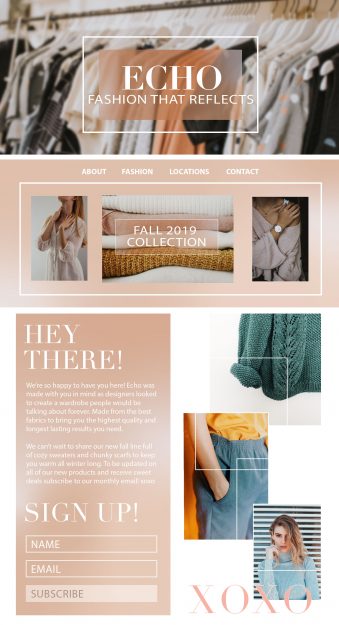
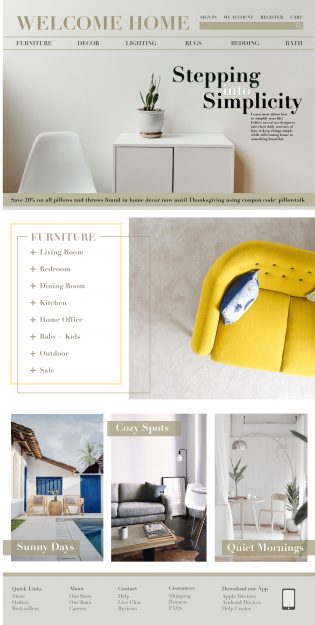
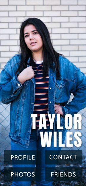
I have continued on the daily UI project and wanted to share some work from my day working on a few different landing pages ideas for three hypothetical companies who each have different audiences. I created a UI landing page for a clothing fashion store, a home furnishing store and for a corporate company.
It’s nice having some sketches to work off of in order to help bring the vision to life rather than going in with no idea behind the design. Sketching doesn’t have to take up a lot of your UI landing page design time by using shorthand and not writing everything out. It’s just meant to give you a wireframe or placeholder for all of your content.
Here are the final three landing pages for the fashion, home furnishing, and corporate companies. Click on each one to view the landing page bigger if needed! Which one is your favorite? How could I make them better?
One of the things I’ve found help me most is recording my process of design. When I go back through and watch myself working it helps me to see how I can create things faster and what I can do better next time. Take a look at the following process videos for the work I did for the UI landing page web design hypothetical companies and let me know what you think! Which companies website would you most like to visit?
Process Videos
Here’s the link to the daily UI challenge if you’re interested in trying out a few projects!
Here’s a link to my UI profile designs to see more of my projects from this challenge.
UI Profile Designs
iPhone UI Profile Designs
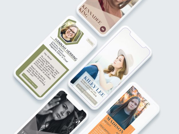
I’ve started the 100 days of UI (user interface) design and I love it so far! It’s a great way to practice various aspects of the UI design experience little by little. I’ve decided to share my process from day 6 when I had the task of creating a user profile. I had so much fun with it that I did 6 UI profile designs in total using pictures that I’ve taken of some close friends. Check out my process video below to watch some trial and error as I was working to make these UI profile designs unique and functional.
One thing to keep in mind is to think about what mockup you want to use for your design before starting. If not, you will probably have to readjust your design and canvas size in order to match up with the mockup size. I decided to go with an iPhone mockup which I linked below for your to find and use for your next UI profile design project! From the 6 profile designs below which one is your favorite?
If you want to get practicing with some UI profile designs sign up today, it’s free!
Here is a link to the iPhone mockup I used above!
Banff National Park
Banff National Park Photography
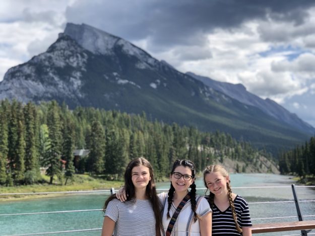
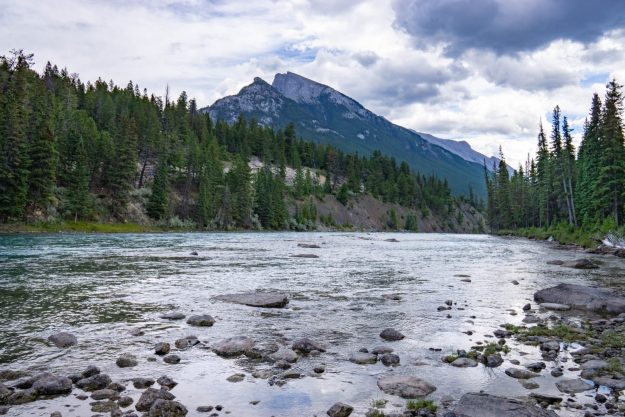
Banff National Park is incredible and should be on your list of vacation spots. It is my favorite national park that I’ve ever been to since traveling up to Canada with my mom and younger sisters this summer. The landscapes, turquoise waters, hikes, vistas, and drives are breathtaking. I wish we could’ve stayed longer. You could spend at least a week up there hiking through the forests and enjoying the glacier mountains that stand majestically against the horizon.
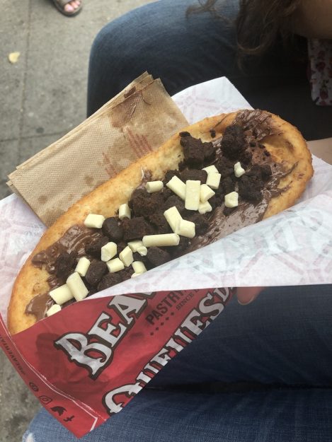
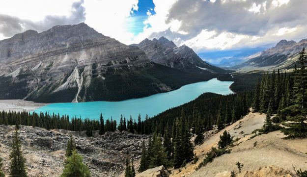
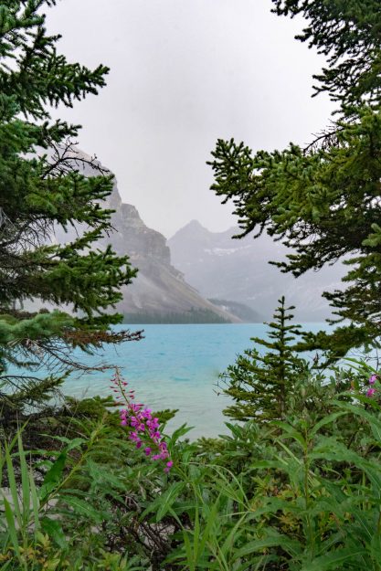
Some of my favorite stops we made along the way included the Banff city area, Bow Lake, and Peyto Lake. The city is full of life and fun things to explore. There are a variety of yummy restaurants, informational centers, resorts, and walking/biking trails along the Bow River. We had some tasty Mexican food at Magpie & Stump and tried out the famous beaver tale dessert which is similar to a scone with a variety of toppings to choose from. You can get up super close to Bow Lake! Peyto Lake has a beautiful hike with tons of beautiful flowers and small evergreen trees. Once you get to the top you see the view in the photo below. It was incredible.
We then traveled up the Bow Valley Parkway for a more scenic drive up the park. We only had time for a few stops and hikes that left me wanting more but we had to continue our trip through Canada. When we go back I want to drive up the Icefields Parkway since it is said to be one of the most scenic drives in the world. I’ve also heard that the gondola ride up to Sunshine Village is amazing, Lake Louise, as well as enjoying more of the beautiful turquoise waters up near the Columbia Icefields, Emerald Lake, and Sunwapta Falls. Stay tuned!
Check out my other post from the same trip visiting Glacier National Park and this post to learn more about Banff National Park Photography.
Engagement Photos
In-Home Engagement Photos
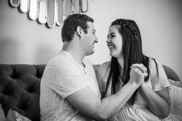
I’ve known my sweet friend Taylor for 3 years. We served service missions for our church together and were roommates at college for 5 semesters. She is full of quotes from The Office, sunshine, and love for all of those around her. She has such a unique way of listening and supporting her friends and family and I’ll be forever grateful to have her as one of my best friends.
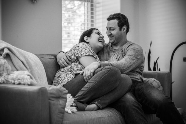
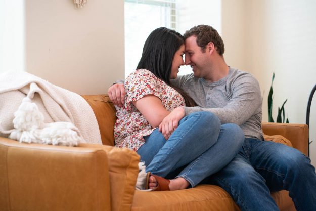
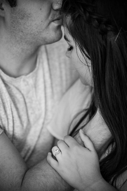
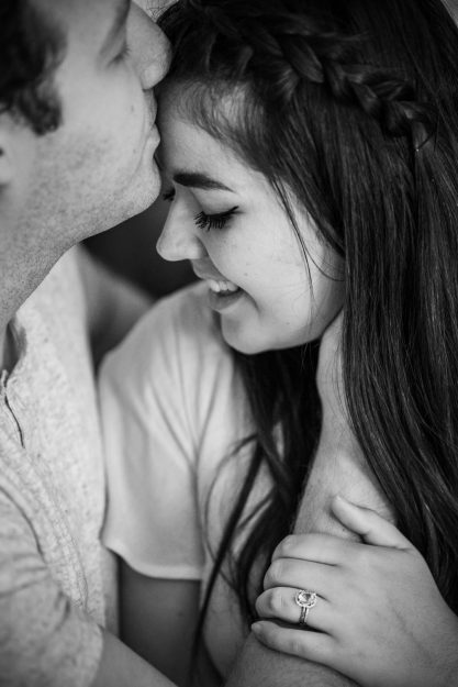
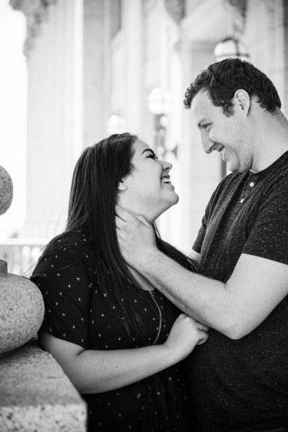
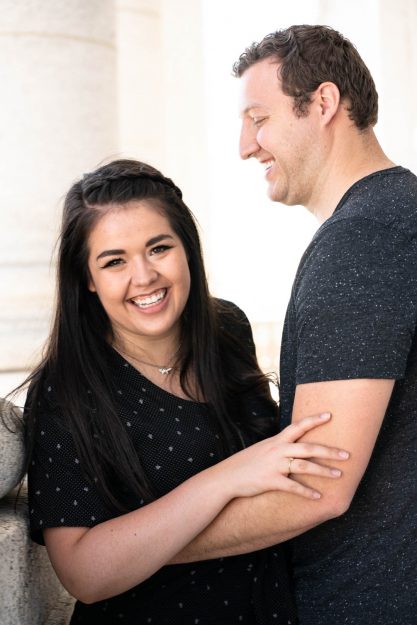
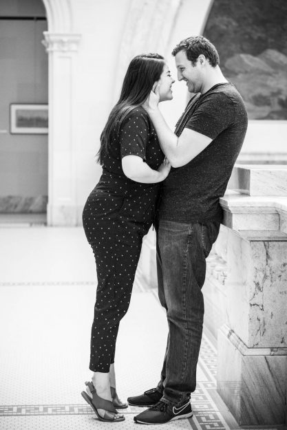
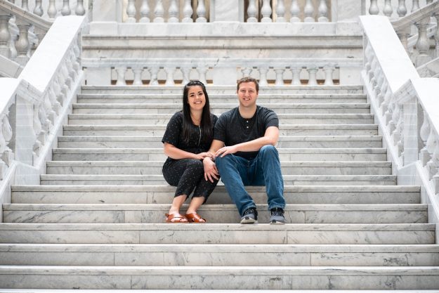
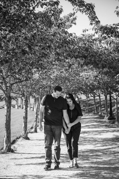
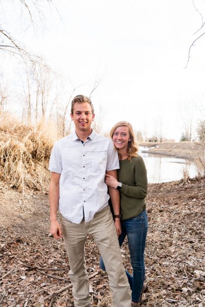
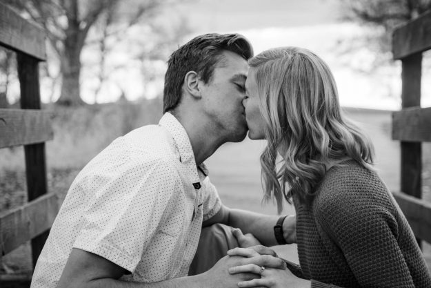
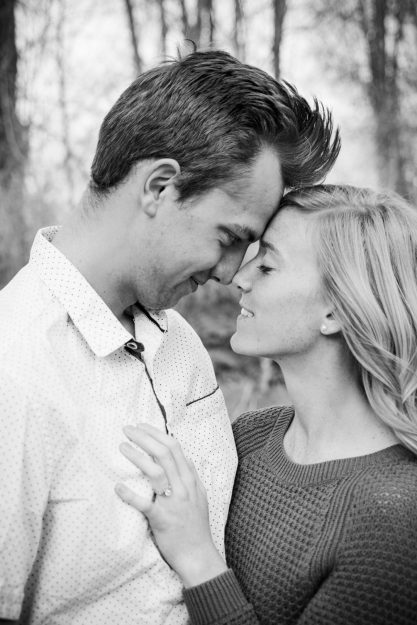
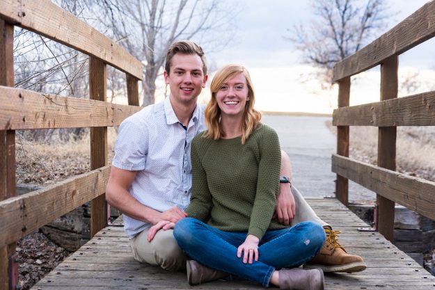
She recently met the love of her life, Brett, and they asked me to take some engagement photos for them. Her aunt has a beautifully decorated house so we decided to take some in-home engagement photos which were a first for me! I loved the intimate feel it gave of peeking into a moment in someone’s life. Since you’re indoors there is a lot less light to work with, so it’s important to find the rooms that have the best natural light coming in from the windows to light your subjects faces. It’s also important to move around your subject and get various angles of the same pose. As you can see from a few of the up-close shots it gives a different vibe facing Brett versus the one facing Taylor. It’s better to have too many photos than not enough!
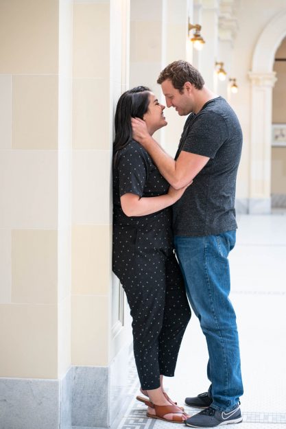
We also took more engagement photos at the Salt Lake City capitol building and the grounds surrounding the area. It’s was a beautiful day exploring for different backgrounds and having the couple change clothes to get a different style of shot. A fun posing prompt to give couples is to ask them to give their order at their favorite fast food restaurant in a sexy voice and whisper it into their partner’s ear. It’s sure to get some laughs and good candid shots.
Take a look at this website for some other ideas for posing for in home engagement photos.
Vegetable Photography
Vegetable Photography and Advertisement Design
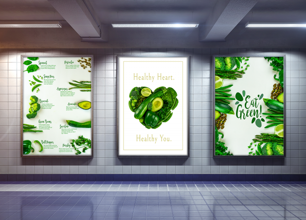
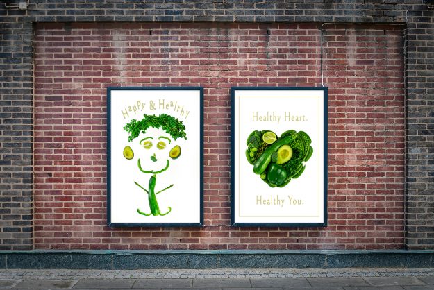
One thing I love about food photography is you can do whatever you want to the item and it doesn’t talk back, get tired, want to leave, etc. You can spend time being nitpicky as you stylize to perfection all without worrying your wasting someone else’s time. Recently, I’ve wanted to do personal projects based on color and though I would start by going green! I had fun with vegetable photography and highlighting how green veggies look but also the health benefits they bring into our lives if we eat them.
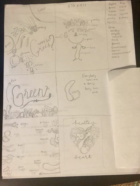
It’s important to take time to brainstorm. Sketch out some ideas of what you want to do before getting out all of your food items. Even though an avocado won’t talk back he will start to turn brown after some time so you need to work smart. Here are a few ideas I had before starting the photoshoot. You can see that I followed some almost exactly and others I modified as I went along.
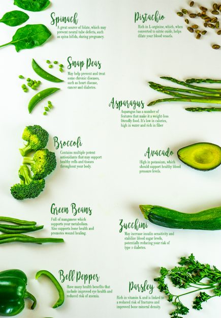
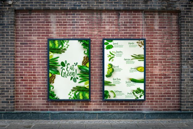
I used my Sony a6000 to take the pictures and HPUSN softbox light kit for auxiliary lighting. In addition to taking pictures, I wanted to add some design elements and create poster advertisements you would see walking around town. I feel like healthy eating has been a hot topic recently as people are wanting to be more conscious of what they’re eating. I created one informational poster that has 10 facts about what those various green items have to benefit your body.
Hopefully, this vegetable photography and advertisement design looks pleasing to the eye and learning more about the health benefits makes it pleasing to your appetite. Also, take a look at my process video to see some behind the scene work with vegetable photography and advertisement design.
All vegetable health benefits were found on this website if you want to learn more!
The outdoor and indoor Photoshop mockups were found on this website if you want to make your own!
Glacier National Park
Glacier National Park Photography
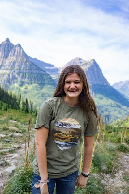
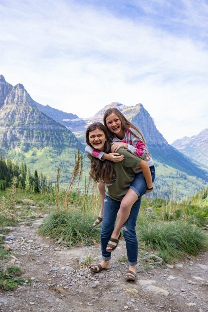
Looking for a fun, nature-filled vacation for the family for your upcoming vacation? I have a great place for you with some great picture opportunities! In the northern part of Montana, you can explore the amazing Glacier National Park! The park entrance fee is $30 (as of 2019) and lasts for 7 days. It’s always a good idea to start the day off early and get there at 9 am right when the park opens so you can miss some of the bigger crowds that come all through the afternoon. I went with my mom and two younger sisters for a girls trip to Glacier National Park and we had a blast exploring through the park. We went at the end of August and the weather was perfect! It was cool enough to make quite a few hikes through the day while wearing t-shirts and pants.
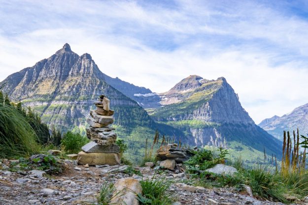
Here were a few of my favorite places to stop in Glacier National Park. I really loved the lookout right after the Trail of the Cedars Nature Trail and before the Weeping Wall. It has a large area to walk around and to get a great shot of the Oberlin and Clements mountains. There were a lot of really cool rock towers (cairn) that added an element of depth to the photograph in the foreground.
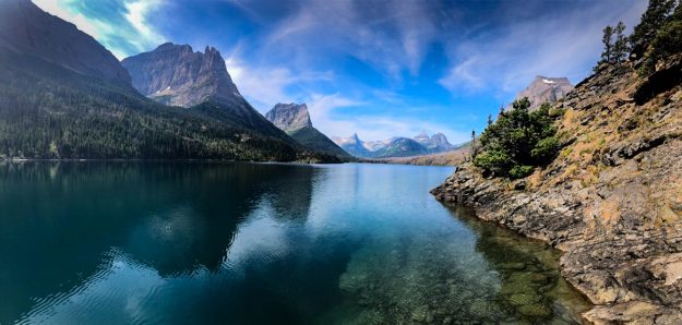
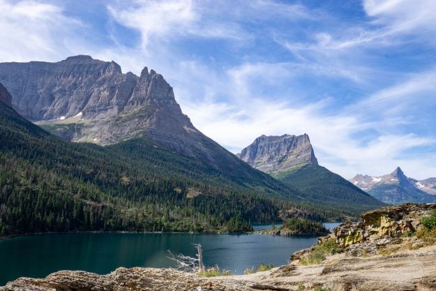
My second favorite stop in Glacier National Park was the Rising Sun trail! There are beautiful rocks and to climb around and a view of Saint Mary’s Lake with the glaciers in the background that is breathtaking! For the first image, I got right next to the water’s edge in order to get the cool perspective of the reflecting mountains in the lake. I didn’t have a tripod with me so I just balanced the camera on a rock. I also heard great things about Lake McDonald, Avalanche Creek, and the Logan Pass but we weren’t able to stop. Go out and have some fun with the family to enjoy Glacier National Park and the awesome photography opportunities you will find along the ride.
Check out another post from the same trip when we went to Banff National Park. Check out this article for more great ideas and photography ideas for your trip to Glacier National Park!
Mr. Rogers Quote Design
Mr. Rogers Quote Design and Process Video
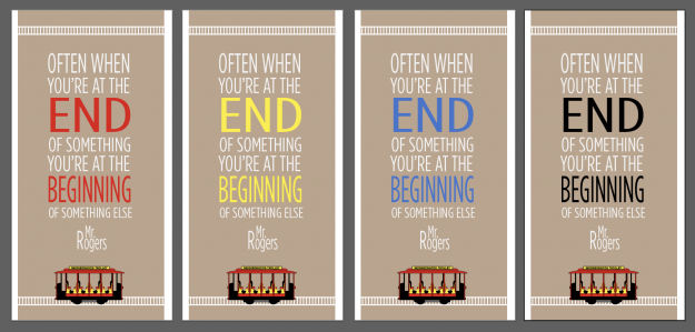
One of my favorite people in the whole world is Mr. Rogers. I remember coming home from school each day to watch his TV show. I loved the way he treated his friends, talked personally to me, and taught me valuable lessons. His messages addressed important topics in simple ways. As I was thinking about him, I remembered my favorite quote and wanted to make a little design to commemorate him and all that he taught me. The quote reads: “Often when you think you’re at the end of something, you’re at the beginning of something else.” I loved this gentle reminder that just because a relationship, job, or life event end that doesn’t mean that it’s the end of the world or that you’re a failure. It just means you’re on a new path and you have a new opportunity to do something amazing.
For the Mr. Rogers quote design I used Adobe Illustrator to add text and to create the cute little neighborhood trolley. I love using various colors and seeing the mood they emanate. Of the 4 colors, which do you prefer? I hope you also like watching the process video to see behind the scenes of how I work. Always remember to keep practicing and get feedback from your family and friends. They are the best at helping you succeed as you consider their opinions.
Check out this article to read other great Mr. Rogers quotes!
How to make a magazine food advertisement
How to make a magazine food advertisement and process video
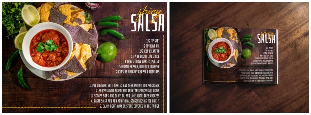
I had a lot of fun exploring food photography and designing a few magazine ads and cover for this personal project. I had two food photography setups with salsa and a meat platter. I composed the shot with white space on the bottom right because I wanted to create a salsa recipe spread later. Visualizing the end goal is critical in being effective with your time. Picture where your text will be, what size of ad you want, and what platform you will be using to make sure you set up your document size correctly.
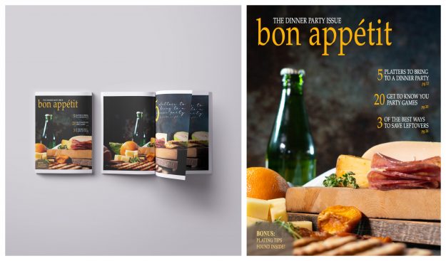
For the meat platter, I wanted to try doing a food magazine cover and also a full-page spread using the same photo but a different angle. For the cover, I loved playing with the colors and brining out the pop of orange. Which is your favorite of the two magazine food advertisements?
I also included a process video showing behind the scenes work of creating the ad. You can make your own process video by using the screen recording function on QuickTime Player. I then take the long video and bring it into Adobe Premiere and increase the speed. I try to make them under a minute long. It’s also great reference for watching yourself work and seeing how you could do better or quicker next time. Try it out with your next project.
You can also check out this article in a previous post about how to integrate your food photography and graphic design skills for social media.
Check out this article for some more great ideas of how to make a magazine food advertisement.
How to Make a Social Media Food Advertisement
How to make a social media food advertisement and process video
One of my favorite things about photography and design is how you can bring a visual message to life that connects with people and their emotions. I created a few food setups with the idea of making them into social media and magazine spreads. I like taking the beauty of photography and capturing a beautiful image and adding graphic design elements to create a beautiful image that tells a story and invites people to do, learn, buy, something.
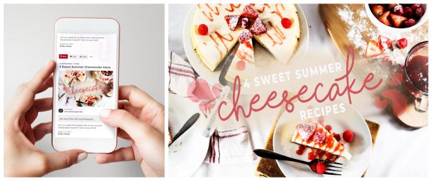
So, let’s jump into how to make a social media food advertisement! I started with a beautiful cheesecake spread with pops of red colors. I wanted it to feel like summer and to be warm and inviting for someone to click on. I ideally envisioned this ad to be on Pinterest since that is the social media platform that I usually get recipes so I chose to insert my design into a mockup to help people envision it in a real-life setting. After getting some more critique from friends I decided to change the font a little bit for it to be more legible. I love getting constructive feedback from friends to make my work even better. Check out the process video to see my step by step process!
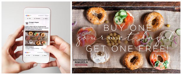
I had a similar theme with my second shoot with gourmet bagels! I chose a random bagel shop (Bruegger’s Bagels) to “advertise with” to go through the whole process. I also inserted my design into a Facebook ad mockup to again help viewers and prospective clients see my work in real life and how I could do the same thing with their products and services. Watch the process video to see how I used similar elements to the cheesecake video!
I hope you learned something new and are inspired to make something new and exciting! Be sure to share how to make a social media food advertisement with your friends and create some awesome stuff together! If you need a place to get creative mockups check out Freepik!
Check out this article for more details on social media advertising and what you can implement for your business!
Yellowstone in the Spring Time
Beautiful Yellowstone in the Spring Time
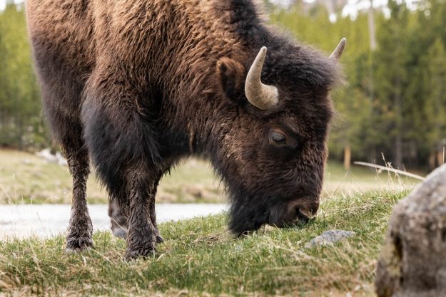
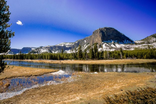
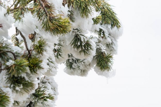
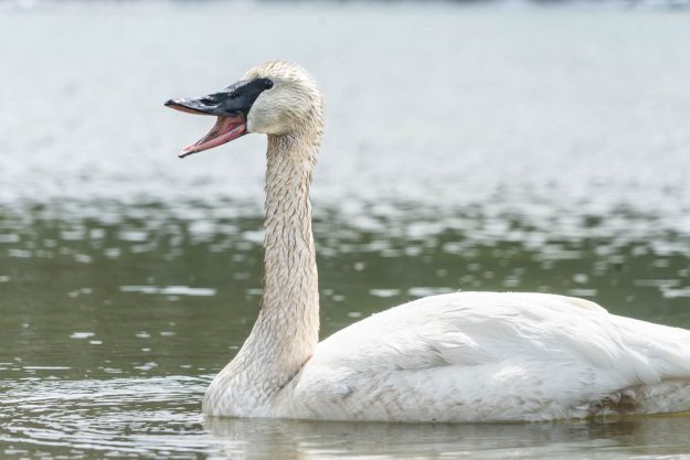
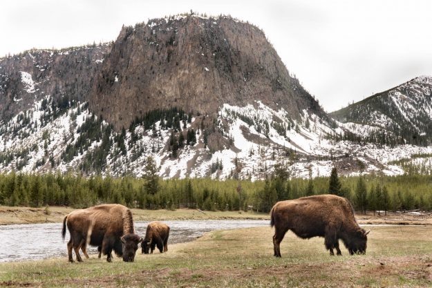
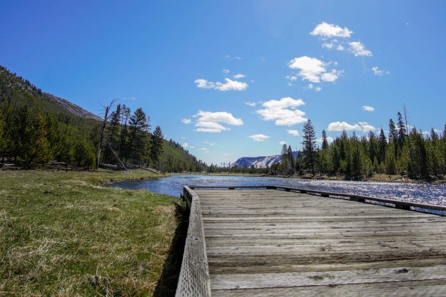
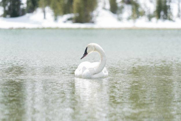
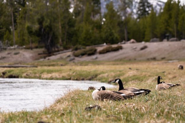
While we were out exploring I was able to capture a few fun animals and landscape shots. As you can see there is still a bit of snow on the mountains and the weather was a bit nippy in the early morning but overall the trip was a lot of fun! We were able to see some bison and swans near a serene lake. In the above picture of the tree with what looks to be snow is actually a chemical reaction that happens when the steam (water vapor) from the geyser rapidly freezes when it touches a cold object and forms frost or rime ice.
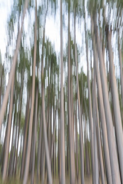
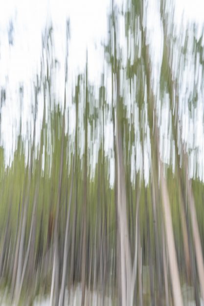
I also tried a new photography technique where you have your camera set to take multiple shots while holding down the shutter and moving the camera up and down in a horizontal fashion. It works best when you find a dense area of trees. We found an area full of aspen trees and tested out this abstract technique. What do you think? I think it creates an almost dream-like state of the moving forest. Try it out sometime! If you want some more tips for visiting beautiful Yellowstone in the springtime check out this article!
Beach Portraits
Beach Portraits at Sunset
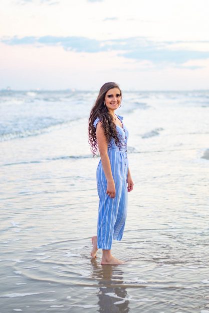
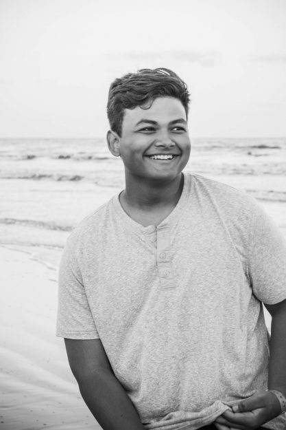
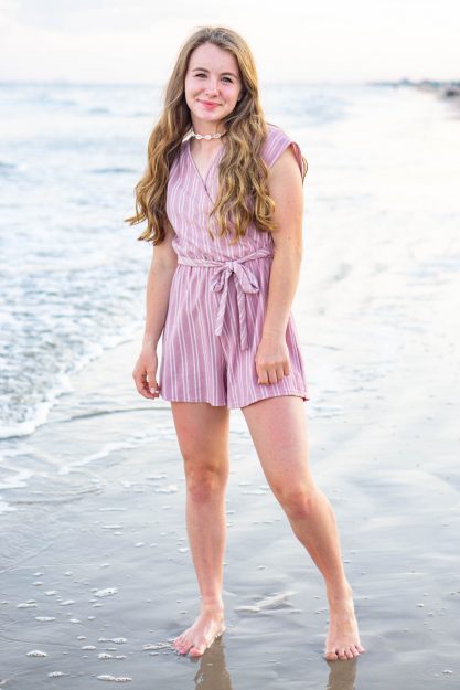
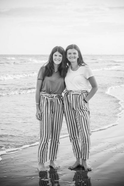
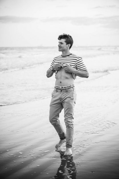
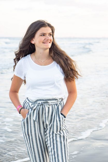
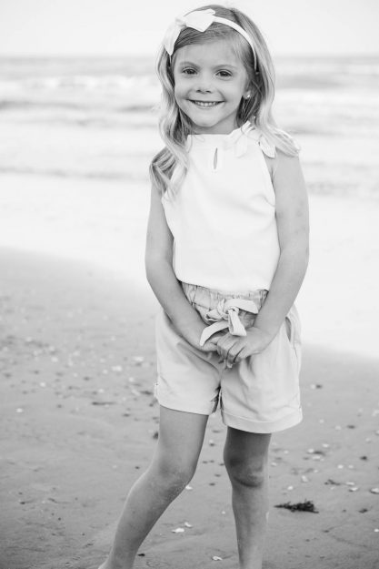
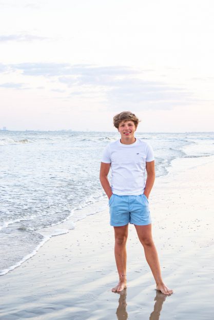
Who doesn’t love vacations to the beach? This summer I went to Texas for a family reunion. We stayed on Crystal Beach in conjoined beach cabins with over 60 people! It was crazy awesome and full of memories I’ll never forget. Crystal Beach doesn’t have the prettiest sand or water but it’s still a fun place for vacation. One of my favorite things about beach portraits at sunset is the beautiful colors in the sky and the open background that allows you to focus solely on the person. We were taking pictures around 8pm so the light was very soft. It’s also a bonus that I have some pretty attractive cousins! Take a look at the following beach portraits and let me know your favorite beaches to take pictures! My favorite is Destin, Florida because the water is crystal clear and the sand is white and soft!
One thing I wanted to do is to have Aneliesse spin around to get those cool reflections and movement with the water and sunset behind her. Don’t you love the candid moment better than just a typical standing normal shot? Even though I loved the colors in the sky, I also wanted to capture a few black and white beach portraits. Jordan wanted to pretend he was a Tommy Hllfiger underwear model and I thought the black and white feel made it look more like a cool advertisement. Southern Living has a nice article that gives some other tips for how to take great family beach portraits.
Mission Pictures in Nature
Mission Pictures in Nature Park
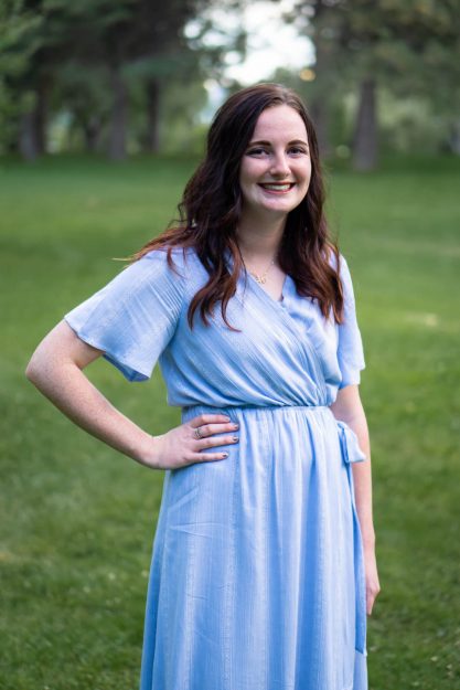
Kaitlyn is my sweet cousin featured in my last post about family pictures in nature! We wanted to take her mission pictures in nature and thought the park in Layton, Utah would be a good location! Kaitlyn is leaving on her 18-month mission to Lansing, Michigan! She will be serving the people there and teaching people about Jesus Christ. If you are interested in learning more about what she’ll be doing as a missionary check out this website.
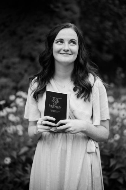
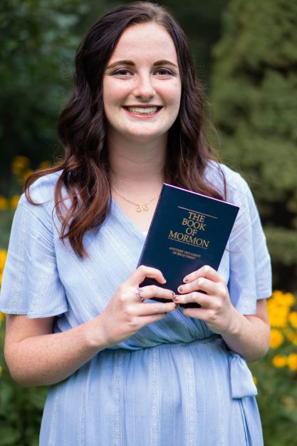
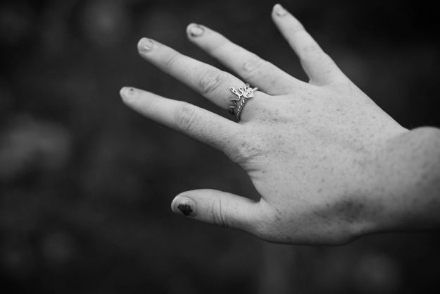
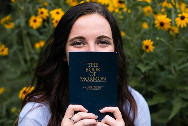
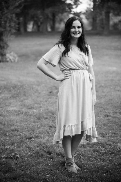
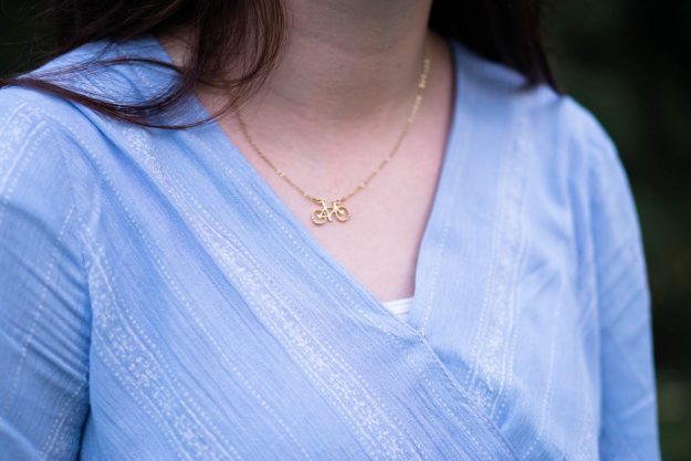
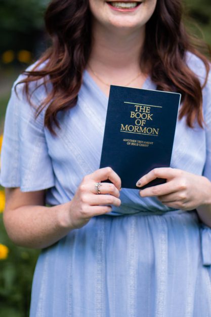
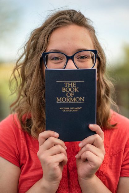
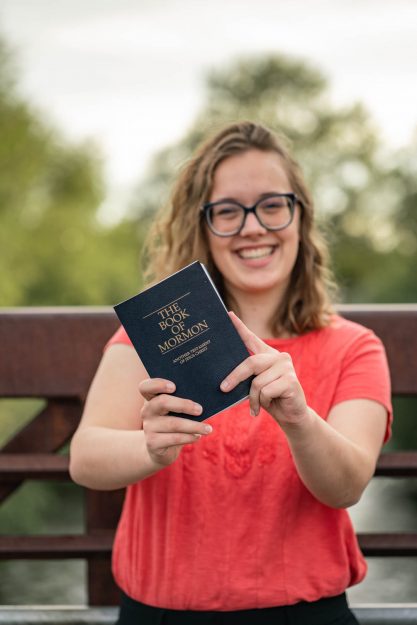
It was a nice location with beautiful shades of green to compliment her light blue dress. We did some shots with her Book of Mormon and CTR (choose the right) ring, and bike necklace. We were losing light pretty quickly since we had taken family pictures right before her mission pictures so an important this is to have the model to spin around as you spin with her to see what way the light is best lighting her face since there were a lot of trees in the nature park hiding the light. I’m so proud of her and all that she has accomplished so far to get to this point. I know she will be a great missionary.
Family Pictures
Family Pictures in the Park
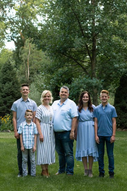
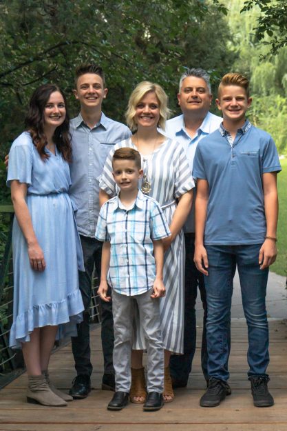
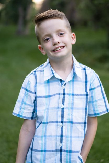
I love this cute family! I was so happy they asked me to take family pictures in the park before their daughter, Kaitlyn, left on her 18-month mission. We went out to a park in Layton, Utah and had fun capturing some memories before Kaitlyn headed out. One thing that was a bit difficult is finding a good way to organize their family pictures. Everyone is about the same height except for Evan, so it makes the posing part a bit difficult to make sure everyone can be seen. The best thing is to try various poses and areas to find which one looks the best that way the family has a variety to choose from later. Which pose do you like best?
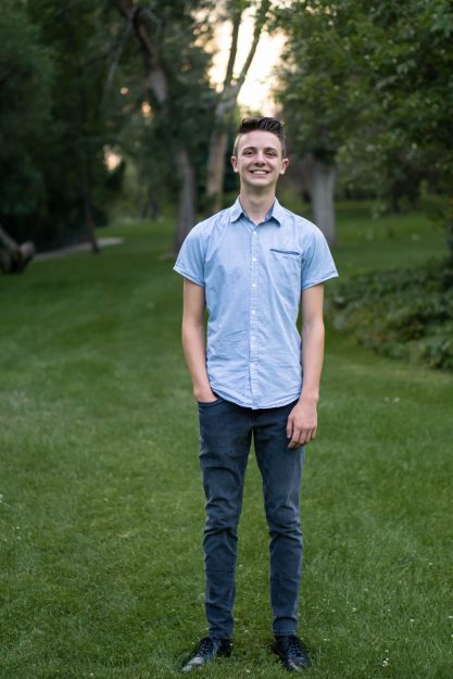
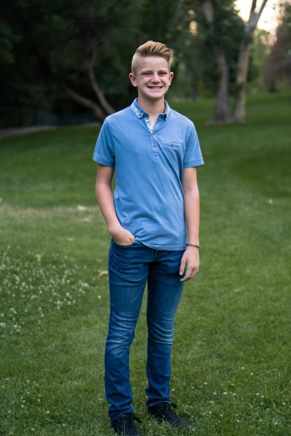
In addition to the whole family, it’s always good to get shots of each child. Who doesn’t love to see the progression of kids growing up? Especially with guys, it’s important to have them do something with their arms so they aren’t limp by their side. I usually have them put at least one hand in their pocket just to add a bit of dimension and movement with their body language. I love taking family pictures in the park just because of the simple background with varying shades of green. I love how their blue outfits complement the background so well. You can also see Kaitlyn’s mission pictures on the next post.
Here are some other fantastic family pictures taken by Busath Photography if you need some more posing ideas!
How to Take Better Graduation Photos
How to Take Better Graduation Photos Outside
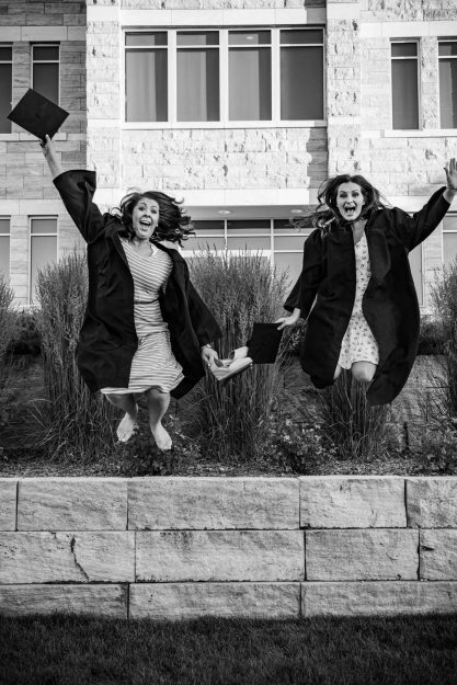
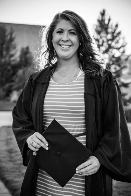
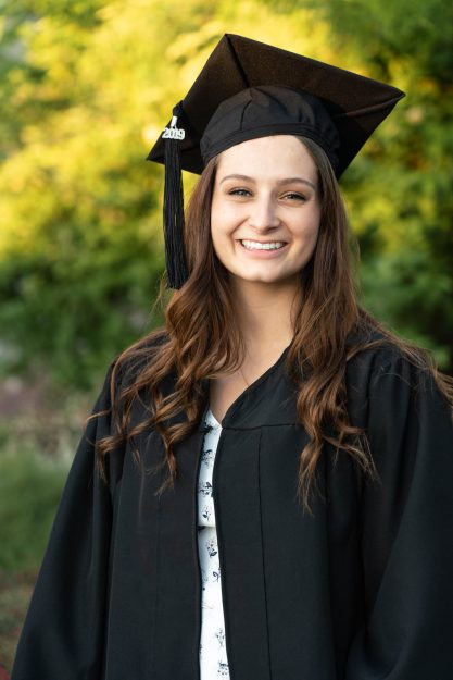
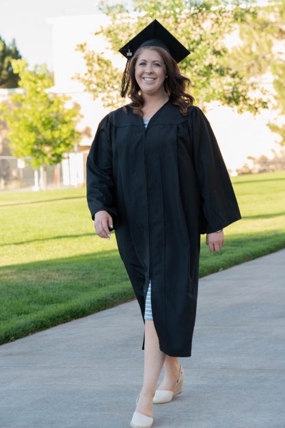
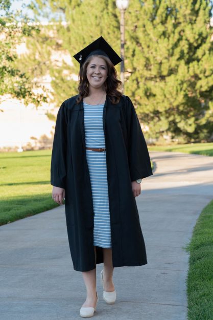
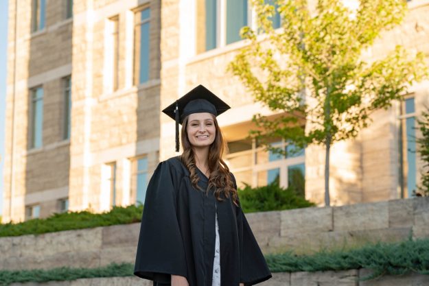
Graduating is one of the most thrilling experiences! You’ve worked for many years to specialize in a specific area and have gained the tools necessary to be successful in the real world (hopefully lol). Two of my really good friends from the Communication Department at BYU-Idaho just graduated and I was so happy to take their photos and capture the happiness that comes from taking such a big step.
A question I try to ask myself before going to a shoot is, “What can I do better this time?” So in this case, “How can I take better graduation photos?” However, I had never taken graduation photos previous to taking Sara and Amber’s pictures. I had to think about what makes graduation photos different from a normal portrait shoot. The only things you add are a graduation gown, hat, school, and possibly a diploma depending on when you take the photos. Since these are the signifying things that tell everyone that these photos are graduation photos I wanted to make sure I highlighted those things well.
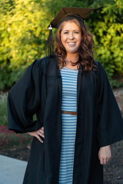
To be honest, I’m not a huge fan of graduation gowns. You lose your form, they’re a weird length, and just not super flattering. I still wanted the gowns to be a part of the shoot because it is one of the signifying things that make your photos graduation photos versus portrait photos. So how to take better graduation photos is to mix it up! I took a few with the gown closed, and more with the gown (see below for differnce) open so we can still get some color from their dress and see more of their form. I also made some better choices by having some with the cap on their head, some with them holding them to the side, and some with them throwing them up in the air. Make it fun and memorable as you look for how you can take better graduation photos!
Check out Nikon’s article about some great graduation day photo tips!
Black and White Portraits
Black and White Portraits Compared to Color
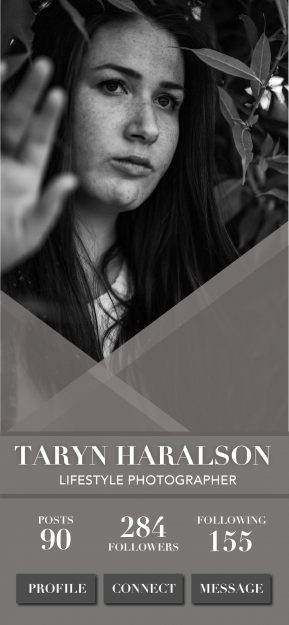
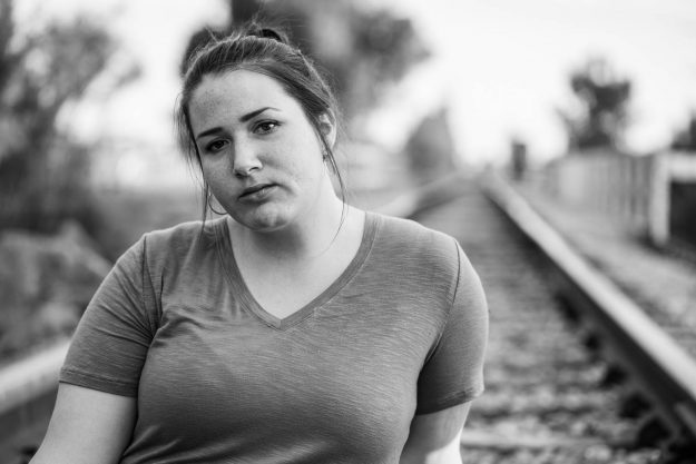
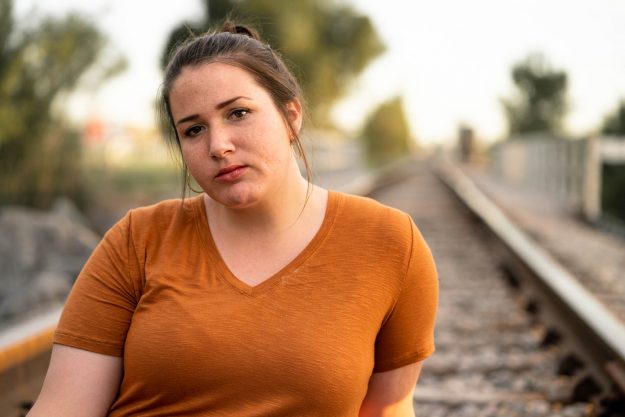
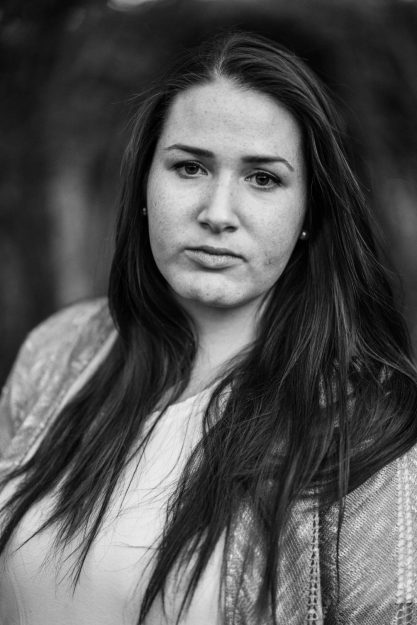
There is something so beautiful about black and white portraits. When the color is taken away you are left with an image full of emotion and raw beauty. Don’t get me wrong you’ll get to see some beautiful images of my best friend Taryn too, but I love how the black and white portraits hone in on different things that make her beautiful. Which do you like best?
Being aware of your light source, while shooting, is most important in creating interesting shadows. If you want softer light try diffusing the light if your outside, or if you’re using studio light try using a smaller light that’s farther away to utilize the effects of harsh light. One thing I like to do when editing is to bump up the clarity on a black and white image. It further enhances things like freckles, dimples, movement in the hair, etc. By also adjusting the shadows you can adjust the mood on whether it’s more light and airy or dark and moody.
There is something beautiful about color and the way things complement each other. It also adds a bit of human touch when you see skin color and deep natural greens. I loved seeing the differences in black and white portraits compared to color and I look forward to spending more time in making conscious decisions of when I shoot with a model. For more tips on how to enhance your black and white portraits check out this article by Digital Photography School.
How to Take Pictures of Little Kids
3 Tips for How to Take Pictures of Little Kids
Have Mom (and little siblings) dance behind you – If you’re trying to take a picture of all the little kids together it is almost impossible to get everyone looking towards the camera, especially with a baby, without someone to make noise behind you. Have mom, dad, grandma, etc. stand directly behind you and have them shimmy around and wave their hands up abover your head so their eyes are toward the camera. If you are just taking a solo portrait, have the other little kids try to make their siblings smile. While Miss Maddy was getting her portraits I told Miles to do whatever he could to make her smile. He started dancing and yelling funny things which made Maddy burst out laughing and I got some adorable candid moments rather than forced smiles.
Capture they’re personalities – Sometimes it’s hard to get pictures of little kids sitting and looking perfect, because how fun is that? Little Miles wanted to play in the dirt and sticks. Instead of pulling him away from all of the messiness I asked him to show me his sticks and play around with it. Although some of the shots were crazy, I was able to get a few golden ones of good smiles while also showcasing his love of sticks which will be a fun memory to look back on. Maddy was walking down the path and wanted to smell all the flowers rather than look at me, so I go a cute little close up of something she loves to do – appreciate the beauty around her.
Candy is everyone’s best friend – The last tip for how to take pictures of little kids is it’s key to have a little snack pack. You can pull it out and remind them that they get a prize at the end for good smiles and listening. Text the mom before to make sure to get something they’ll like. It also works for a bit of a noise maker with the wrapper crinkles to help capture the attention of little babies.
Soon to be Missionary in Arizona
Pictures of Soon to be Missionary in Arizona
My sweet friend, Olivia, is a soon to be missionary in Arizona! She will serve for 18 months in Tuscon, Arizona! As a member of The Church of Jesus Christ of Latter-day Saints, both men and women are allowed to serve and preach the gospel of Jesus Christ to an area of the world in which they are called.
I was also able to serve a mission in California, speaking Spanish, and it was one of the most important decisions I have ever made in my life and it will forever impact who I am as a person. When I was a soon to be missionary, I got my pictures taken by my aunt and it’s funny looking back on them and seeing how young and naive I was in life and making big decisions. By the end of my mission, I had grown in so many ways and had met so many wonderful people who have taught me so many valuable lessons. It makes me so excited to take mission pictures for other people because I get to see myself in them and I get a glimpse of who they’ll also become as they righteously serve and come to love their Savior more and more each day.
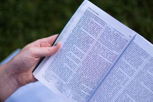
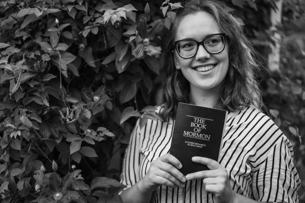
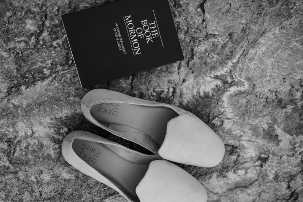
One thing to make mission pictures more than just portraits is to ask them to bring a Book of Mormon, Preach My Gospel, CTR ring, the flag of where they’re going, different outfits, etc. Spice things up a bit with they’re personality. As always, remember to make a few black and white. I was surprised at how much more I loved the contrast of black and white for this particular shoot with my favorite soon to be missionary in Arizona! Have fun and capture who they are before their mission because they’ll be so happy to see how much they’ve grown when they come home and look back on these sweet memories.
Check out this article for more information on missionaries who are serving in Arizona right now or this article on missionary work.
How to create a promotional video
How to create a promotional video for a company
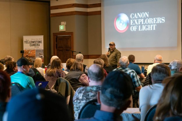
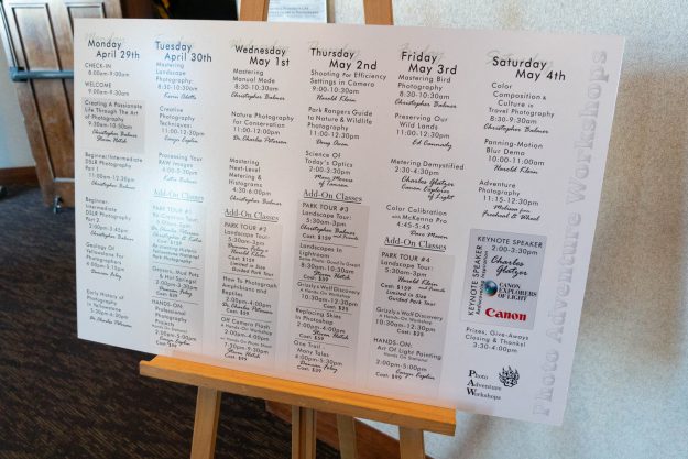
I was able to intern for Perfect Light Camera & Supply in Idaho Falls for 4 months. One of my responsibilities was to create a promotional video for their company in advertising their annual Yellowstone Symposium photography workshop. The workshop lasts for a week in one of the most famous national parks in the world: Yellowstone! They have workshops, hands-on experiences, park tours, and many more fun activities for all types of photographers from all levels of learning. To end the week, a famous keynote speaker comes to help motivate and inspire all photographers to reach their dreams and make a mark on the world. This past workshop, Canon’s Explorer of Light, Chaz Glatzer, came and left the audience with a newfound passion for photography and capturing emotion.
Here are a few tips from what I learned from how to create a promotional video for a company:
Understand the vision for the company– I met with the marketing director to discuss what the Yellowstone Symposium was all about, what to expect, how many people would be in attendance, where it would be, etc. Once I understood what the event was I was better able to understand their vision of creating a promotional video to showcase on their website and social media so more people can learn about the event and participate with people who have the same passion. Create a storyboard of that vision and what parts of the workshop they want to be captured into the promotional video. Know how long they expect the video to be and if they want one long video and a few smaller cuts to focus on various areas of the event. Remember most effective videos are around 90 seconds long. In this case, they wanted a longer informational video for people to understand the context of the whole event. I created shorter versions for other social media promotions.
Be intentional when you talk to people– Let the workshop speakers know who you are and what you’re doing. Ask them what the climax of their presentation will be, if they will be interacting with the audience, any surprises, etc. You need to know what’s happening before it happens to make sure you’re in the right place at the right time to capture everything that is going on through the week. Introduce yourself to those who are in attendance and develop relationships. When people know who you are they are more likely to act natural and be willing to work with you to get certain shots.
Take a look at the video below and let me know what you think!
If you would like some additional tips on how to create a promotional video for a company check out this great article!
You can also check out my post that includes some landscape and animal shots that I got while exploring Yellowstone National Park!
How to be a Second Shooter
How to be a Second Shooter for a Wedding
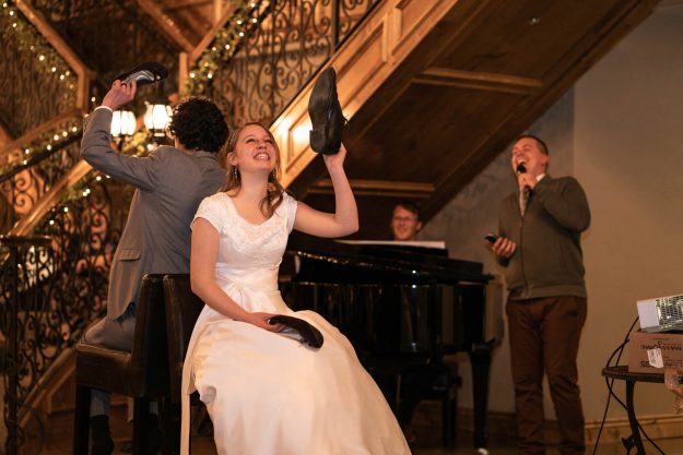
I have always wanted to try out being a wedding photographer but never wanted to be the head photographer for my first time. I was honored to be a second shooter for my good friend Kim Dye for Kevin and Krista’s wedding! It was an overcast day but the couple was beautiful and I’m so happy to have been able to meet them. It was a completely different experience than I expected and I wanted to share a few tips I learned if you’re wondering how to be a second shooter for a wedding.
Be prepared – Ask what the head photographer wants before starting. Where should you be? What shots should you be in charge of getting? How should you dress? Who do you need to interact with? Meet for lunch or chat on the phone so you are both on the same page on the wedding and reception coverage.
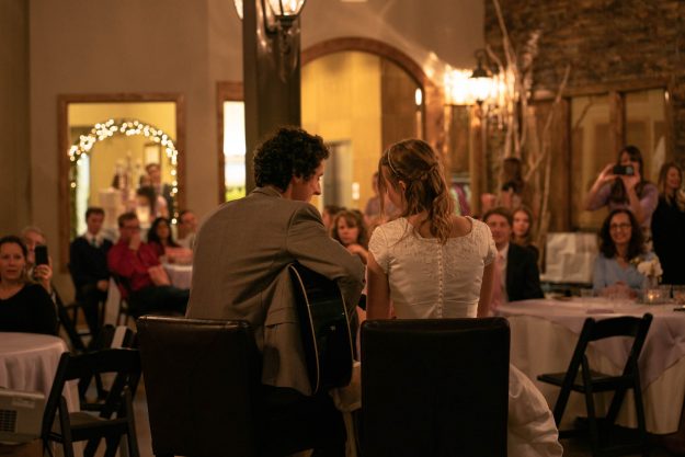
Be flexible – Understand that you are the second shooter. You will be working behind the scenes. Don’t get in the way of the main photographer in getting the most important shots of the night. Also, don’t be an “over-the-shoulder” photographer where you get basically the same shot just from a slightly different angle. You have the ability to be in areas the head photographer is not. For example, if the bride and groom are singing a song together the head photographer will be getting shots in front and you have the chance to get a behind the shot/silhouette look. Be flexible in where you are and be creative with the shots you get.
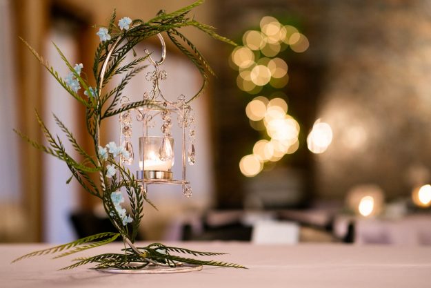
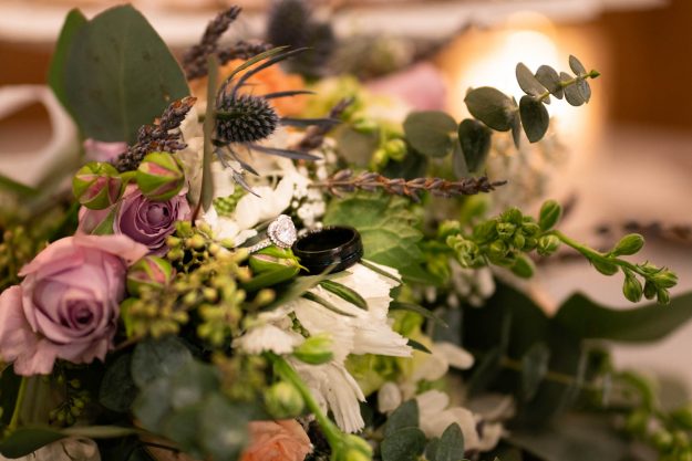
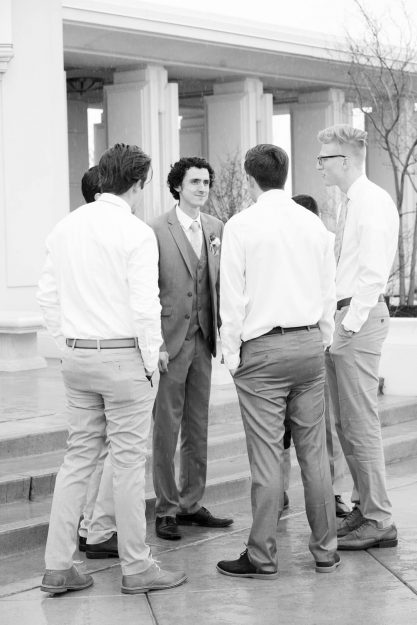
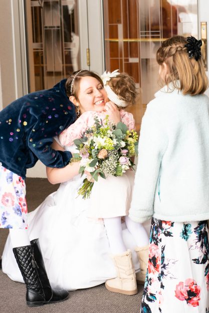
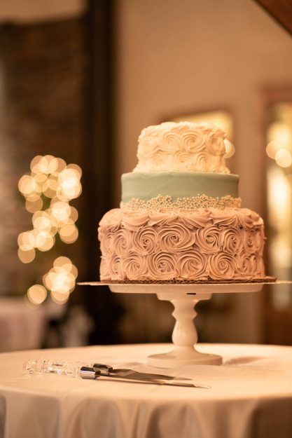
Small details – You have the chance to capture the little, beautiful details sometimes the head photographer doesn’t have time to get. Take pictures of the table decorations, the flowers, flower girls playing, groomsmen talking, cake, the piano man, people walking into the venue, etc.
I hope these ideas help you in knowing a bit more about how to be a second shooter for a wedding! Let me know how your adventures go as a second shooter! Check out this article for some more tips on how to be a second shooter for a wedding! Good luck!
Couple Nature Shoot
Couple Nature Shoot in the Fall
Brennen and Missy are the sweetest couple. They met while working at Red Fish Lake over the summer and they have been spending time in nature ever since. Luckily, I’ve been able to see more of their relationship first-hand because I was roommates with Missy for a semester at college. She has the kindest personality and biggest heart. I love that Brennen treats Missy like the queen she is and gives her all the love he has. I’m grateful to have been able to take some pictures for them before their wedding and to capture a glimpse into their happiness. Here’s a look at their couple nature shoot we did at the end of fall.
One thing I love to do when shooting with couples is to have couples hug and whisper things they love most about the other person. You get tender smiles and looks of pure joy in their eyes. It’s also good to have someone else there who knows funny stories about them to get them laughing. My other roommate, Kennadee, also worked up at Red Fish Lake with them and knows things about when they first started dating. By creating those raw emotions you are sure to get some awesome photos from a couple nature shoot especially in the fall with all the beautiful colors. Even though we love those beautiful fall colors, don’t forget about changing a few to black and white to capture a different emotion! Check out this article for some other fun outdoor engagement photo ideas!
Fall Portraits at Golden Hour
Fall Portraits at Golden Hour and Warm Sweaters
Now that we’re in the heat of the summer it makes me miss the fall sweater weather! We always seem to want what we don’t have, right? I loved going out on shoots to capture the warm fall colors and my friends in cozy sweaters. Plus doing those fall portraits at golden hour made for some magical moments. Golden hour is about 45min-1hour before the sun sets or rises. Once you find that warm, soft light that’s when your fall portraits will go to the next level. Take advantage of that time so there won’t be harsh shadows on your models face or squinty eyes. Of the shots below, which are your favorite?
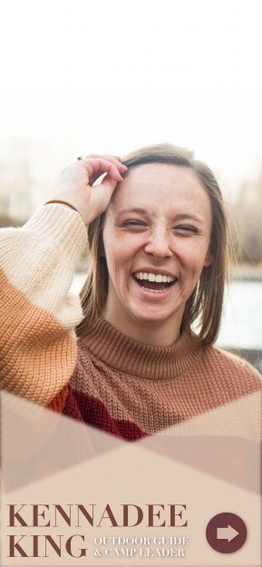
I love the upclose shot of Kennadee because you get to see her beautiful freckles and soft smile. I chose to use the golden hour light as a back light but you can also spice up your fall portraits by using the golden hour light as front lighting, rim lighting, and more. Check out this article for more details of how to take advantage of the light better during golden hour! Happy Shooting!
Lifestyle Product Photography
Showcasing lifestyle product photography
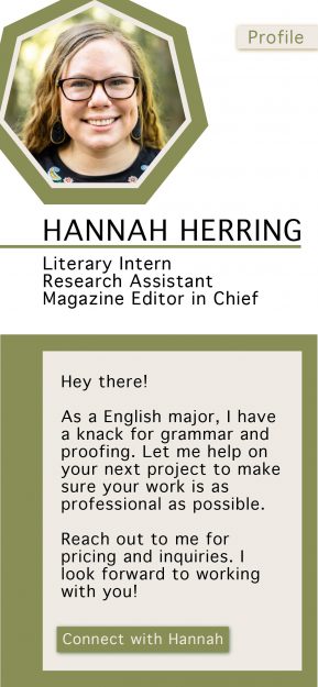
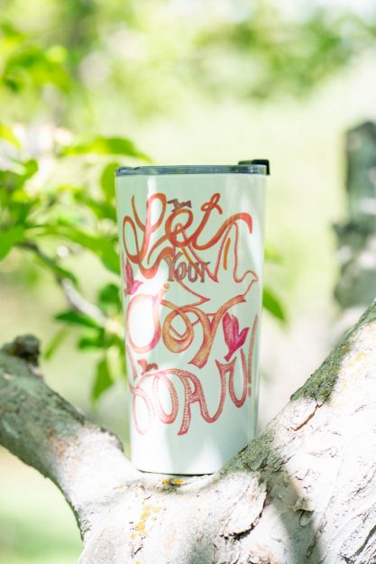
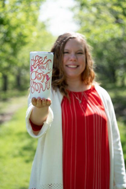
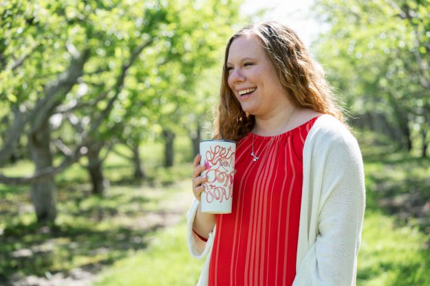
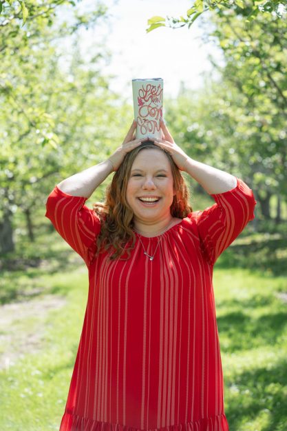
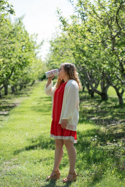
Product photography is a great way to showcase individual things a company sells. One way to better showcase those products is to implement a lifestyle element. One of my favorite lifestyle elements to utilize are people! My friend, Hannah, wanted to give her mom a special mother’s day present by taking photos with a product her mom created. Check out her mom, Dawn Herring’s website to see some more of her creative work.
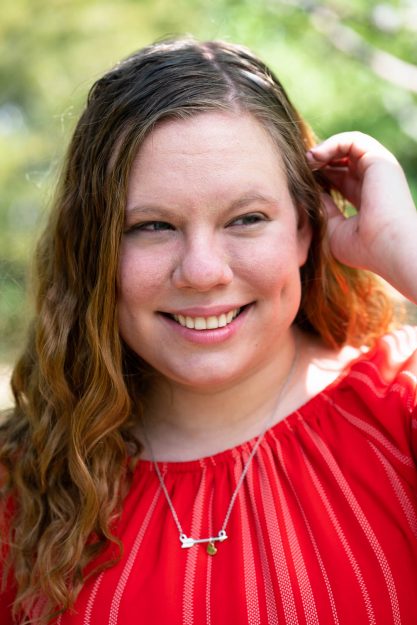
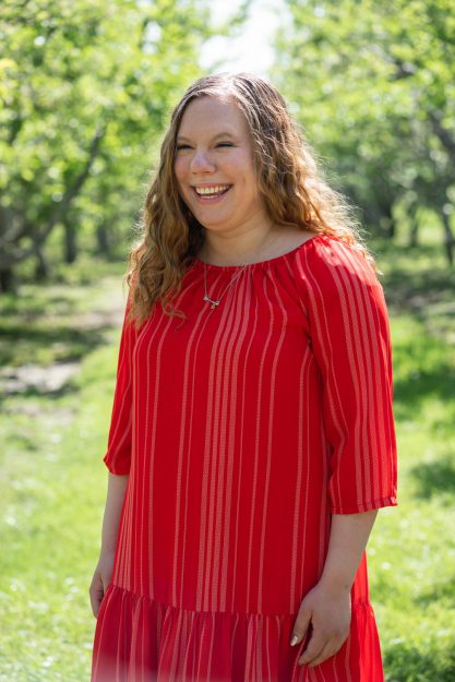
Hannah wanted to not only showcase the cute mug but also her interacting with the mug to show more of a lifestyle look. Sometimes it’s hard to look natural, but my best tip is to just get your model moving and laughing. Everyone can relate to a smile and that’s the best way for people to relate your product with something they can also see themselves using in their own life. What are some of your own tips for creating better lifestyle product photography shoots? Check out this article for more ideas! Here are a few bonus portraits I took after we had captured all the lifestyle product shots she wanted. Doesn’t she have such a fun personality?
Jean Fashion
A look into some jean on jean fashion
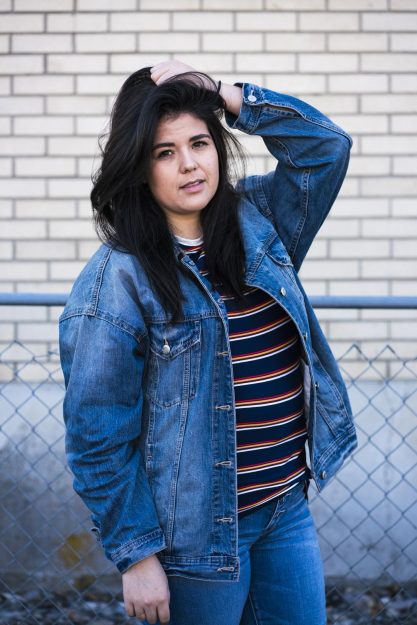
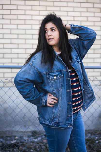
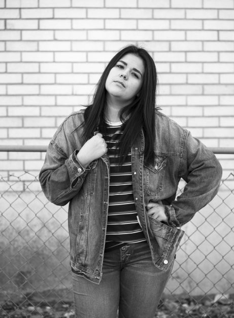
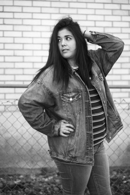
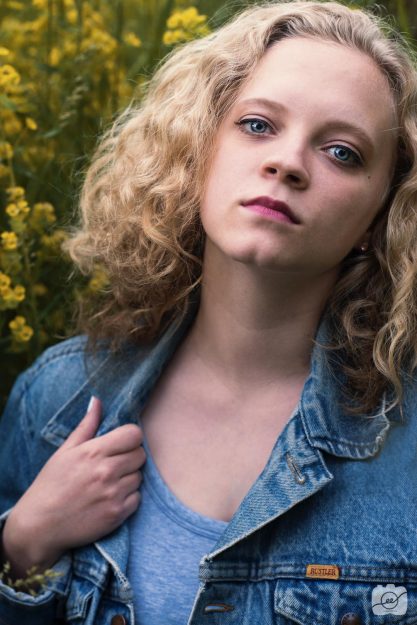
My best friend Taylor is a jean fashion queen. She has an oversized jean jacket that she can work with basically any outfit. For her 23rd birthday, we went out for a quick shoot to highlight her spunky personality and jean fashion. For this shoot, she decided to do a jean on jean fashion look which is not easy to pull off.
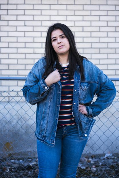
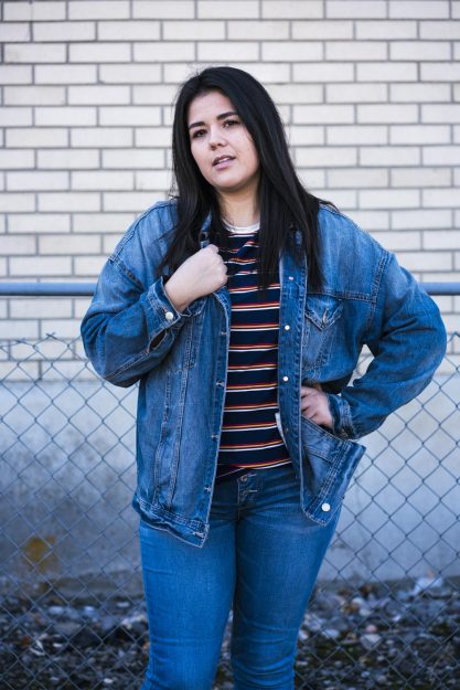
One of the most important things to consider when looking to implement a jean fashion look to your wardrobe is to find jean material that has a difference in color and texture. You don’t want to blend in like camo. Remember you were born to stand out in the jean fashion world! It’s also fun to play around with colors to give your jean fashion a good balance. In this case, Taylor decided to match her jean-on-jean look with a striped tee to add a bit of color and personality.
A tip to give your model is to have them slightly open their mouth. This little thing will make a huge difference in making your image look more engaging and more emotion showing from your model. Take a look at the difference it makes:
Another tip is to not forget about trying out black and white options too! Even those you lose the typical blue color you capture a bit more grunge and texture to your jean fashion looks.
The Profile Shot
The Power of the Profile Shot
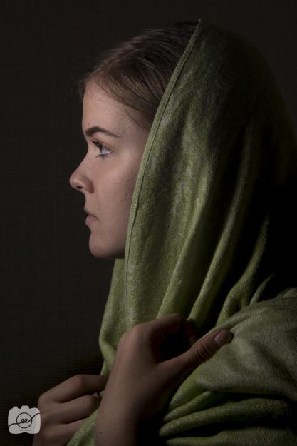
One thing I love when working with models is capturing a side profile shot. There is such a nice emotion behind getting them to laugh, or to look off in space in a candid way. The power of the profile shot comes when you can really get a nice silhouette of their face to really showcase their features. Make sure to have great lighting either from natural sources of auxiliary sources so it will able to really highlight the outline of the model. The profile shot can be used for so many things and it will be sure to make your model feel beautiful/handsome.
Check out Pinterest to see some other great profile shots!
3 Tips for Photographing Couples Outdoors
3 Tips for Photographing Couples Outdoors
I love photographing couples! It’s fun capturing the emotions between two people, especially when it’s love! Going outdoors is a tough thing sometimes depending on your lighting situation. There are 3 tips for photography couples outdoors I have for you today that will help you know how to get a certain look by manipulating the settings in your camera!
Tip 1: Bracketing!
Bracketing is a function on your camera where it takes 3 different exposures of the same image sequentially similar to taking a burst picture on your phone where it will take a few pictures right in a row. By using bracketing, you are able to get the foreground, midground, and background in all good exposures by blending the three images in Lightroom (Highlight all three images, right click on photo merge, choose HDR, and select low deghosting, and click merge)! I love being able to have that nice warm sunset in the background while still being able to see my couple without them being in silhouette. The only downside is you and your models will have to hold SUPER still of you will get movement in the photos which will create weird outlines around the subjects. Try tip 1 for photographing couples outdoors next time you go out to shoot with your friends!
Tip 2: Expose for your models and not the sky
Another thing that is popular among many photographers is to blow out the sky to white so the exposure is solely on your models. This creates the “light and airy” look. You do this by having your f/stop open to around 1.8-3.5 depending on your lens, having your shutter speed somewhere between 1/100-1/200, and your ISO somewhere between 100-600 depending on how dark it is outside. The light and airy look is more easily achieved when it is overall bright outside. Try taking a few test shots and adjusting your settings accordingly until you get your background nicely blown out and your subjects with a nice exposure as seen below.
Tip 3: Backlit lighting
Another fun tip of photographing couples outside is to use the sun as a backlight to give a cool edge light around the subjects! This was taken as the sun was getting closer to setting so we had the nice side light coming in. I had them face towards each other to get a good silhouette and I faced the sun with my camera this will blow out the sky and have a darker light around the subjects face but I love the look the edge light gives the overall photo. It’s a super intimate moment and we only get to see parts of it lit by the light.
Here’s just a bonus portrait of the lovely Kayley! Isn’t she gorgeous? I used tip 1 of Bracketing in order to get the warm tones in the sky as well as the nice exposure on her face. The vibrant colors make my heart happy. 🙂 I hope you enjoyed learning a bit more about lighting outside. Make sure to try out the 3 tips for photographing couples outside next time you go on an adventure!
Check out this awesome video by Mango Street of how to pose couples!
24 Days of Advertising
24 Days of Advertising will be sure to rock your world
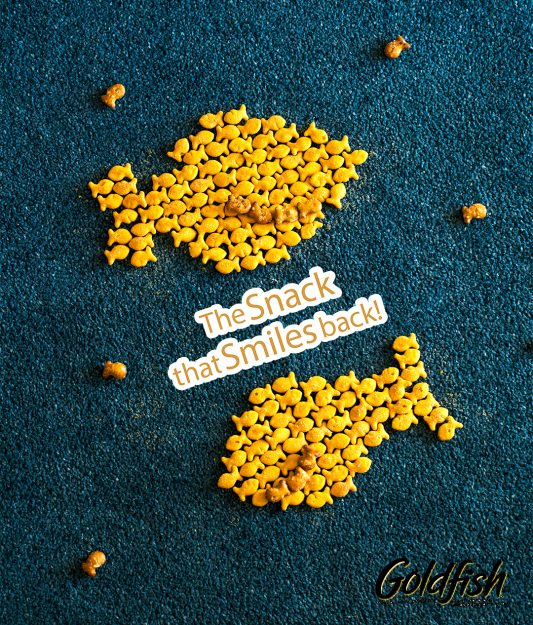
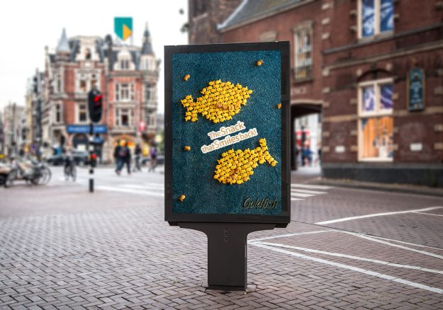
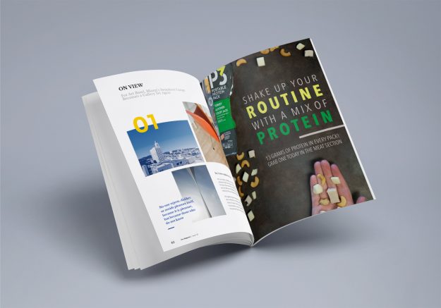
This project stretched me in ways I didn’t expect! Having the determination to create a complete project every day for 24 days was a stressful yet rewarding experience that I’ll be forever grateful for and all it taught me. The 24 Days of Advertising focused on taking local and commercial businesses and creating advertisements focusing on various products or services. I primarily used Lightroom and Photoshop to edit the photos and InDesign and Illustrator to put the advertisements together for the 24 Days of Advertising project. My top 3 days were advertisements for 5 Gum, Goldfish, and P3 Protein as shown below. You can see my other 24 Days of Advertising examples in this PDF document!
5 Gum
Goldfish
P3 Protein
You can see my other 24 Days of Advertising examples in this PDF document!
Check out this link to see the top advertisements for 2018!
Christmas Candy Video
Christmas Candy Video at Florence’s Exquisite Candies
I love the Christmas season and all the fun traditions that come along with the holiday time of year, especially Christmas Candy! I had a blast going to Florence’s Exquisite Candies in Rexburg, Idaho to shoot a video to showcase their Christmas candy selection. What more could you want that to watch a pleasing Christmas Candy Video? I shot all the video footage on a Sony a7rii camera and edited with Adobe Premiere. The music is called: “Happy Holidays” by Borrtex. Check out the video on Youtube and let me know what you think!
Check out this other video to see some other yummy Christmas Candy!
How to Make Peanut Brittle Video
How to Make Peanut Brittle with Florence’s Exquisite Candies
I love the crunchy, sticky peanut brittle treat! I had a fun time going to Florence’s Exquisite Candies in Rexburg, Idaho to shoot a video of how to make their delicious peanut brittle. How to make peanut brittle is a slow process with lots of steps and requirements, but the employees at Florence’s have it down to a science! I was amazed at seeing how quickly they work and all the steps that go into how to make peanut brittle! I shot all the video footage on a Sony a7rii camera and edited with Adobe Premiere. The music is called: “Happy Ukulele” by Scott Holmes. Check out the video on Youtube and let me know what you think!
Here’s a yummy peanut brittle recipe for you to try!
How to Make Caramel Video
How to Make Caramel at Florence’s Exquisite Candies
Isn’t caramel such a yummy treat? I had a blast going to Florence’s Exquisite Candies in Rexburg, Idaho to shoot a video of how to make their delicious caramel. How to make Caramel is a slow process with lots of steps and requirements, but the employees at Florence’s have it down to a science! I was amazed at seeing how quickly they work and all the steps that go into how to make caramel! I shot all the video footage on a Sony a7rii camera and edited with Adobe Premiere. The music is called “Ukulele Whistle” by Scott Holmes. Check out the video on Youtube and let me know what you think!
Here’s a quick recipe for you to try out!
Social Change for Mental Health
Social Change for Mental Health – ELEVATE: An Interdisciplinary Competition for Social Change
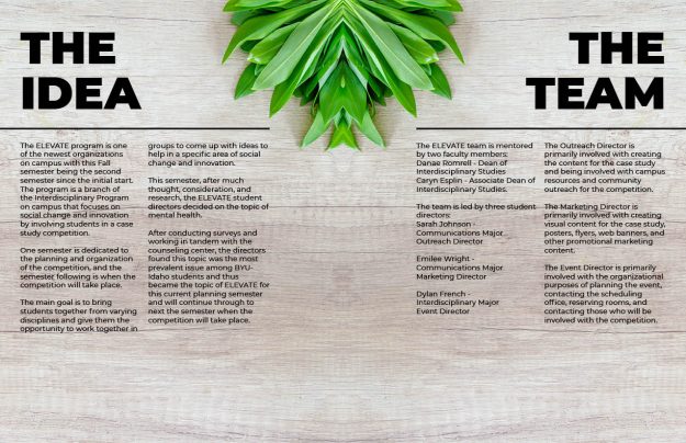
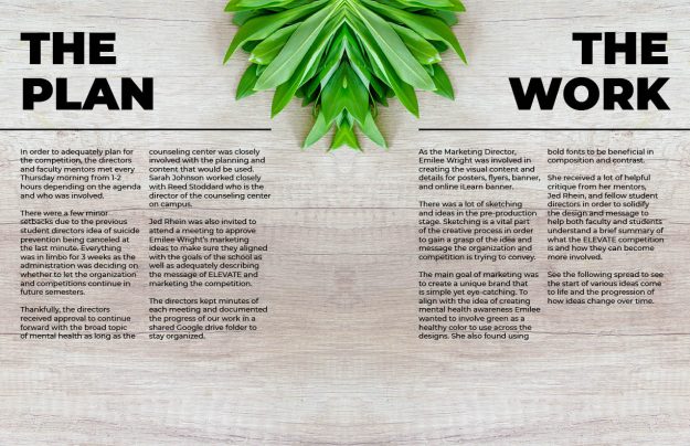
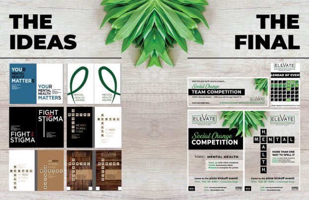
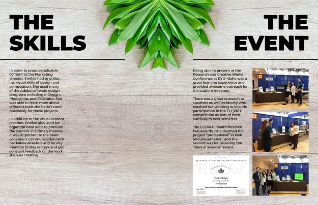
I was able to participate as the Student Marketing Director for a social change for mental health competition at Brigham Young University – Idaho. The competition is interdisciplinary in nature meaning we wanted to involve students from all colleges and departments across campus. Our goal is to ELEVATE one another as we come up with Social Change ideas for Mental Health. As a team of three directors, we spent one-semester planning the event and another semester actually carrying out the competition.
As the Marketing Director for the Social Change for Metal Health competition, I am in charge of creating and designing the informational posters, running two social media accounts, creating the event calendar, team registration materials, and taking pictures throughout the course of the competition.
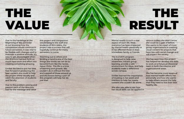
Social Change for Mental Health was our theme because mental health disorders such as depression and anxiety are the most prominent issues students face on the BYU-Idaho campus. As directors, we are passionate about mental health and we desired to help students come together to make a change. Groups fo 5 students from at least 3 different colleges come together to create an idea for social change with the emphasis being on mental health.
They refer to a case study we compiled with resources, rules, and guidelines in order to effectively address the question on mental health. They have a period of two weeks to consult with their team and come up with a presentation to show to a panel of judges. After our kickoff event on February 28, to register teams, we had over 40 teams and over 200 students participating in this amazing event.
View this PDF to see more details about the first semester of planning the Social Change for Mental Health ELEVATE competition.
Follow this link to read more about social change for mental health!
Creative Resume
Creative Resume for Comm 316 Digital Imaging
My name is Emilee with two “ee’s” instead of a “y.” Two is better than one my friend would always say. I’ve lived my whole life with everyone spelling my name wrong – with no fault of their own, of course. So, I decided to spare people the trouble of spelling my full name to shortening my photography business to “ee photography.”
I’m a lover of ice cream, elephants, sunrises, funny people, and capturing life’s beautiful moments. I’m also that, sometimes, annoying friend who wants to take pictures of everything. My bedroom walls are covered with pictures of the people and places I love most.
I believe everyone and every business has an important story to tell and I want to be a part of bringing that unique message to life. I seek to inspire individuals to look at life differently. I love designing and creating images that evoke various emotions and to also initiate change.
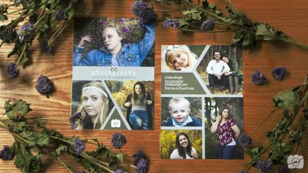
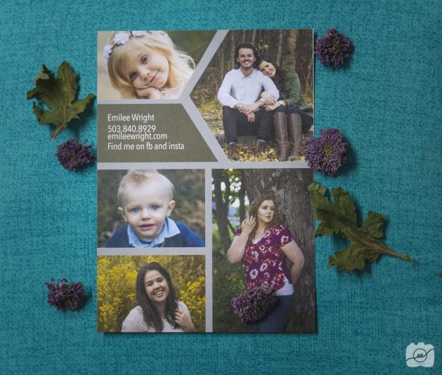
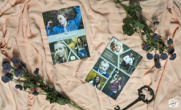
I, personally, love having something in my hand to hold. I wanted to create a small handout that I can show friends, family, and potential clients what I can do. I chose to create a 5X7 handout in InDesign on cardstock paper that features 8 pictures I have taken. I originally designed a handout that had 14 pictures on it, but it was too overwhelming and I wasn’t able to really showcase my work. By simplifying and focusing on my best shots I am better able to portray who I am as a portrait photographer and attract the attention of those who want my business in creating unique memories that will last a lifetime.
Reach out to me through social media or my website (which information is found on the back of my handout) and we can collaborate together to create something amazing. Check out this website to see some other examples of creative resumes. Remember two ee’s are always better than one!
Here are the full pictures I used for my creative handout:
Photography Portfolio
Semester Portfolio Review
I have learned so much in my Comm 316 professional imaging class this semester! As I look back on all of the images I have taken the last few months it’s amazing to see all the skills I’ve learned. It’s crazy to think that I picked up a DSLR camera for the first time just a few months ago. The world of photography is bright and beautiful for those who are willing to be patient and keep practicing.
This portfolio blog post features some of my favorite images that I have taken this semester. My final personal style project focused on people and capturing them in elements of nature. Capturing people’s emotions is my happy place but I have also really enjoyed learning more about creative composites and product photography. Enjoy my personal portfolio and check out Caryn’s portfolio for some other great work.
Hair with Flowers
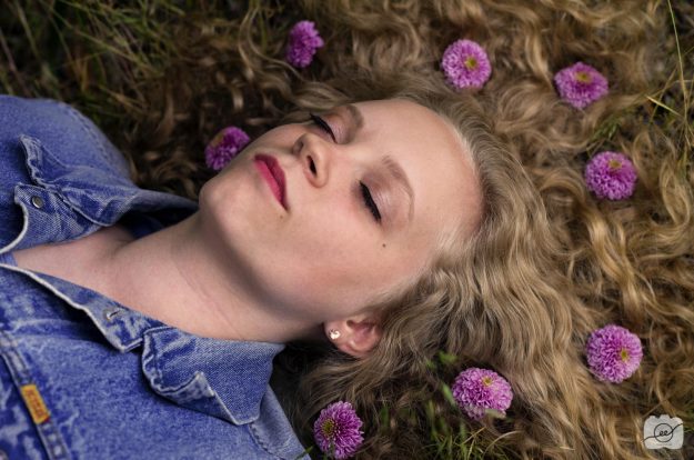
Good morning, Sleeping Beauty! Beautiful hair with flowers
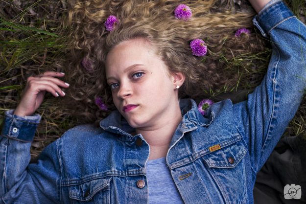
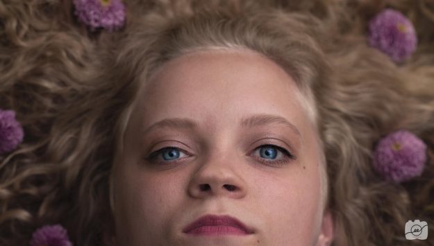
Who doesn’t love their hair with flowers? I had such a fun shoot with my curly haired friend Molly! I love her bouncy curls and intense blue eyes. I wanted to showcase her lovely locks so I thought it would be fun to add some purple flowers to add contrast and interest. When you have hair with flowers it’s important to make sure the flowers are spaced around evenly so it doesn’t create conflict with something different. I also added quite a bit of contrast in post-production to increase the difference between her hair color and the flowers. I also messed around with the color selection adjustments and added some warming LUTs on the photos without flowers in Photoshop. Have fun shooting hair with flowers to create something beautiful! Check out this article for some ideas for hair with flowers and go out for your own creative shoot!
Nature Portraits
Becoming one with nature as you take portraits
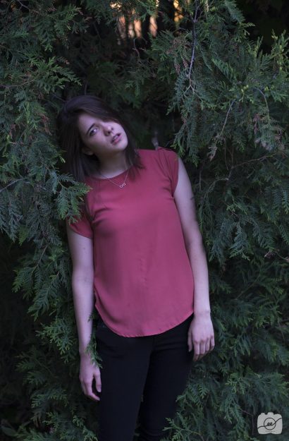
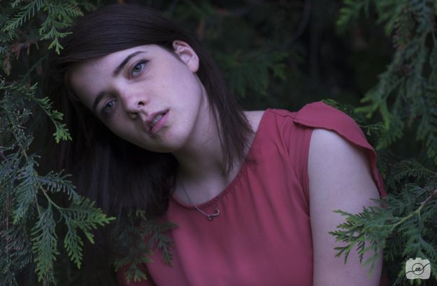
I love nature and people so the beautiful mix produces nature portraits. I think there is something so unique about photography that incorporates nature’s different colors and textures. My sweet friend Nelani is a little forest fairy. She has a unique shape and color of eyes that draw you in. She also has a tall, skinny body that makes for interesting angles. I think the biggest thing that makes your nature portraits stand out from others is having your model interact with the nature. Don’t just stand in front of it, but step in it! Have them almost immerse themselves in the warm hug (or pokey back scratch) of tree branches. This will add a different mood that will take your nature portraits to the next level. Check out these other tips of how to improve your nature portraits!
Cute Dimples
Turn the other cheek to see those cute dimples
I love cute dimples!! They make me want to make my friends laugh and smile just so I can see them more often. Sometimes those cute dimples are hidden because of the way the face is positioned. If you have your model look at you straight on you may be able to see parts of the the dimples but they are often in shadow and you don’t get the full effect. If you have the model turn their cheek to one side then you can see more of one side of the face as well as the dimple. Experiment with different angles and be sure to follow your light source in order to capture those cute dimples! Check out this article to see some other photos of people with dimples.
Beautiful Eyes
Using the light to your advantage to bring out beautiful eyes
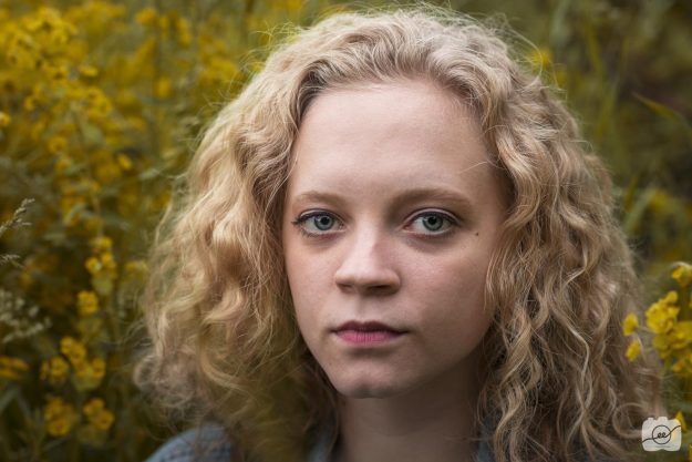
I truly believe that eyes are the window to the soul. Usually, I can sense how someone is feeling just by looking at them. Monica has some of the most beautiful eyes I have ever seen. They are big and have such a beautiful vibrant blue that reflects light so flawlessly. I love the innocent emotion her beautiful eyes evoke. The most important thing to get them to pop is to have sufficient light. Sometimes beautiful eyes get covered up by shadows and hair. Pull back the hair and have some warm light to adequately light the models entire face. I did very little in post-production but, I love adding a bit more exposure and white to her eye with an adjustment brush to have her eye light up a bit more. Check out this article to see some of the most beautiful pictures of eyes.
Young Love
An afternoon in the park with a cute couple
It’s so fun to capture young love. This is my sweet roommate Gwen and her boyfriend Skylar. They have such a cute way of interacting with each other. The best thing to do is to get them laughing. Once they start joking around with each other, than they will show natural interactions and you will be able to capture those tender little moments of young love. Check out The Beauty of Young Love to see some other interesting black and white photos capturing young love. I also captured a few portraits of Gwen looking at Skylar off camera. He definitely knows how to make her laugh and bring a beautiful light into her eye.
Architectural Photography
You Lift Me Up to New Places in Architectural Photography
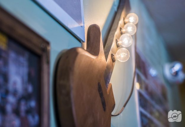
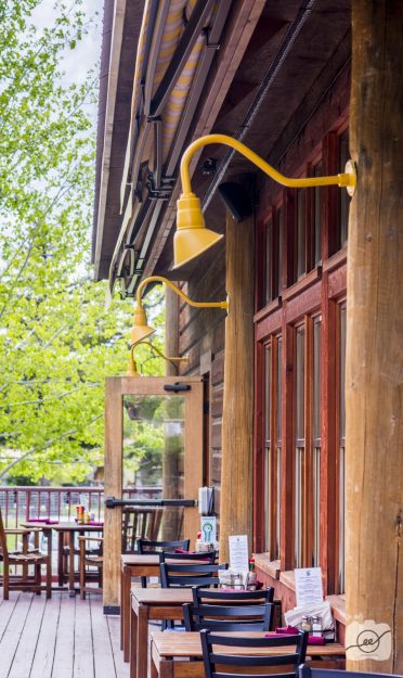
Another aspect I loved about the Lift restaurant in Jackson Hole, Wyoming is the cool architectural elements. There are so many little nooks filled with history of Jackson Hole and cool architectural elements that make the restaurant unique.
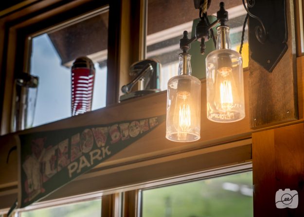
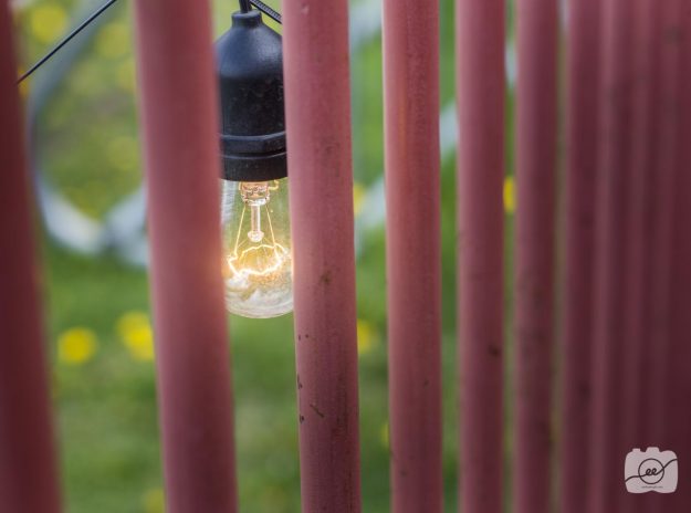
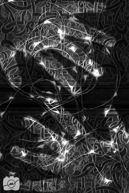
One thing I loved focusing on was the unique light fixtures they had both indoors and outdoors. It’s really interesting to get the warm glow of energy. In post-production, I just lowered the highlights a bit and increased the contrast so you can better see the individual wires.
Look for different textures and how the décor works with walls/ceilings. It’s also cool to look for repeating elements to add to your overall composition.
Check out https://www.archdaily.com/804685/10-tips-to-perfect-your-architectural-photography to see some other cool tips in order to get some great architectural shots.
Food Photography
Lift Your Cravings to Food Photography
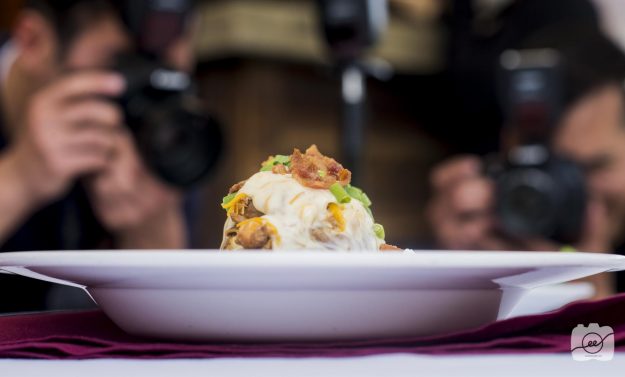
If there’s one thing that makes me hungry, it’s food photography. A good photographer can not only snap the shutter, but they can make you feel something. In this case, you should hopefully be able to almost taste and smell the following items.
If you like what you see, head over to the Lift restaurant in Jackson Hole, Wyoming. I’m going to be taking you on a 3-course journey that will hopefully make your mouth water as you enjoy these food photography shots.
Appetizers
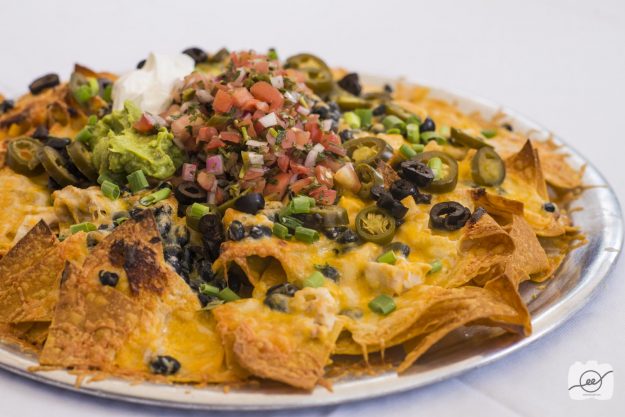
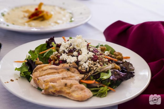
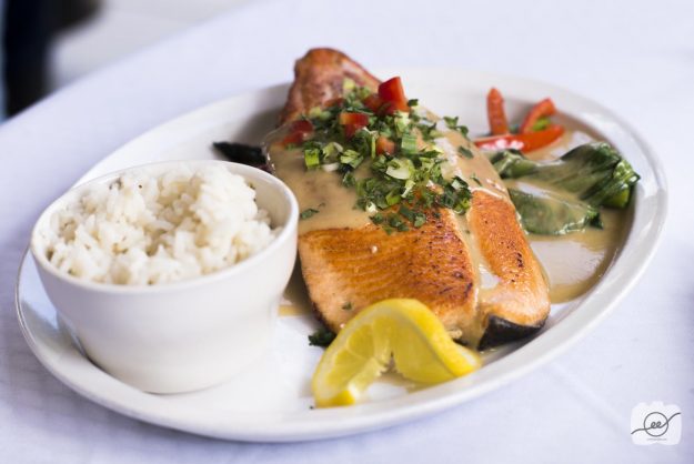
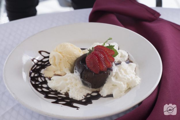
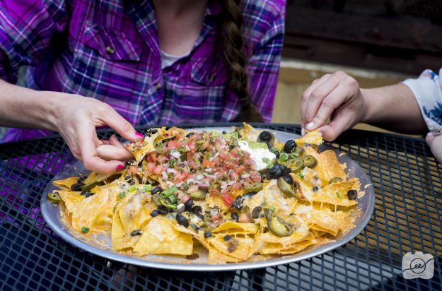
A good tip for food photography is to utilize a lot of different lighting. I took all of these shots on the roof of the restaurant in a little open area. It was good to have the natural lighting but it’s also nice to have a few speed lights around to get full coverage on the food in order to see all the colors and textures. It’s also important to get close and to find different perspectives.
Entree
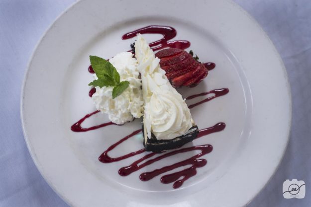
Desserts
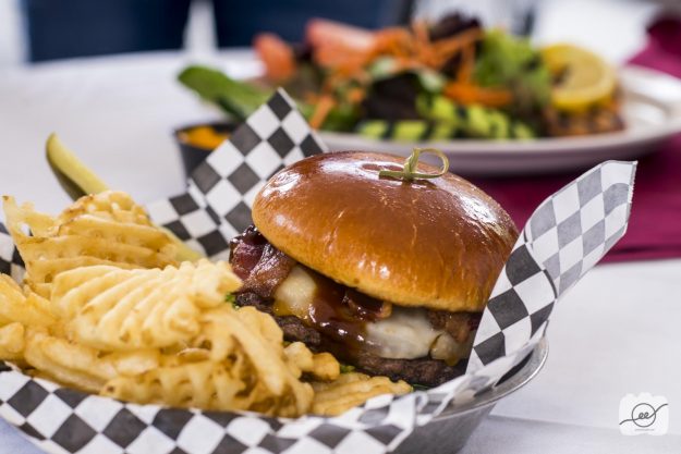
A cool aspect of food photography is being able to point out the little details and also being able humanize environmental objects. After getting a few shots of the food, grab some friends to interact with the food. Have them pick up a chip, cut the chicken, or getting the first bite of a juicy burger. Go cook up your favorite dish and capture a delicious perspective to share with your friends! Check out this website to see some more awesome food photography shots!
Motion Photography
Capturing quick motion with photography
Spray
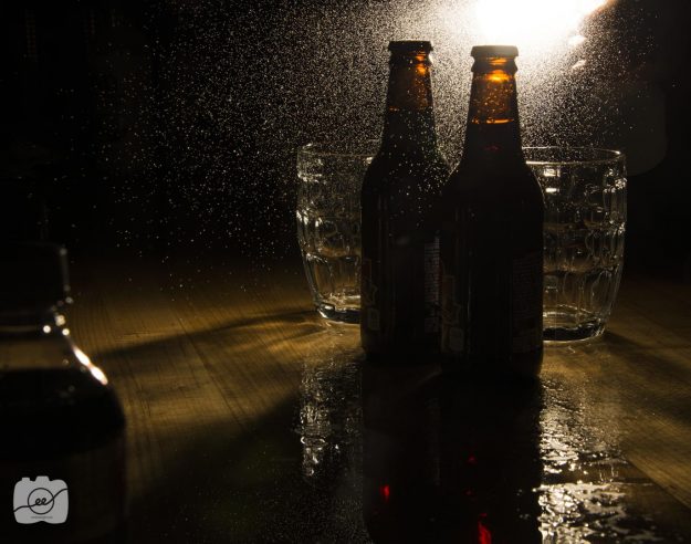
This shot was so much fun to capture! Adding water to a product photography shot adds such a cool effect. In order to freeze the water in midair I had my settings at f/18, 2.0 shutter speed and at ISO 100. I set my camera up on a tripod, my friend held a speed light behind the root beer bottles and I sprayed a water bottle as much as I could in the time frame of the shutter being open. I raised the contrast, highlights, shadows, and blacks in post-production and voila! Capturing this motion creates an exciting mood and interest for your next product photography shot.
Sprinkle
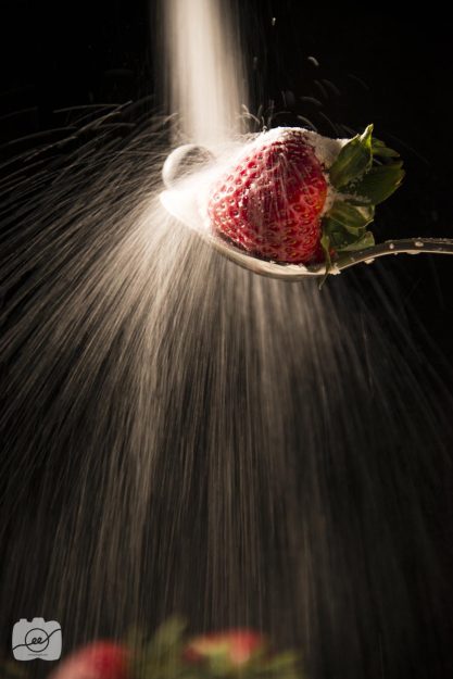
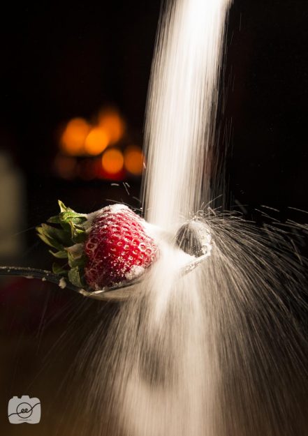
Motion photography can add excitement to an ordinary object like fruit. Grab a spoon, stack of books, salt (since it is thicker than sugar), your favorite fruits, a tripod, a light source, and your camera. Stick the spoon into the stack of books so the part you put in your mouth is sticking out. Place your fruit on the spoon and set up your tripod in the desired location. Have someone sprinkle/pour salt over the fruit while you take multiple shots of the image. Depending on what result you want will depend on the settings. If you want more of a consistent flow then you can set your shutter speed to go a bit longer so it captures more of the motion, or you can have a quick shutter speed to capture the specks of salt bouncing off.
Set up the image as many times as you so desire! An additional tip to take your image to the next level is to add something interesting to the background. I was staying at a cabin and we had a nice warm fire in the background to create a warm glow. You can also move your light source or move to a different side of the table to get a different perspective on this motion photography technique.
Splash
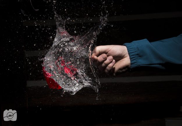
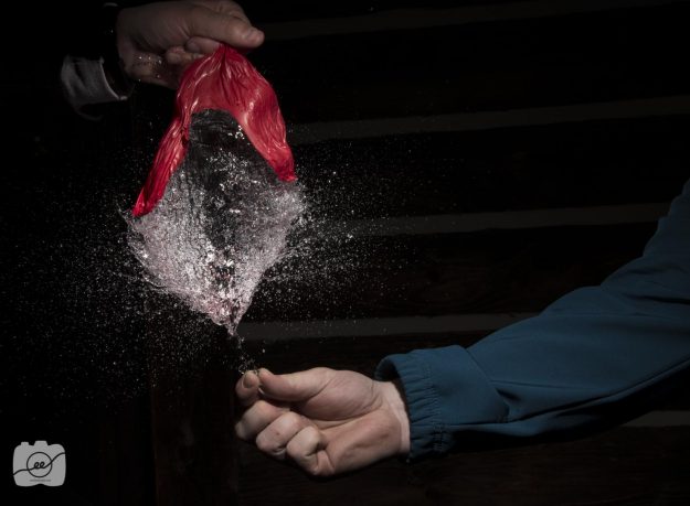
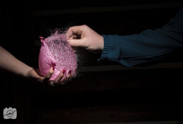
The final motion photography idea involves water! You’ll need some water balloons, a needle, someone to hold the water balloon, someone to poke the water balloon and hold the speed light, a tripod, and your camera. Fill up some water balloons to about the size of a softball. Set up your tripod and have f/18, 2.5 shutter, ISO 100 for your camera settings. The long shutter is so there will be enough time for the person to hit the test button on the trigger for the flash to go off as they poke the water balloon.
Have about 10 balloons filled up because it takes a few times to get the settings and timing correct for this quick motion photography. An additional tip is to have the person holding the balloon try different hand positions in order to get different popping experiences. Have fun with this final motion photography tip and check out https://digital-photography-school.com/a-beginners-to-capturing-motion-in-your-photography/ for some additional motion photography tips.
Photography Branding
Logo and pricing sheet ideas for photography branding
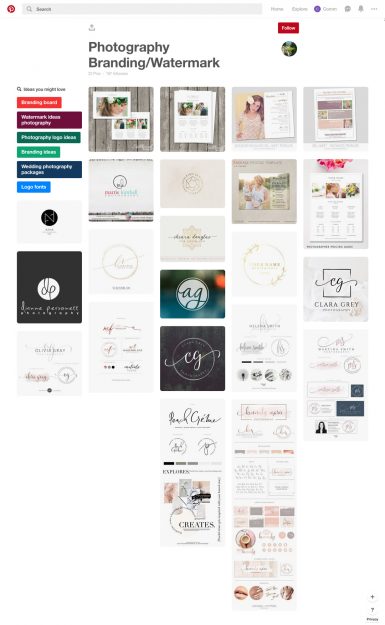
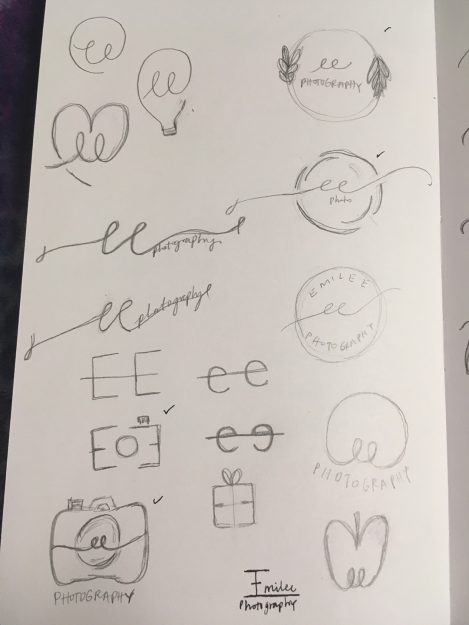
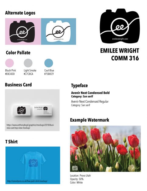
Branding is a way to market yourself or your business. This includes logos, colors, font styles, etc. For myself, I wanted to incorporate a camera that incorporated a unique part of my name. Since I spell my name with two e’s instead of a y, I wanted to name my business “ee photography” which is different and also rhymes. So, with those two requirements I started brainstorming ideas on Pinterest and creating a few sketches of what I could do for my own photography branding.
I really liked how some individuals would use their initials in a cursive font with a circle around it. I made a few variations and decided to make the circle like the lens of a camera and have my two ee’s be at the center.
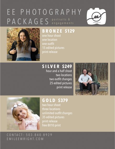
Another part of photography branding is making a pricing sheet of the services you offer. I learned that it is important to include numbers that end in 99 rather than rounding up to the nearest whole number. This makes people think that they are getting a lower price when in reality it’s not that big of a difference. It’s also good to have at least three different options so that way people also can convince themselves to spend a certain amount if there are one or two options that are higher in price.
I hope a few of those tips helped you in the process of discovering your own photography brand and what you can do to make yourself unique from the rest. Check out this website for some other great photography branding ideas!
Make an ordinary photograph extraordinary
Ordinary Spot, Extraordinary Shot
OSES is another acronym that stands for Ordinary Spot, Extraordinary Shot. This means that you can take a photograph in any ordinary spot and find a new perspective in order to create an extraordinary shot. So here are a few steps of how to make an ordinary photograph extraordinary:
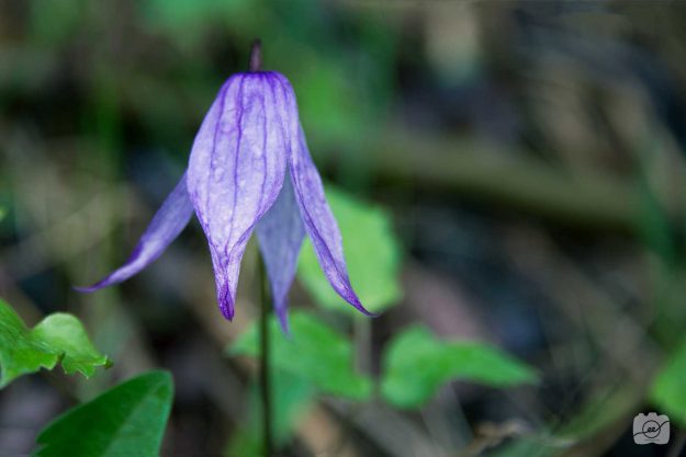
Go outside and explore! It’s important to walk around and be inspired by what is around you. Try getting really close to objects or looking at it from a different perspective.
Ordinary Spot
Extraordinary Shot
Minimize distractions. I think in order to have an extraordinary shot, it’s important to minimize the distractions that may take away the focus from your photograph. Try to really think about your composition and all the things you are capturing in your frame. If there are distracting elements, you can always work in post-production to darken part of the image or clone stamp elements out of the image.
Ordinary Spot
Extraordinary Shot
At times, it may seem difficult to produce an extraordinary shot, but if you follow these two steps of how to make an ordinary photograph extraordinary I know you will find a new way to look at the world around you. Go out and create something extraordinary! Check out https://www.digitalphotomentor.com/make-the-ordinary-look-extraordinary-photography-challenge/ to participate in a challenge of how to make an ordinary photograph extraordinary.
Invisible Black Background
Studio Quality Invisible Black Background
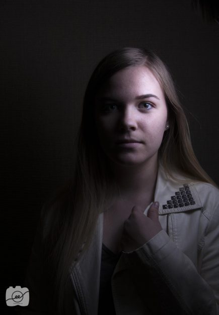
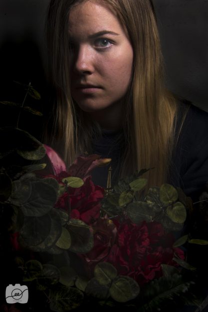
SQIBB is an acronym that stands for Studio Quality Invisible Black Background. It is this really cool technique where you change your camera settings in order to create an invisible black background in whatever lighting you are in! Who needs to lug around big pieces of background fabrics anymore?
The key to make an invisible black background is to make a triangle of subject, auxiliary light, and camera. Once you have a good setup change your settings to ISO 100; 1/250; and the f/stop depends on if you are inside or outside. You want to let in the least amount of light, so if you are outside use f/22 and if you are inside use f/5.8-8. Try to get the auxiliary light as close to their face as you can in order to create a softer light on their face. It may take a few tweaks in the settings to adequately create the invisible black background and find the sweet spot for your lighting situation.
I worked with my friend Kaley for a few of these shots. I wanted to add a colored scarf in order to add more contrast and interest to the photo. We were just standing in a classroom hallway.
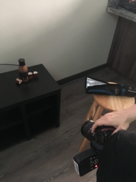
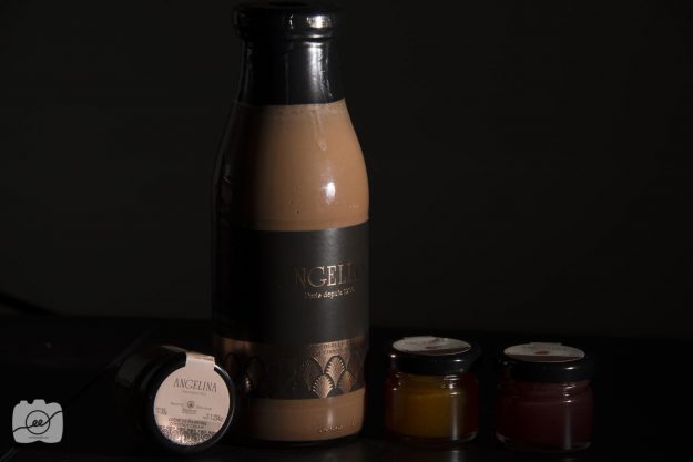
I also did some product photography shots and just set up a little table for the product and stool for the speed light. It was difficult to get the entire logo of the hot chocolate, but I think it created an interesting way to showcase the product.
Set up
Go out and try your own set up to create the invisible black background! Check out https://petapixel.com/2013/06/01/quick-and-easy-trick-for-adding-a-black-background-to-your-shots-anywhere/ to get some more examples of how you can incorporate the invisible black background.
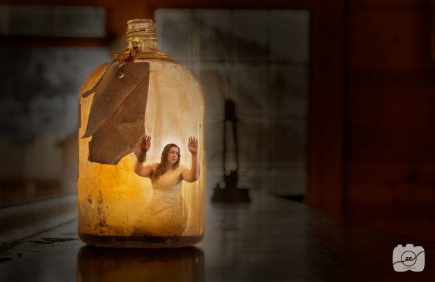
How to Photoshop someone into a bottle
Using Photoshop to put someone into a bottle and scanography ideas
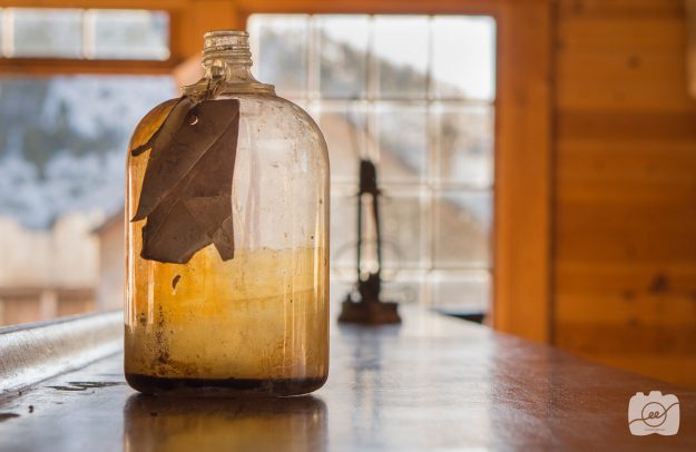
Photoshop has such amazing capabilities especially with creative composites. I took this picture of a jar wanting to later blend someone inside of it.
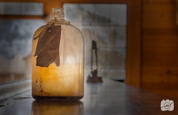
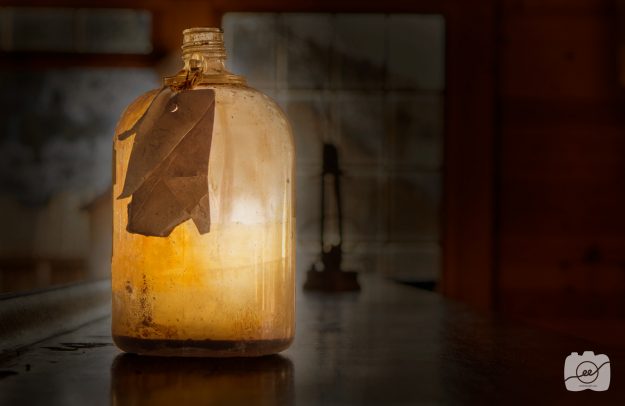
To make sure that I would have the focus solely on the jar, I took some time to burn the area surrounding the jar with the brush tool as well as clone stamping out a few distracting elements in the jar.
After that, I added adjustment layers changing the levels and color balance.
I had my roommate, Liz, kneel down on our living room floor with her hands up so it would look like she’s resting her hands on the inside of the bottle. I brought the photo of her into Photoshop and masked out the background so it was just her body. I then brought that image into my document with the jar and clicked the multiply blending mode. That made it appear as if she was inside the bottle.
So, there you have it: how to Photoshop someone into a bottle. Look for different objects in your own home and try these techniques to Photoshop someone into a bottle! Check out http://inobscuro.com/tutorials/photo-manipulation-tutorial-how-to-make-a-fairy-in-a-bottle-37/ to see another example of how to Photoshop someone into a bottle.
Scanography is another creative concept that is fun to try. Gather different objects and scan them onto your computer. After making different scans you can try different blending modes and try different adjustments to get your desired effect. In the image below I used a journal, fairy lights, and my hand.
Fine art flower photography
How to print fine art flower photography
Your photography will truly come to life when you see it printed! I was able to participate in a gallery showing of fine art photography work of university students from BYU-Idaho in the Spori building.
I chose to do a fine art flower photography piece of a simple purple flower I found on our photography excursion at Sky Mountain Lodge in Victor, Idaho. I love the simplicity of flowers and the beautiful bokeh blur you can produce by using a shallow depth of field.
The original photo
Here are a few edits I made in Photoshop. I rotated the picture to the right in order to have the stem to be more vertical. I also went into the selective color adjustment to really bring out the purple color of the petals and change the muddy brown color of the background to more cool blues and greens. Finally, I sharpened and brightened the image so it would print nicely. It’s always important to overcompensate because everything in print will be darker than you imagine.
The edited photo
I went to a local print and copy business and printed a 16X24 glossy print mounted on foam core. My fine art flower photography print will be framed and displayed in the Spori gallery from June 21st to early July. Check out this website to learn more about Fine Art flower photography.
