B L O G
Post production techniques in Photoshop
Learn new techniques in Photoshop with these tips
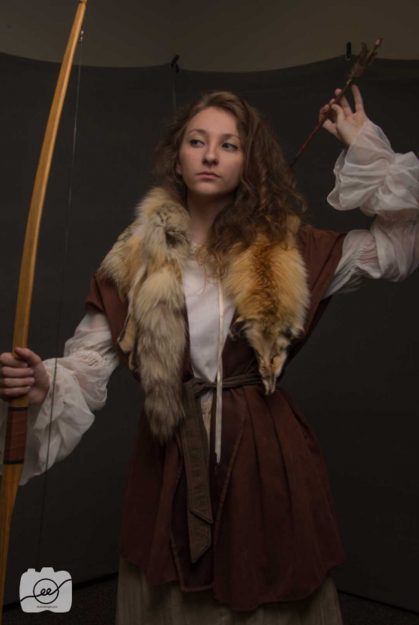
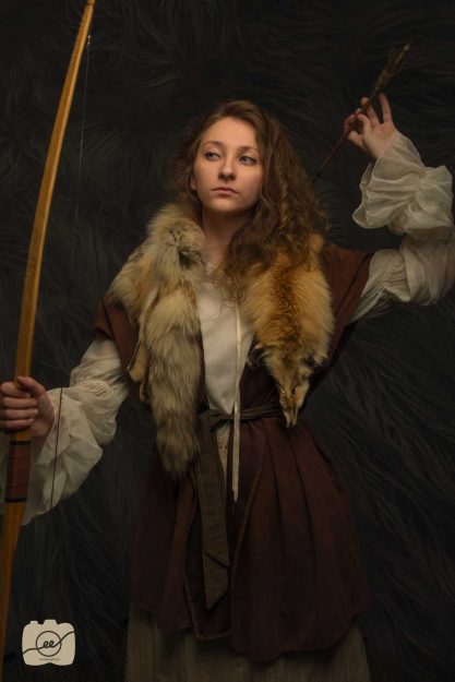
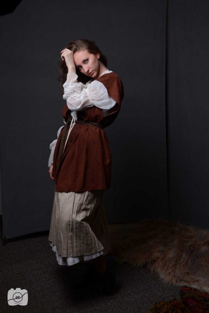
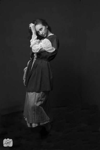
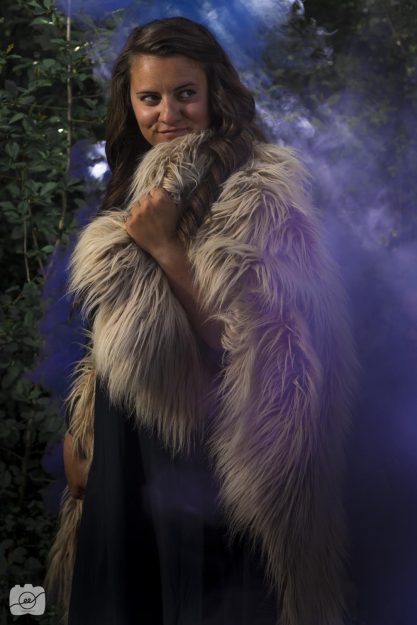
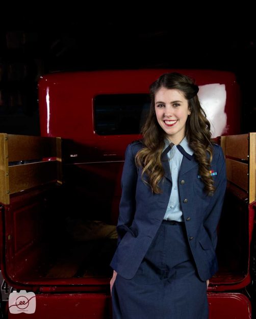
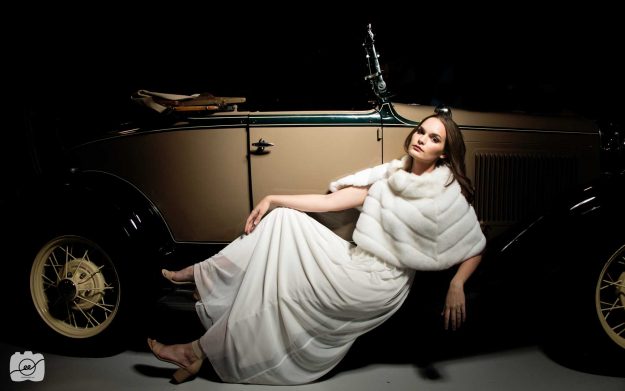
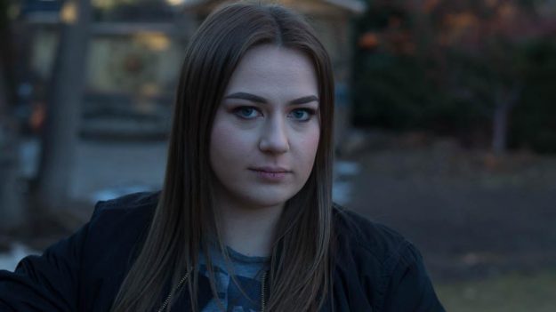
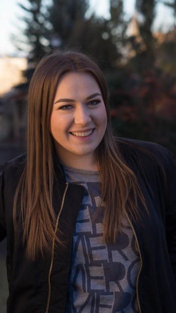
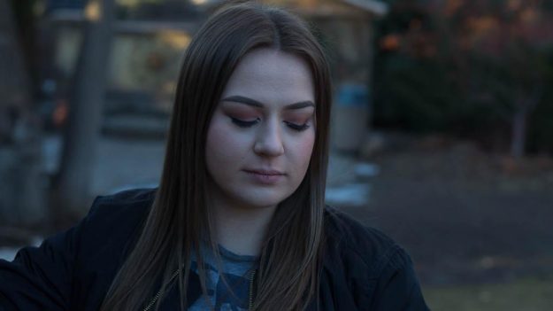
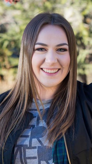
The lovely Elena was our Maid Marian model for this fun photo shoot. I learned a ton of new post production techniques in Photoshop and I’m excited to share them with you! Post production is at times a bit daunting, but these few techniques in Photoshop will be sure to add something special to your photos and they don’t take too much time!
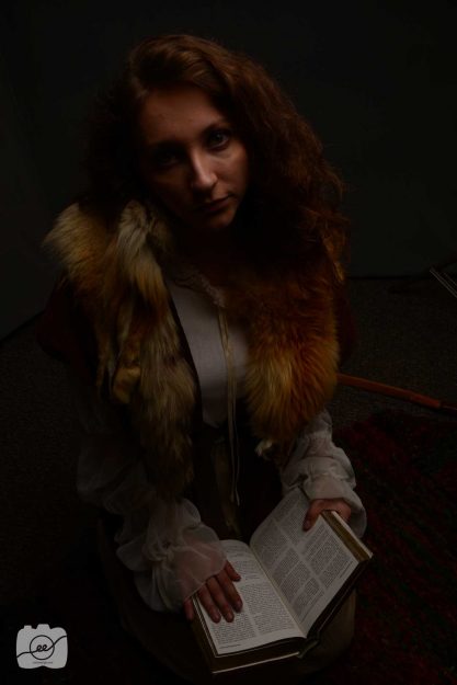
Before
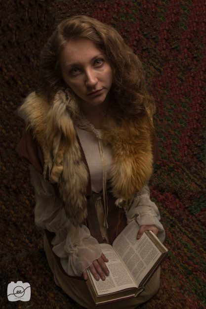
After
Techniques
Add Texture
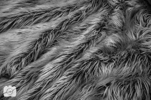
I took a picture of this beautiful fur wrap as the texture for my background. It was important to take the original picture with Elena on a dark background to make it easier in post production to blend the texture on to the photo. After uploading the texture, I made some extreme edits like adding a ton of clarity and contrast in order to really bring out the different colors and textures. After getting the desired look, I dragged the image over to my document with Maid Marian. I then used the soft light blending mode and lowered the opacity and fill about halfway since I wanted it to be very subtle in the background. I then masked out the areas on her skin and parts of her clothing.
Color Look Up Table (LUT)
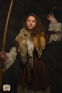
This post production technique is my favorite! Photoshop is amazing. I had my image and it was looking cool but it was needing some good color and overall blending. I created a new layer and went to the adjustment panel and clicked on color look up. I used three different effects to add warmth (Edgy Amber), a bit of green (Tension Green), and some fog (Foggy Night). I then lowered the opacity on each effect to my desired taste. Look at the before and after images below to see the difference in warmth and overall blending. It’s very subtle but makes a big difference in my eyes!
Eyes
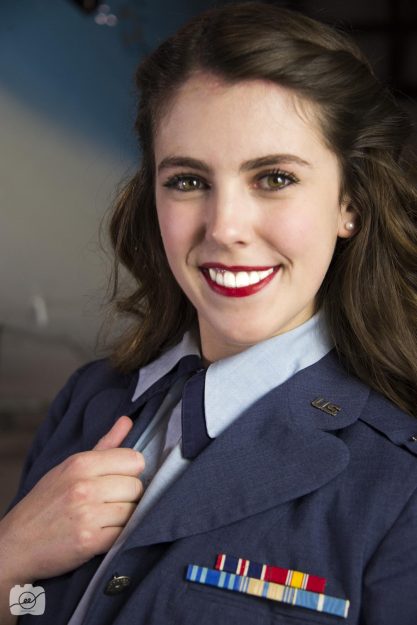
Finally, this post production technique in Photoshop focuses on making the eyes pop. By using the quick mask tool (found under the foreground/background color boxes) I was able to select the iris area and utilize the selective color adjustment to make her eyes pop. I used the screen blending mode to get a lighter color and then used the selective color adjustment to change the color value.
Additional Before and After Examples
I did general editing of raising the shadows and blacks and then I followed some of the above post production techniques in Photoshop to make the images come to life. I hope you have fun trying out these new tips and will take your photography to the next level as you follow these post production techniques in Photoshop! Check out https://www.creativebloq.com/10-photoshop-post-production-tips-8134073 to see some other awesome post production techniques in Photoshop.
Headshot Portraits
Creating the perfect set up for headshot portraits
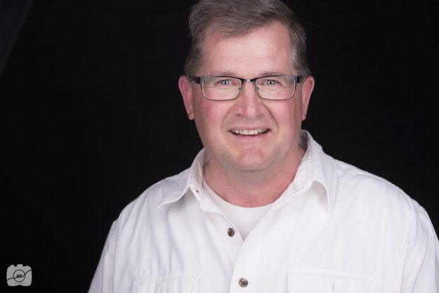
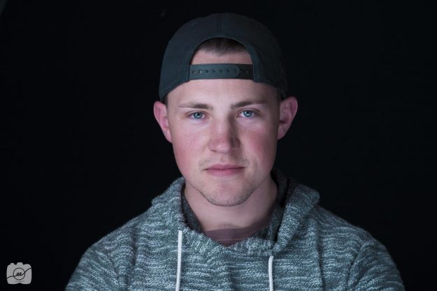
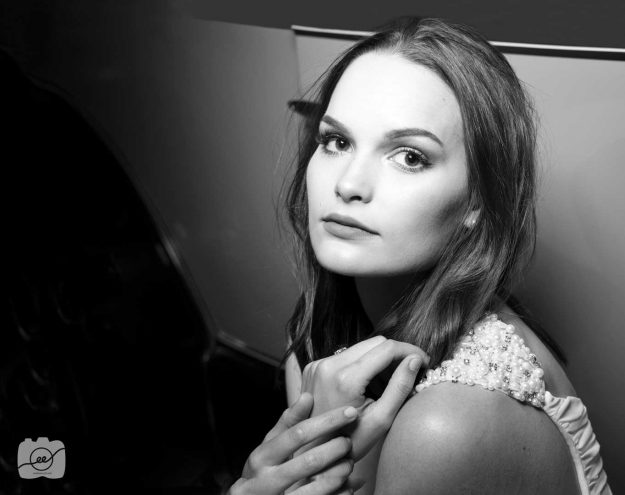
There are so many different types of lighting that you can experiment with when taking headshot portraits. There is split lighting where you have the light source at a 90 degree angle, Rembrandt lighting is when the light is at a 45 degree angle creating a dramatic shadow, loop lighting is when the light is at a 25 degree angle opening the shadow, and butterfly lighting is when the light comes from directly in front of the subject creating a professional look. The following three headshot portraits are a primarily a butterfly lighting look where the whole face is lit nicely with very little shadow. We created this look by placing 3 lights in a triangular shape. If you look closely at their pupils you can see the reflection of the light set up.
A tip for set up when doing head shots is to have them pull their forehead towards you. When they do this it lifts the neck and prevents double chins. It also tricks the model into being more engaged in the photo since they are not standing normally and will provide a more active look into the camera. Check out http://www.mikemcgeephotography.com/beauty-photographer-san-francisco-bay-area/ for some more great examples of headshot portraits
Epic Lighting
See how epic lighting can transform your portraits
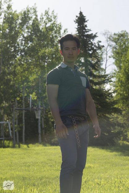
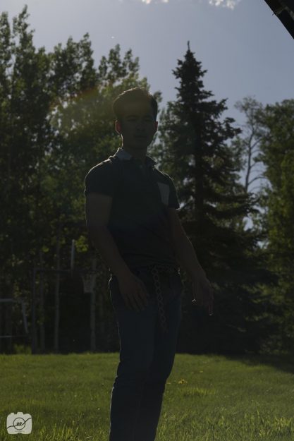
I never realized how you can work with auxiliary light outside. I always pictured them indoors, but they can do awesome things in creating epic lighting for your portraits! You have to mess with your settings a little bit more in order to capture a well exposed background and then utilizing the speed light to adequately light your subject. It’s cool to see the details in the background rather than just blowing out the background by shooting purely with the natural lighting.
Natural light settings (1/200; f/7.1; ISO 100)
Under expose for the sky settings (1/800; f/8; ISO 100)
Epic Light settings same as #2 but using a speed light balance the light on subject and background. Cool, right?
Check out http://brockalli.com/epic-portrait-lightning/ to see another example of how to capture an epic lighting portrait!
Themed Portraits
Smoke, gels, and a cowboy to style themed portraits
Forest Smoke Bomb
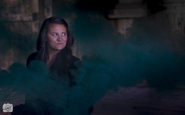
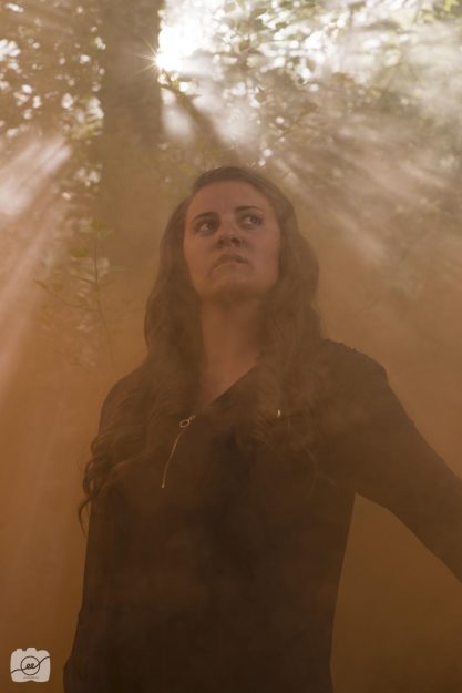
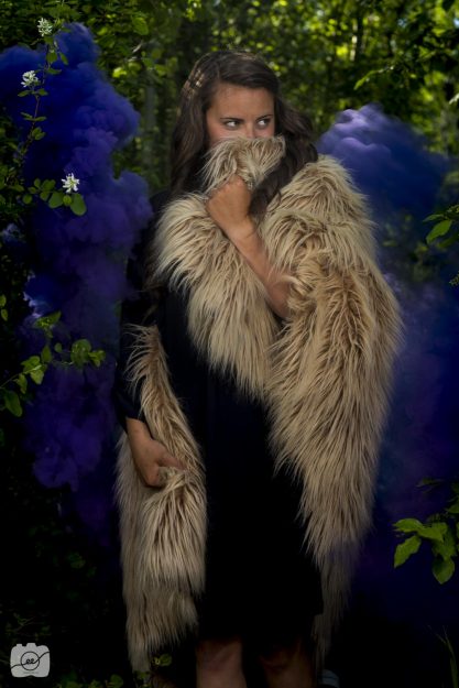
Smoke is awesome! It was fun experimenting with different colors both inside and outside. With each smoke bomb you have about a minute to get the smoke trails and then a following minute to get the lingering color that mixes everywhere. The sun flares are also a cool effect shooting through the smoke. It’s really fun in post editing to manipulate the smoke color.
Cowboy
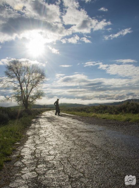
I love the interesting shapes that silhouettes create. I had our model dressed up as a cowboy walk down this rugged path and shot right into the sun. I had my settings at f/22 in order to get the whole landscape in focus. I added a bit more contrast and lowered the highlights in post.
Speed light with blue and red gels
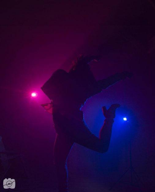
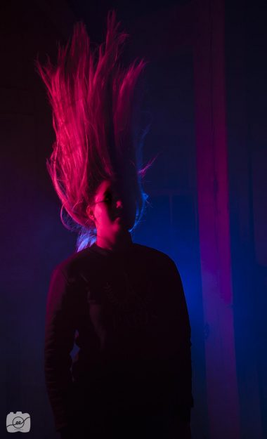
I love the concert vibe that comes with gels! I set up two speed lights with a blue and red gel over the top of the light. I had a 1/200 shutter speed with f/8 aperture at ISO 200 in order to capture these silhouette images. Check out http://www.channingrosedesign.com/special-effects-photography/ to see some more awesome shots with using gels on your speed light to create cool effects!
WWII Accessories
It’s all in the little details of accessories that remind you of WWII
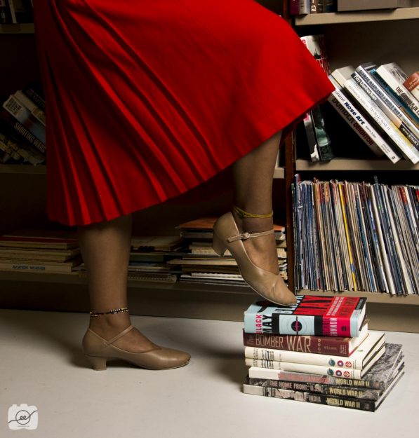
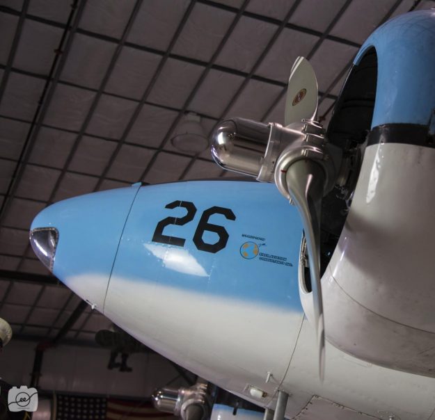
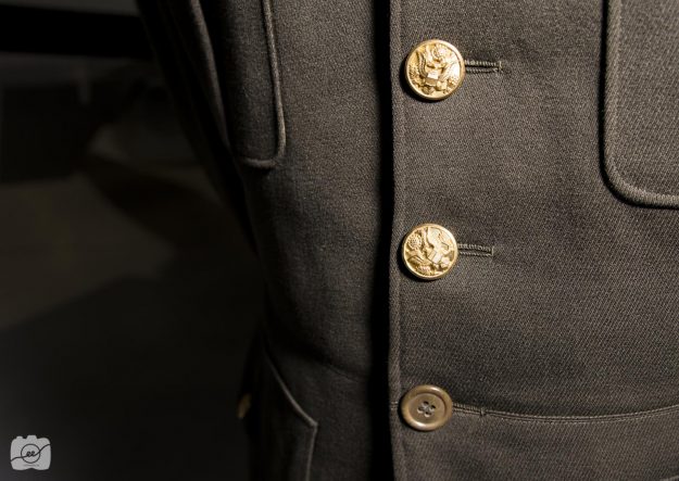
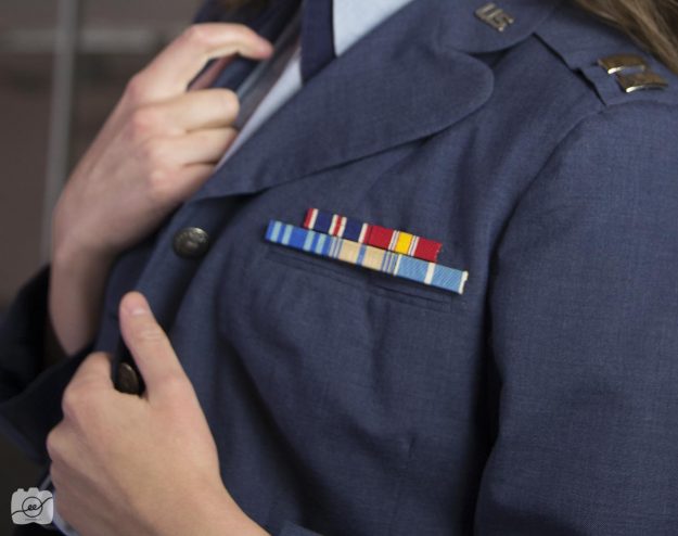
It was fun to go to the Legacy Flight Museum in Rexburg, Idaho to discover more about the history of war, the various types of planes, and the different types of uniforms that were worn. I came to see that the little details and accessories is what reminds us of WWII. I liked being able to get up close and personal to buttons, badges, shoes, as well as parts of the aircrafts. The details in the buttons and emblems are so symbolic to each branch of the military.
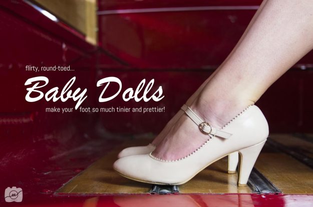
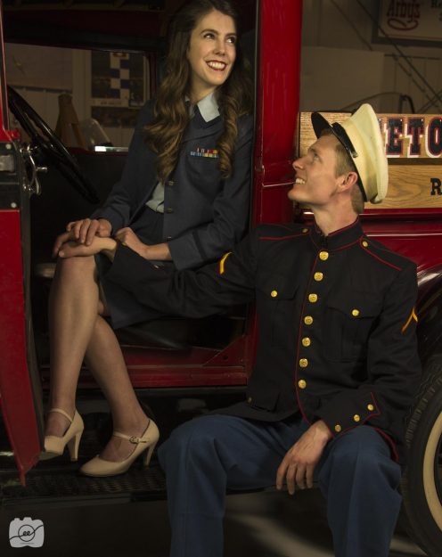
I love shoes from the 1940’s. When looking up the various types of shoes and the advertisements that went a long with them, I found Baby Dolls. It was popular to the time to have dainty little feet. The Baby Dolls focused on rounding out your toes so it makes your feet to appear even smaller. Luckily, we had a model who was wearing some classic Baby Doll shoes so I was able to create my own advertisement focusing on this beautiful accessory.
Check out http://www.haleighklewis.com/wwii-photoshoot-womens-fashion/ to see some other great examples of accessories used in WWII themed women attire. Remember that it’s all in the little details!
WWII themed couple photography shoot
Couples come together for a WWII themed fashion shoot
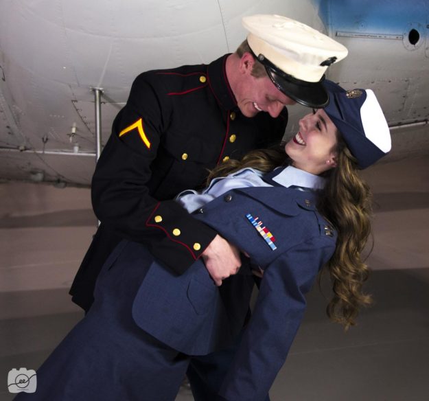
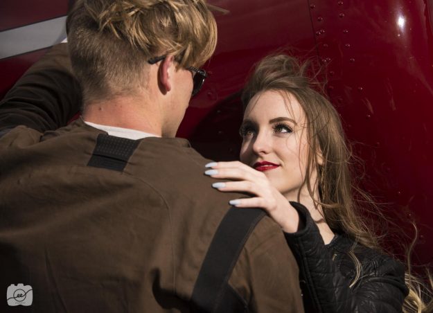
Who doesn’t love a good love story from the war times? Even though war was such a sad and terrible time, it was the relationships that made everything worth it. The courageous soldiers fought to protect their families and homes. This WWII fashion themed photo shoot included men and women in their individual shoots, as well as bringing them together to showcase the many wonderful relationships found in every day life.
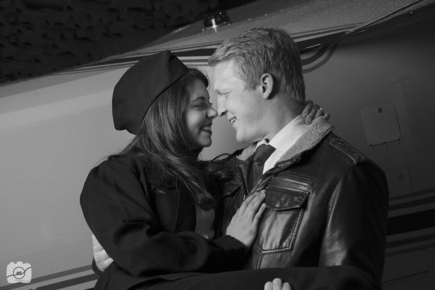
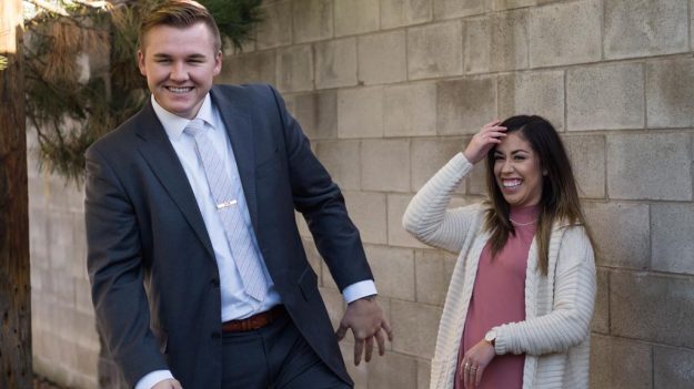
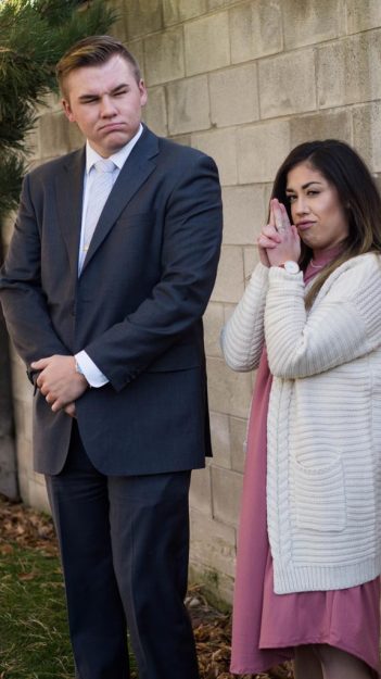
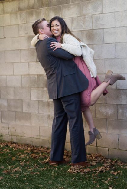
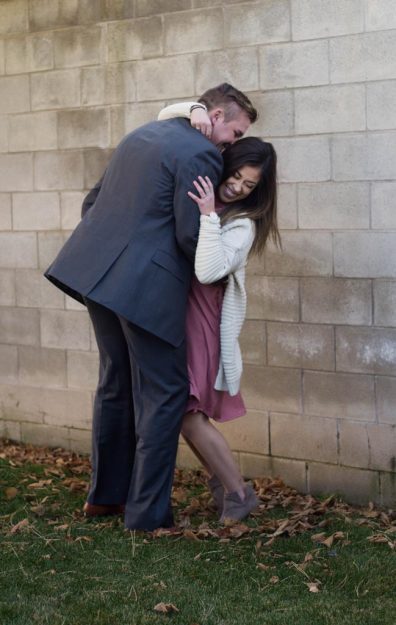
I love capturing the fun moments that aren’t completely staged. This first photo was one of my favorites because the male model was having time leaning the women back and looking lovingly into her eyes since they *spoiler* aren’t really a couple. I know, so sad. After a few tries they just started laughing together and this is what I captured of that awkward but fun moment. Look for those opportunities to create interest and hopefully showcase a story to viewers.
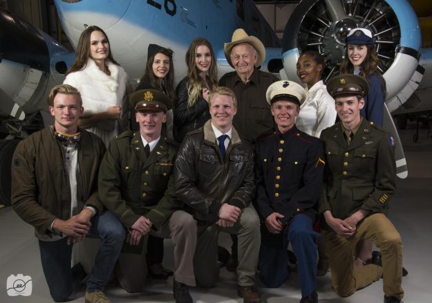
It’s also fun to make some of the photos black and white. It brings back the mood of that time period and helps to focus on the main subject of the group portrait rather than be distracted by the various colors. Bring your friends together and create a fun WWII themed fashion shoot to showcase a time in American history. Also, check out http://www.sarahwakefield.com/wwii-womens-fashion/ to see some more fun ideas to do a WWII fashion shoot!
Women Fashion Portraits from WWII
Capturing portraits of women in WWII attire
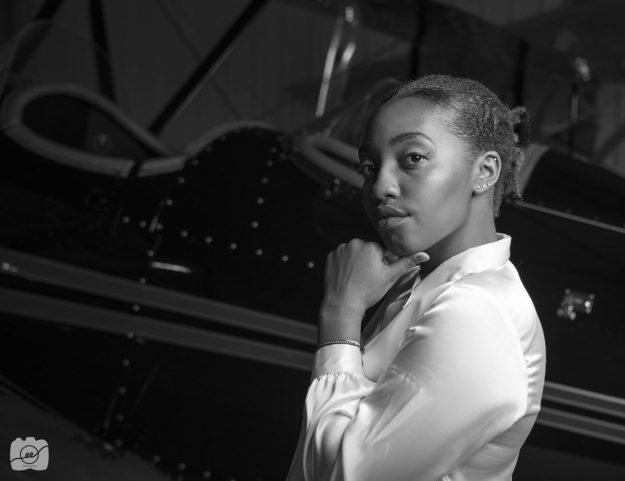
Step back men, WWII couldn’t have been won without the women too. It was a blast being able to spend time in the Legacy Flight Museum in Rexburg, Idaho learning more about the planes and other equipment used in previous wars, specifically WWII. As well as working with male models, we had the chance to include some key female characters as part of our fashion shoot.
Women and portraits go together like peanut butter and jelly. There is such beauty and elegance that can be captured in a women expression and smile. It was fun to capture a few women in WWII attire as well as some clothing from that time period. Study your model to determine her unique, beautiful characteristics and highlight those things in your portraits. For example one model has the most beautiful smile, so I had most of her shots with her smiling with her teeth rather than making a serious face. Another model had fantastic cheek bones, so I had her turn to the side so the light could highlight the beautiful curve on her face.
Go out and find a cool themed fashion shoot you can do where you are located! Check out http://www.haleighklewis.com/my-portfolio-winter-semester-2016/ to see some more WWII themed photoshoot ideas!
Men Fashion Portraits from WWII
Flashback to WWII portraits with men in their armed forces attire
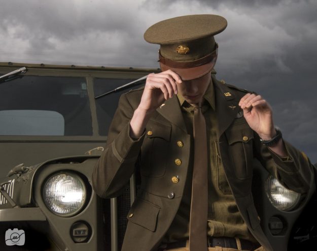
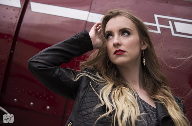
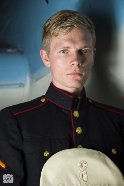
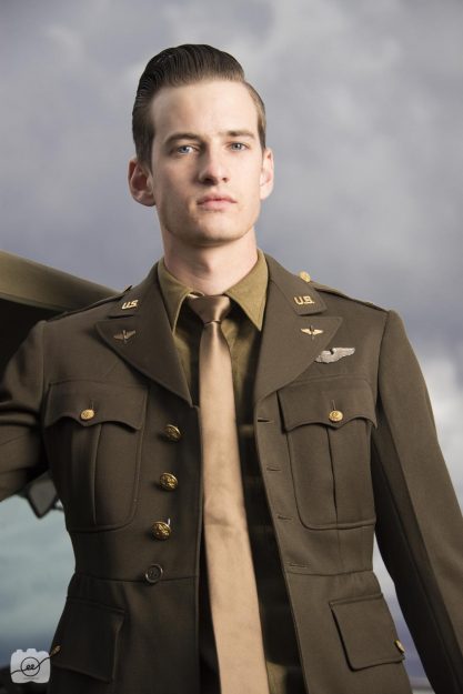
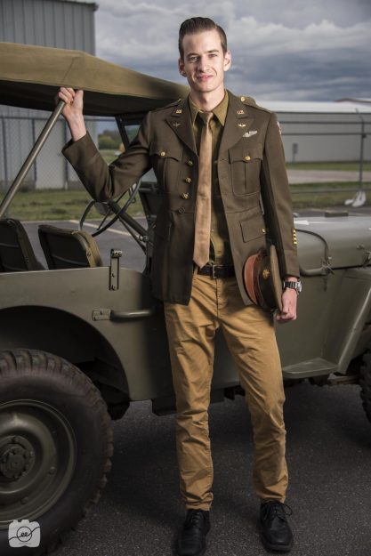
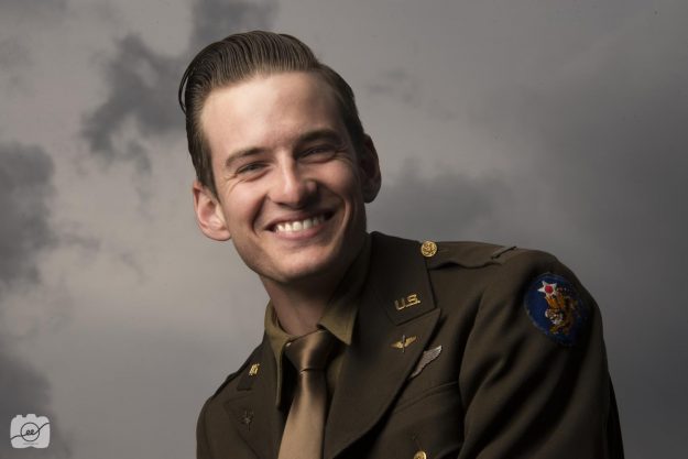
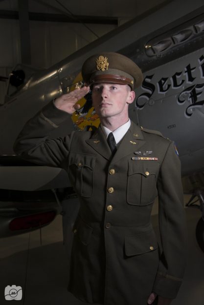
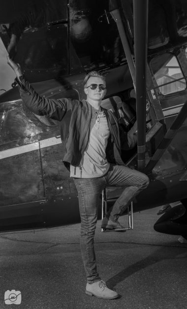
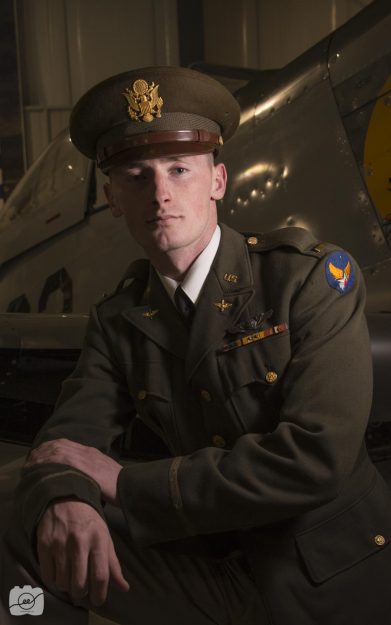
If a man in a uniform doesn’t give you butterflies in your stomach, I don’t know what will. I had the priviledge to go to the Legacy Flight Museum in Rexburg, Idaho to see airplanes and other war equipment from all the various sections of the armed forces. We had a fun fashion shoot with some awesome models who look like they stepped out of a history textbook.
One thing I love about male portraiture is their defined facial features. It’s nice to get a shot from the side or to have the model turn his head to either side so you can get a defined jaw line. Utilizing some great auxiliary light created some cool shadows that highlights their face and creates more interest for the viewer. It’s always good to have them interacting with something. Holding their hat, lifting their arms up to touch something, or giving a salute helps to define their manly features.
Check out https://www.emilykayp.com/stunning-women-in-vintage/ to see some women in attire from this same time period!
Close up nature shots
Nature shots from Sky Mountain Lodge
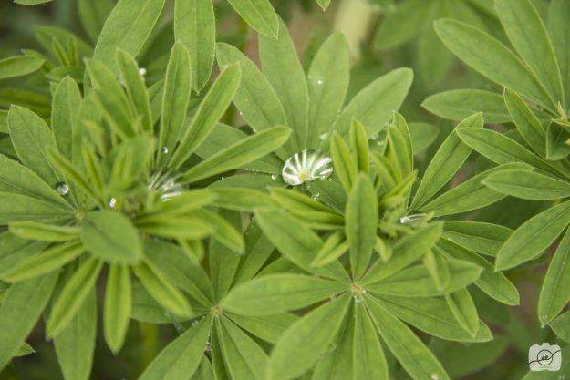
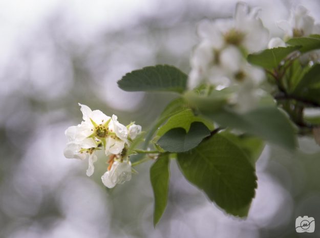
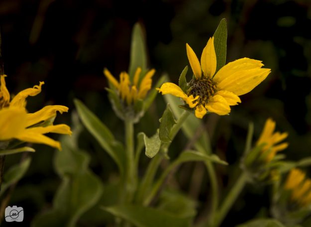
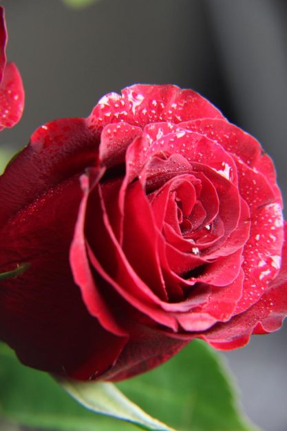
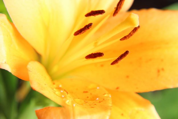
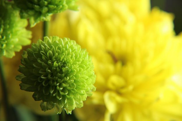
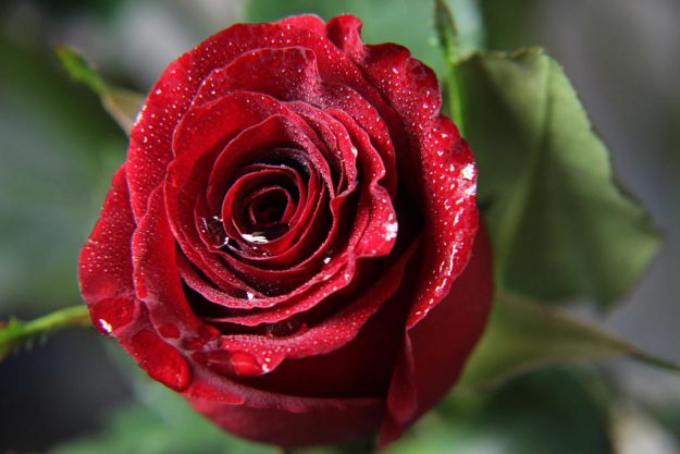
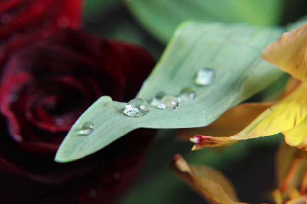
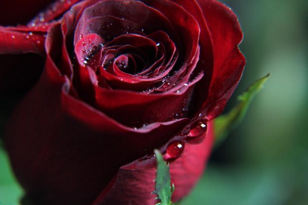
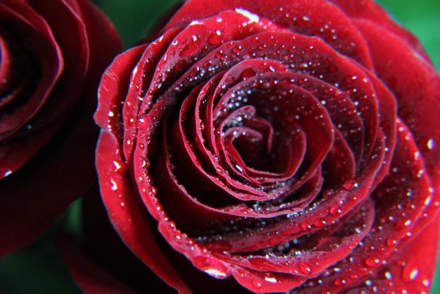
On the same excursion to the Tetons, we stayed at the Sky Mountain Lodge in Victor, Idaho. On an outdoor adventure I captured these up close and personal shots of some beautiful parts of nature. It had just rained so there were so many water droplets on all of the plants so that’s what I focused on.
One of my favorite ways to get a nice bokeh blur is to have a 50mm prime lens. If you don’t have that, don’t worry! You can get a similar effect with your own zoom lens! If you zoom all the way out and get fairly close to the subject there will be enough lens compression to create a blurry background. I love to blur the background when I have a subject that wants to be in the spotlight.
Go out and get close up to find a new perspective. Look for interesting colors and how you can showcase the unique qualities of everything in nature. Check out https://www.outdoorphotographer.com/tips-techniques/photo-tip-of-week/10-quick-tips-for-better-close-ups/ to see some more tips of what you can do with macro lenses or filters!
The Grand Teton Landscapes
Landscape, nature, and wildlife images from the Tetons
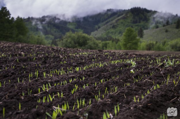
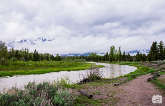
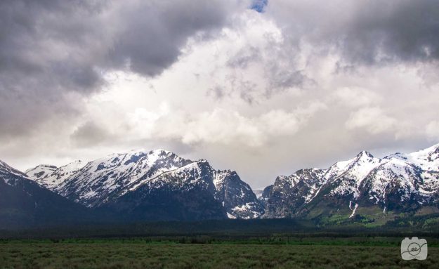
I was able to go on the most amazing trip with a class of photographers to see some Grand Teton Landscapes during the spring. The lush green forests were so inviting. Although there was a lot of cloud coverage, hiding The Grand, I was able to capture a few beautiful moments.
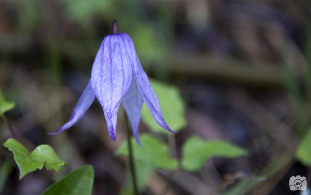
The nature is breathtaking with beautiful little flowers and trees that surround you. In order to get this shot with a nice bokeh blur, my camera settings were 1/125 shutter speed, f/5.6 ISO 100. I had a zoom lens so I zoomed all the way out in order to have more lens compression to increase the blur.
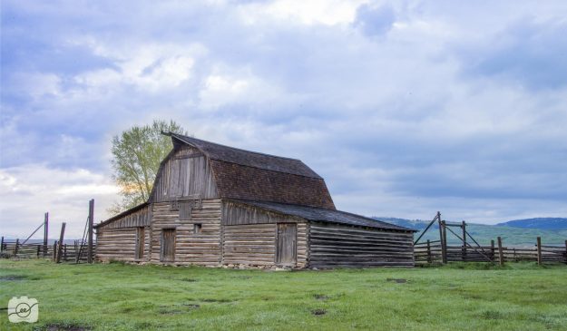
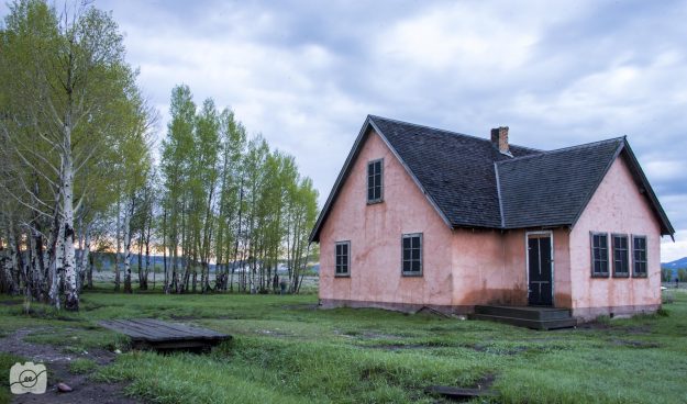
We also went to Mormon Row which has quite a few beautiful old barns and houses. The following barn and pink house were taken on the same street. I love the beautiful light pink color and how the sunrise warmed the picture. I used a tripod for the two pictures in order to have a slower shutter speed to let in more light since they were taken when the sun wasn’t quite up. Check out http://www.carynesplin.com/grand-tetons-mormon-row-barn-featured/ to see some more amazing shots of the Mormon Row Barn.
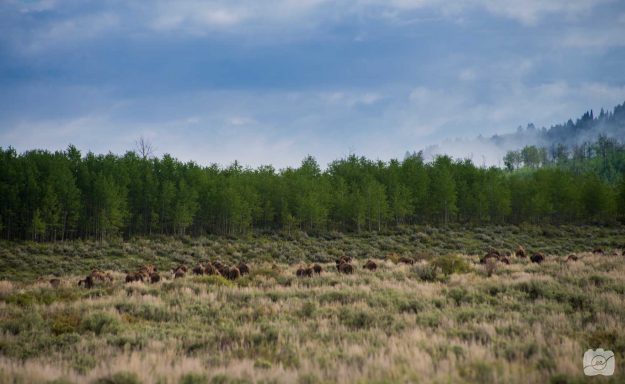
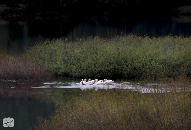
It’s also a fun adventure being able to see wildlife in the park and surrounding areas. We found a whole herd of buffalo making their way into the forrest. It was fun to watch them run and gather together as a family. We also saw a group of birds in a nearby lake. If you haven’t made your way out to The Grand Teton National Park, I would highly recommend it. There is so much to see and appreciate in the world around us.
How to take a golden hour landscape image
The power of photo merge to get a well exposed landscape image
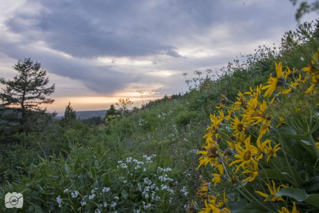
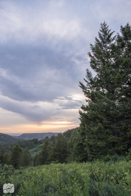
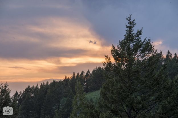
The struggle is real when you want to get both the foreground and background well exposed when capturing a beautiful landscape picture. Adobe Lightroom has the powerful ability to merge three images of different exposures into one image! I took the following image at 9pm at Kelly Canyon in Ririe, Idaho with my sweet friend Kaley. Check out the images she captured at http://www.kaleymichellephotography.com/2018/06/08/golden-hour-landscapes-at-kellys-canyon/.
Let’s get into the details of how I got the landscape picture to be well exposed during golden hour!
First, my settings were 1/500 shutter speed, f/8 aperture, at ISO 800. Next, I set my camera settings to bracketing which means that it will take three sequential images of 3 different exposures. One that is over exposed to get detail in the foreground (grass and flowers), one that is the normal exposure (everything is shadowed), and finally one that is under exposed to get detail in the background (sky and sunset colors).
After getting the three different images, I opened them into Adobe Lightroom. After selecting all three, right-click on the image and click on Photo Merge – HDR. When the information box comes up make sure Auto Align and Auto Tone are checked. Then click low on deghosting which just means that if there is slight movement between the three pictures due to wind it will made sure it merges the similar things together. Once it loads, click on merge. It will take a bit of time, so feel free to grab a quick snack. 🙂 After the image loads you will get both the foreground and background well exposed during the beautiful golden hour.
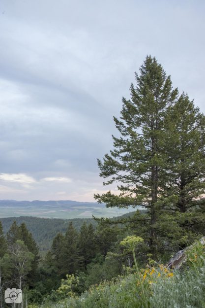
Here are a few more examples in the same location but with different angles. Have fun using photo merge to create a beautiful, well exposed, landscape image during golden hour! Check out http://www.carynesplin.com/fine-art-photography-contest/ to see some more amazing well exposed fine art images.
Long exposure indoor light painting
Turn the lights off and follow these indoor light painting tips
I love the quote from Dave Black when he said “if you want a picture to look interesting, only light part of it.” Such a profound thought. Light painting is a technique where you capture images in the dark and use a flash light as your light source to highlight certain parts on an image. The most important thing is to set your FOCUS! With the lights on, set your focus and lock it so when you turn the lights off it will still be focusing on your subject! Then, you want to have a long exposure to have time to light paint. I used a shutter speed of about 10-20 seconds. Depending on how much light you want to show up in the image is how long you shine your flashlight on the subject. It usually would take me a few tries to understand how to light the specific areas.
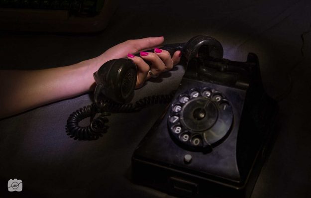
I wanted to create an eerie look with this first one. I love old telephones and stories with a good mystery. I love her pink lifeless fingernails and the questions it leaves the viewer of what was said over the phone.
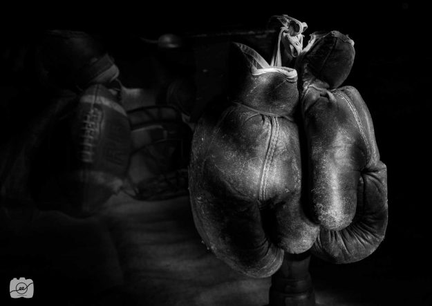
We had a lot of old antique sporting equipment that was fun to set up. I tried a new technique called faux bokeh! You take the picture like you normally would but in the middle of the open shutter you move your focus ring so it makes everything else you light up blurry. If you look closely you can see the boxing its in focus and the football equipment blurred out in the background.
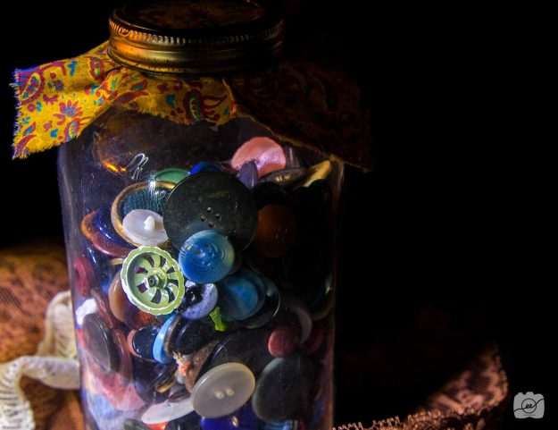
I love the vibrant buttons in this jar. It looks so mysterious with the black background but I think it really makes the colors and textures pop. I love the selective color effects in Photoshop. It really helped me to bring out the colors and get the warmth I wanted out of the light.
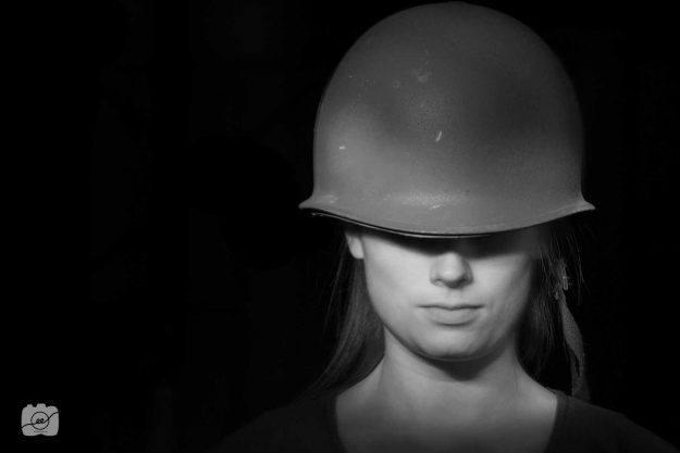
The tricky thing with doing light painting with people is that you can’t move! If you light their face at the beginning, start lighting the helmet, and go back to their face it can look blurry if the model has moved at all. To avoid blur, only light their face one time during the long exposure so that way if your model moves the camera won’t capture it.
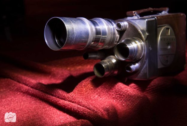
I love old cameras! They have such unique angles and gears. Along with the cool shape, the vibrant red sheet brought a lot of depth and warmth to this indoor light painting.
I hope you found these indoor light painting tips useful! There are so many interesting things to do with long exposure elements. Turn the lights off and have fun lighting part of your subject to make it more interesting! Check out Dave Black’s website to see more tips on how to work with light painting and long exposures! http://www.daveblackphotography.com/creative-lighting-portfolio/
How to capture outdoor long exposure images
Ideas to capture light with a long exposure
Half orb
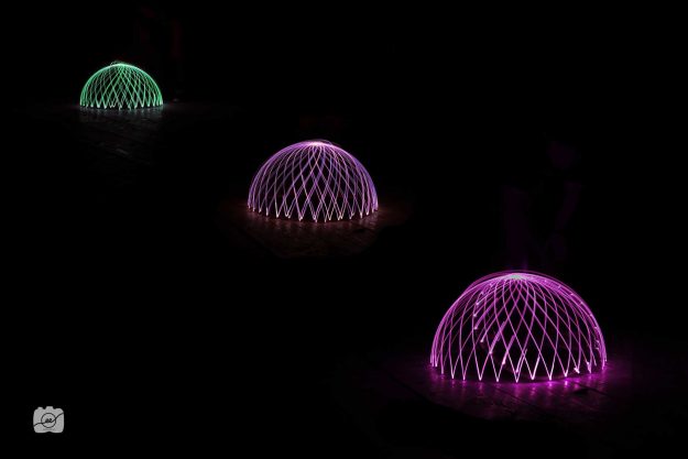
We had a bike wheel wrapped with lights and attached a peg so it could spin in a circle on the floor. We turned off all the lights in a barn outside and set our camera shutter speed to a long exposure of around 3 seconds in order to capture the full rotation so it creates this half orb look. This image is actually three separate images masked together in Photoshop with the orb placed on different parts of the floor while my camera was in the same spot on a tripod. I then changed the color of each orb to add some variation.
Light Sketching
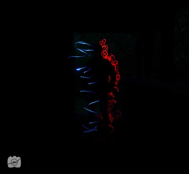
Such a fun idea that yields different results every time! We had our friend Garret stand outside in a dark alley and set our cameras on tripods and set the shutter speed for a long exposure of about 15 seconds to have time to sketch around the subject with flashlights. We put different colors of paper placed over the flash light to create the red and blue. In post production, I masked out any extra light from outside and made the background black so you can see his silhouette.
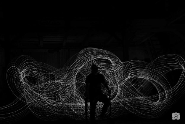
This second light sketch was done with the bike wheel used in the half orb photo. We had our subject sit down and someone else ran around behind him with the glowing wheel to create all the light trails because of the 30 second long exposure. In post, I changed everything to black and white because I love the stark contrast.
Environmental
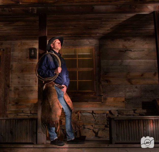
It’s amazing what light can do when you have a long exposure. We were outside a cabin in complete darkness. We had our model stand still for about a 10 second long exposure and used a flash light to light him and the cabin. In post, I darkened the entire photo and then masked out the darkness to create a direct focus on the cowboy.
Nightscape
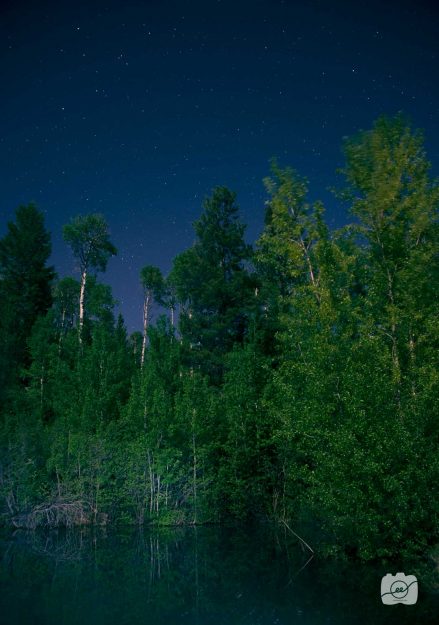
I love astrophotography! Such a fun thing to capture and there are so many different ideas of how to make your image different. So how to do it in the dark? I used a flash light to light the trees and pond in a 20 second exposure in order to get some color in the trees and reflection in the pond. It’s also fun to mess with the white balance to get different moods. I used auto white balance but tried a few with tungsten and go a cool blue hue.
Have fun with these ideas of how to capture light! If you want some other great ideas of how to capture outdoor long exposure images check out Caryn Esplin’s website: http://www.carynesplin.com/night/
Choosing the Happy Life
Taylor Wiles Feature
The trials of life can make or break a person. The attitude one chooses to cultivate can determine the result of the lesson learned. For Taylor Wiles, her trials have become pivotal steps up the mountainous climb of life. Her childhood and school years were full of trying new things. Growing up in a small town, of 250 people, in Burlington, Wyoming gave her many opportunities to be involved in everything. This helped her develop many friendships and talents. She strove for perfection and never wanted to do anything wrong. She graduated top of her class, was involved in clubs, music, arts, and was successful in many sports. She was ready to take on anything life could throw at her.
At age 19, she prepared to serve an 18-month mission for The Church of Jesus Christ of Latter-day Saints in El Salvador. What started out as a picturesque adventure turned into one of the most difficult experiences she had ever faced. Being immersed in a new culture, learning the Spanish language, and adjusting to missionary life wasn’t easy. It was nothing like she had planned. After months of working hard and struggling with difficult challenges she developed a sickness that led to her returning home to receive medical attention. Everything fell apart and she realized what an imperfect life she had.
After coming home, it was difficult finding the purpose behind her trial. She prayed to God to find the answer and promised that no matter what happened she would choose to be happy, if He would help her in return. After this sweet promise, God gave her opportunities to serve those who were struggling more than she was which gave her a greater perspective on the purpose of life. She had been given talents and abilities to work and serve. She could choose to sit and be sad or to be a blessing to those who needed her.
Taylor found that there was more to life than having a perfect image. She realized she was happier even when everything was going wrong. All we can do is be kind and understand that people are trying their best. Her favorite scripture is found in John 16:33. She loves the focus of how there is nothing that can keep us from the peace and happiness of life even amidst the hardest trials. A joyful life truly comes when we spend our time serving others. In her words, “Things don’t have to be perfect to be beautiful.”
“It gets better. No matter what is happening it will always get better. You just have to keep trusting.”
Push or Pull?
A Day at the Ropes Course
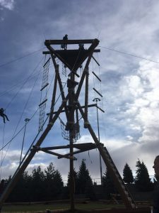
The cool wind blows quietly. Wet dew glistens as the rising sun shines brighter and brighter. The harnesses are tight and we are ready. The brown, wooden tower stands tall with ropes spread out for support. We gather as classmates to accomplish a task together —to lift. To raise one who can’t yet raise herself. Individually, we must decide to push or pull.
Each day we are faced with pushing or pulling situations. Will we push others away when things get too hard? Will we push them down if their talents seem better than our own? Will we push them away if they think, speak, or act differently than we do? Or, will we decide to pull up those who have fallen? Will we pull others to share what makes them unique? Will we pull others to reach for their dreams?
We stand in a line ready and willing, the wood chips crunching beneath our feet. She has chosen to put her life in our hands. We watch and listen for the signal. The wet, black rope rubs against our cool skin as we pull for Emma. Our fingers squeeze the rope tightly as we find the right momentum. We cheer her name as she is lifted higher. The feeling is electric.
As we choose to be pulling agents in life, our attitude and perspective will change. We will find renewed strength and a greater love for those we serve. As a proverb states, “Thee lift me, and I’ll lift thee, and we’ll ascend together.” At times, we may not see the immediate benefit to serve another person, but as we continue to move forward each day, to pull others, we too will ascend. We too will feel an excitement for growth and improvement as we help others achieve their goals.
She reaches the top with a tired smile. She stands and raises her hands joyfully in the air. She conquered a fear. The emotions are sweet as we look up to her. She made it to the top, just as we made it to the top even when our feet still touch the ground. Today we will walk away not just as classmates, but as friends who seek to lift one another.
Push. Pull. Push. Pull. These two actions determine how we choose to interact with other people. The decisions we make determine who we are and what we will become. We must seek to pull even when pushing would be the easier way out. We may feel weak, but the pull will always be worth it.
Push or pull, which one will you choose?
Tough Love Feature
Kye Ferguson Feature
The wind howls as snow falls from the gloomy sky. Brief flashes of light shine in a 15 year-old boys face as cars pass him by on the lonely road. His task is to haul one ton bags, full of horse feed, onto the fork lift his boss is driving and get everything in the barn before the night is over.
His teeth quietly chatter as he waits for the lift to return. He wears two sweatshirts, jeans, work boots, and leather work gloves as he huddles around the bags for any ounce of extra warmth. After 3 hours, the job is finally over and they walk inside. A sinewy man laughs as he looks back at the boy seeing his visible pain from the cold. “Don’t you feel like you should be paying me for these experiences?”
The 9 months Kye Ferguson spent working under, Kevin Mclaws, at Zion Mountain Ranch forever shaped his perspective on life.
“I was so mad at him,” Ferguson said, “but that moment, in the snow, reminds me that if I can do that, I can do anything. I want to pay him back for those experiences because from that moment I decided to take on any opportunity.”
Ferguson started out working at the ranch as a shy and cautious kid, unsure of how to develop his talents and abilities.
“The only reason people choose not to do things is because of the temporary pain,” Ferguson said. “Kevin taught me to accept the pain because he knew I would have to go through it eventually. I found a new world of things I always wanted to do and essentially happiness for myself.”
Kevin Mclaws has worked at Zion Mountain Ranch for over 20 years as a successful businessman and takes on any opportunity to help boys become men.
“My role is to be a mean, abusive, and stern boss that also has a love and compassion for the welfare of their souls,” Mclaws said. “I made sure he knew what was what, up from down, and to take no crap.”
Rhonda and Brad Ferguson were left empty nesters as they came to see their son developing new qualities as he worked at the ranch.
“He loves to figure out how to make things work,” Rhonda said. “Kevin helped him develop independence and confidence by leaving the job up to him. He was also instrumental in setting goals to get him on a mission.”
Before serving missions, longtime friends, Pryce Seely and Ferguson worked together at the ranch for many months.
“One time, Kevin put me on a tractor and asked me if I knew how to drive it,” Seely said. “I told him I didn’t and he said ‘Okay, see you later.’ I learned how to drive a tractor in 10 minutes. He was big into letting us learn how to do things on our own.”
Mclaws’ tough love and unique life lessons gave equal opportunity for growth to all workers.
“The ranch affected us all in different ways,” Ferguson said. “Others chose to walk away and miss a great opportunity to learn from him. They came and went without having the stamp of “Kevin’s training” and now they are having a harder time learning those experiences on their own.”
Mclaws was unsure of his impact on with the workers because he knew he wasn’t the most popular guy around the ranch.
“You expect them to get a little upset with you, but some kids never get over that and they become childish men,” Mclaws said. “Others, like Kye, get over it as they start to see how those experiences were beneficial and make you mature. That crap sticks with you. No matter what he does going forward he’ll have a hardwired spine that will assist his outcome whatever the challenge may be.”
Although Ferguson will never physically repay Mclaws for the things he experienced, he has learned that application is key to true growth personally and in sharing it with others.
“It is a constant fight,” Ferguson said. “I am constantly trying to teach myself the things Kevin taught me and keep reapplying them. I want to help my friends overcome their addictions through changing their state of mind. I can only lay it out there. They have to take a chance on what I’m saying and figure it out for themselves.”
Change is just around the corner for those willing to work hard and utilize every opportunity they are given. The simple lessons taught by Kevin Mclaws changed Kye Ferguson’s life. Here’s to ignoring the pain, taking no crap, learning to be independent, and appreciating tough love.
Picnic Feature
A Picnic for the ‘Hole’ Family
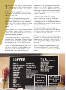
The warm, savory aroma of fresh bread, sweet pastries and homemade coffee fills the air as one walks into the café on a brisk morning. Ed Sheeran’s quiet singing fills the ambient space as friends and members of the community come together at Picnic Café.
Since Picnic’s grand opening two years ago, its popularity has spread just like a blanket for a picnic lunch outside with the family. Locals and tourists from all parts of the world visit Jackson, Wyoming, and Picnic Café is one of the newest places to explore.
“Picnic is the hub that all locals come to on the west side of Jackson,” Augusta said, a 10-year Jackson resident. She and her friend Kendra chat over some coffee before heading into work.
“Whenever I come to Picnic, I always run into someone I know,” Kendra said. “It has such a warm, inviting environment that draws people in and they keep coming back for the great food and coffee.”
Owners, Ali and Kevin Cohane, saw great success with French influenced Persephone Bakery, their first business on the east side of Jackson, and wanted to make a place especially for locals.
“Persephone was my initial baby and I did things exactly the way I wanted – whether or not it was popular,” Ali Cohane said. “Whereas Picnic, a place for everyone in Jackson, I listened to what people wanted and was able to give them that while not abandoning my basic principles of quality and service.”
The Jackson Hole Planet, a local newspaper, conducted a local’s choice survey of the best of Jackson in 2016. They focused on what people and businesses do to add to the community. Out of all the restaurants that opened, Picnic came out as Jackson’s best new restaurant.
“We were so happy,” Cohane said. “We worked really hard, and put a lot of care into developing this place so it was very gratifying.”
As head manager since Picnic’s opening, Connie Korhonen has seen Picnic develop and become part of Jackson’s thriving community.
“This last summer we had a significantly higher sales volume,” Korhonen said. “That tells us our marketing is doing well and we’re spreading by word of mouth as people come to town. Networks are recommending Picnic so we’re receiving a lot more of the tourist traffic even being off the town square. So that’s really exciting in even two years that we’re getting more business.”
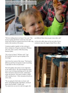
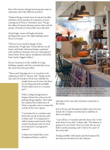
The Picnic atmosphere is warm and welcoming. Cool blues and grays coat the walls with splashes of pink and orange in the décor. Windows let in the natural sunlight with small glowing lights that line the ceiling. There is a variety of seating for the whole family with tables, couches and bar stools. Eric and his 3-year-old son, Xavier, come in to enjoy breakfast together.
“We love walking from our house,” Eric said. “The service is great and Xavier can be his crazy self.” Little Xavier lifts his croissant into the air with a big smile at the mention of his name.
Customers gather together in the open spaces of the inviting sit down eating area. Frequent customers, Whitney and Amy, enjoy a pastry while discussing business plans.
“It’s so close to home,” Whitney said. “I always get the breakfast burrito to get me going in the mornings.”
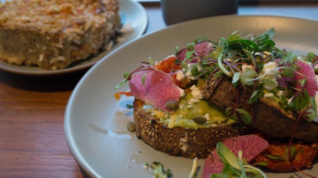
Amy loves the variety of the menu. “The bread is delicious and they incorporate it into everything. I especially love the avocado toast.”
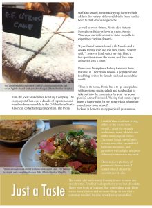
The food quality is very important to Picnic as it has a wide selection to choose from, as well as changing their menu up twice a year to bring something new to the table. They have hearty and sweet toasts, sandwiches, soups and desserts. The pastry window is filled with countless items – from cinnamon brioche to citrus cake.
Picnic has unique American recipes of their own that are created for a specific mood. Owners wanted it to feel more fun, casual and easy.
“We are going for fresh takes on classic café items, using high quality ingredients, and local items when possible,” Cohane said. “So, meals you can eat over and over again, but are different than what you get at any other café.”
As the only coffee shop on the west side of town, customers love the variety and custom organic blend Picnic has to offer as they work with locals at Snake River Roasting Company. The Snake River Roasting Company has been creating coffee for over a decade and won four bronze medals in the Golden Bean North American coffee tasting competition. Also, all of the syrup flavors are homemade which is unique to other coffee shops. They sell a variety of flavored drinks from vanilla bean to dark chocolate ganache.
As well as sweet drinks, Picnic also features Persephone Bakery’s favorite treats. Austin Weaver, a tourist from out of state, experienced the various Picnic desserts.
“I purchased banana bread with Nutella and a cookie for my wife and she liked them,” Weaver said. “I received kind, quick service. I had a few questions about the menu, and they were answered with a smile.”
Picnic and Persephone Bakery have also been featured in The Female Foodie, a popular online food blog written by female locals all around the world.
“True to its name, Picnic has a to-go case packed with awesome soups, salads and sandwiches to take out into the mountains for your very own picnic,” Annie Fenn said. “I can’t seem to leave Picnic without a big bag of treats to take home. Seeing that waxed paper bag labelled Picnic on the kitchen counter is a happy sight for my hungry kids when they come home from school.”
Jackson is home to many people all year around, but as the seasons change different groups come to experience all of the different activities available.
“Jackson being a tourist town by nature has ebbs and flows of the number of customers we have coming out of Picnic,” Korhonen said. “We get the influx of tourists during summer time and ski season. It’s kind of a funny little town like that.”
Greg Prugh, owner of Prugh real estate, developed the Seven Ten Split building where Picnic is located.
“It’s no secret we love to see modern design in this community,” Prugh said. “Picnic delivers on all fronts with bold, whimsical design by Nona Yehia of E/YE Design combined with outdoorsy elements such as a wall papered hand-drawn forest and an installation of Paul Villinski butterflies from Tayloe Piggott Gallery.”
Picnic’s location is in the middle of a large building complex and also conveniently across the street from the post office.
“There aren’t big signs for it, so you have to be exploring to find it,” Weaver said. “Being on the east side of town gives Picnic less visibility for people from out of town, but there are exciting postcards available which makes sense in a vacation spot.”
Jackson pulls crowds in for the winter outdoor activities. Ali Cohane, native to Chicago, was drawn to the area for the skiing and outdoors. She loved the open space Jackson offered.
With a college background in design she has a keen eye for putting things together. This talent and love for beautiful things has inspired the architecture and feel of Picnic as people come to escape the crowds of the town square.
“I envisioned it as a modern and fresh take on the mountain café,” Cohane said. “It is supposed to reflect textures and moods of the western landscape and our local environment in a progressive manner.”
The future of Picnic looks bright as more people come to experience Jackson. Cohane hinted that a new Persephone Bakery could be opening on the west side of Jackson sometime in the future.
Just as Picnic and Persephone Bakery have become family, the Cohane’s recently had an addition to their own family.
“I am still on a 3-month maternity leave, but I work from home every day,” Cohane said. “The balance is going to be very hard. I love my work, but my new baby is pretty amazing, and I want to be there and a part of her every day.”
Finding stability with family and the business life has been an adventure for the Cohane’s.
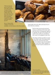
“We have learned how best to work with each other and keep it separate from our personal life,” Cohane said. “We have had really hard times. I don’t recommend opening a business with your partner unless you really know each other and have a very strong relationship, but we have built something wonderful together, and that is pretty special.”
Just as Cohane finds a balance in her busy schedule, so is the mission of Picnic to bring quality food and coffee to the busy lives of those who live in Jackson. The love that is put into the food and service is a reflection of Picnic and their desire to bring people together. It magnifies the spirit of the people that reside in this small town and all those who come to see a glimpse as they visit.
The design and décor provide an escape to the outside world. The food provides a vacation for each taste bud. Picnic offers an invitation to go out and explore or stay in and relax. Gather together to open and enjoy the picnic prepared just for you.
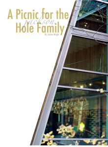
See the magazine layout:
“That’s what she said” Icons
Welcome to the Dunder Mifflin Paper Company. Cue “The Office” theme song.
I love the unique personalities of each of the characters from the popular television show “The Office.” I wanted to play around with the idea that you can know and feel each of their personalities by having limited facial features. In this icon set, I only created their face, hair, eyebrows, and glasses. Let’s take a look at the process of creating these 12 icons.
Sketches
I initially did my sketches with eyes included. I wanted to have them all looking at each other from different directions. I was trying different face and eye shapes but when I started to simplify, I realized that they weren’t really necessary. I began to focus on what made each character look like themselves and they each have unique skin tones, hairstyles, and eyebrows. I didn’t realize how much the eyebrows really do influence the facial shape and personality.
Initial Ideas
These were my first ideas that I experimented with on Illustrator. I was really struggling with Jim’s hair. His hair is all over the place and never really looks the same. I was having a hard time creating his personality. So, I got some feedback and changed the look. Here’s a look at the progression in his hair.
Making Changes
I thought that there wasn’t enough hair, so I decided to add another layer. As you can see, this looks like a crazy mess and nothing like Jim. I needed to simplify the wavy hairs into a move fluid movement. I combined more of the hairs together and created more waves that I feel captured more of Jim’s personality.
I also got some feedback on moving down some of their eyebrows and adding some more highlights to the hair as I did for Pam. Most of the time we just stick the eyebrows at the top of the head when in reality they are pretty much halfway down. It was hard to find the right highlight points or how to make Phyllis’s hair look curly. I asked a lot of friends and roommates and they helped with hair colors and gave me pointers on what highlights looked the best. I also changed the color of Meredith’s clip and added hair highlights.
Final Product
I took all the feedback into consideration and concluded with these simple icons representing each character from “The Office.” I’m glad I got positive reactions from other Office fans who could easily point out and laugh at the similarities the icons had with their human counterparts. Who is your favorite character? Thanks for coming along to see the process! Cue theme song.
The Time is Now
To create a photo-realistic image is quite a feat. It was cool to really look at each highlight, shadow, curve, color, moving piece, etc. of the watch of my choice and try to recreate it in my own vector illustration.
SKETCHES
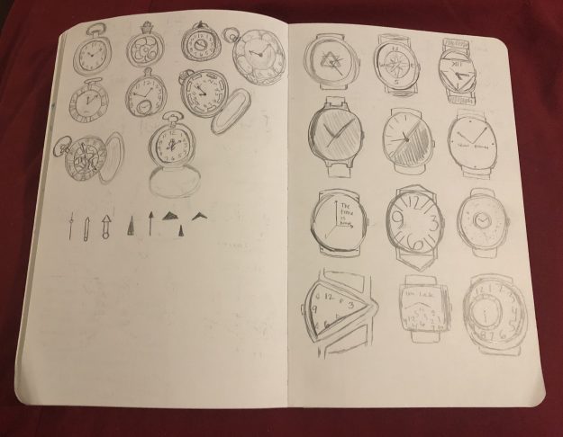
I experimented with both normal wristwatches and pocket watches for my sketching. I tried out different face designs and light sources to see which angles I liked. I also tried out different watch hands and arrows. I enjoy the sketching process because it helps me visualize the workload.
STARTING OUT
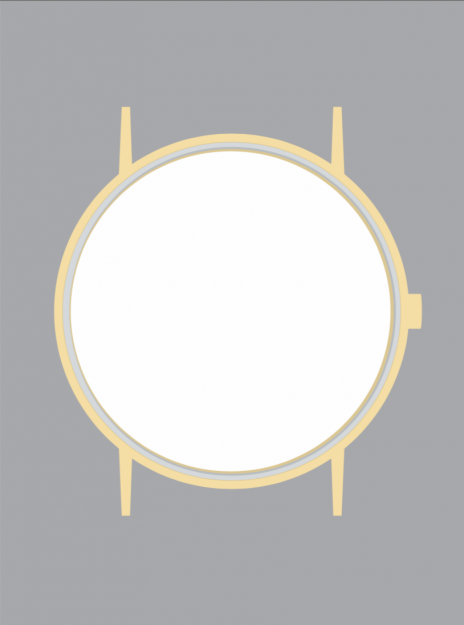
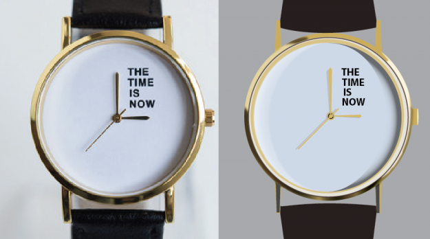
It’s crazy all of the shapes that go into making a realistic-looking image. I feel like I will never look at a watch the same way again. There are so many highlights and shadows that change just from the position of your watch. Here are the bare bones of the progress with working to vectorize the original photo image.
FIRST DRAFT
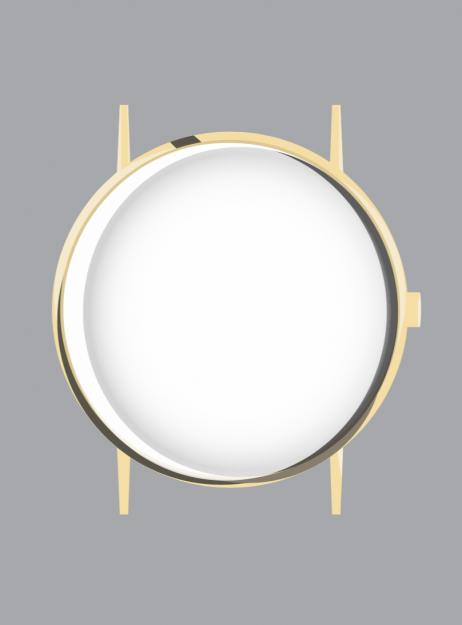
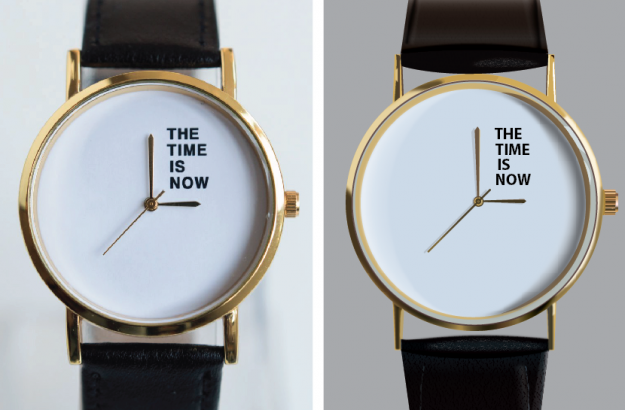
It took a lot of work to get my various sketch ideas brought to life. The left image is the original picture of the real watch. The right image is my progression of vectorizing the watch so far. This first draft was definitely rough around the edges. The biggest critique I received from my peers was to utilize gradients more and to bring out the shadows. I really worked on adding gradients especially around the gold rim and on the watchband.
FINAL VECTOR
After many hours and learning more about capturing light and shadows, I feel I adequately created a photo-realistic image of a watch as seen on the right. I added gradients, s curves, blending, gaussian blur, and many other techniques to bring this watch to life. I hope to continue learning and examining the work of professionals to increase my skills in creating life-like objects.
You raise me up
The Gig
Music is such a unique and universal sign of communication. There are so many different messages and moods that one can feel when listening to a genre of music. From the concentration of classical to the dance party electronic vibes there is literally something for everyone. My objective for this project was to create a hypothetical music gig poster for the band “Lift” that will be held at the House of Blues. I love music that is playful and fun yet chill and airy. I wanted to portray the way the music lifts you up and allows you see a higher perspective.
Sketches
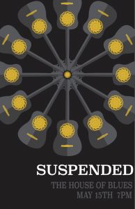
My mind went through lots of different ideas and designs while I listened to various music. My first 25 sketches were cool but I didn’t feel connected to any of them. I was drawn to the idea of circles and continuity so I thought of a guitar and the sound hole and fitting various circle things in the place of the hole. I liked either having a Ferris wheel or a circle design for the center.
Draft Ideas
Feedback
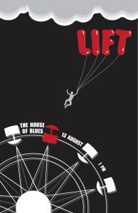
After getting some good feedback from my professor and peers, I realized that everything I had was too overwhelming and the message was unclear. I decided to just have the Ferris wheel and have a figure being lifted up by balloons. I felt like this adequately showed the chill airy feelings of a higher perspective. I also changed the shape of the clouds, the taut of the strings, added shadows to the Ferris wheel, balloons, figure, and moved around the text of place, date, and time to interact more with the design.
Progressive Change
Final
Lifted Up
I’m grateful to see the progression that I’ve made in this creative process. It’s cool to how an original idea can be transformed into a concrete yet abstract message. The simplicity of the colors helps attract your eyes to the band name and the composition leads your eye up from the band up to the date and time. I like having the place be on the center of the Ferris wheel because the music will start on the “ground” but you’ll be lifted up by the rhythm and beat to look out on the world with a new perspective.
How to create your own product advertisement
Steps to creating your own Nature Valley product advertisement
Step one: Identify your product of choice
Step two: Look up previous advertisements to gauge style and content
Step three: Find a way to uniquely incorporate your product to match the company’s style
Step four: Bring your image to life and add logo
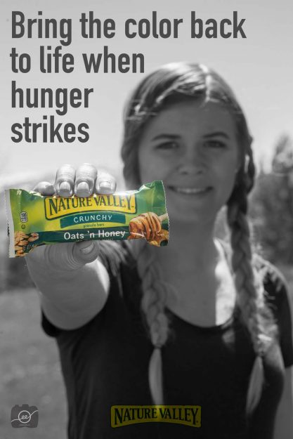
Here’s my advertisement:
After looking at previous advertisements, I saw that Nature Valley had a campaign of “when hunger strikes” and so I wanted to incorporate that into my ad. I made everything black and white and then masked the color back in to the bar in order to focus on how the bar bring the color back into your life when you’re really hungry. I also added their logo to the bottom with a soft light blending mode in Photoshop.
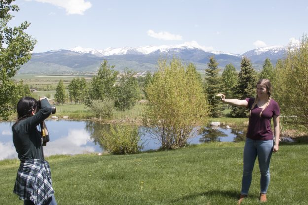
Here’s a picture of the set up:
I wanted Kaley to look like she was going on an outdoor adventure so I had her hair in braids and placed her in front of a mountanous landscape. I had her extend the bar in front of her face so the product would be the central focus and then she would be a little blurry.
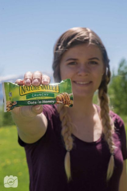
This was the original photo:
Sounds fun? Now it’s your turn to try and create your own product advertisement! Check out http://www.gerardosumano.com/stunning-advertisements-with-invisible-black-background/ to see another great advertisement example!
How to stage a product photography shot
Steps to creating an indoor and outdoor product shot
What a fun project to pick some of my favorite things and to create a beautiful space to showcase various products. Take a look at some steps below of how to stage indoor and outdoor product photography shots.
Indoor
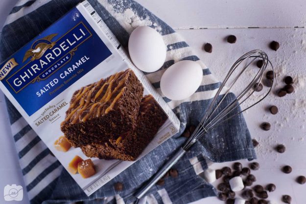
I love brownies! In addition to the mix I love adding chocolate chips and marshmallows so I thought those would be fun additions to the shot to make it feel like we’re about to whip some up for a party. This shot is taken on a wooden plank right by an open door to get a lot of natural light.
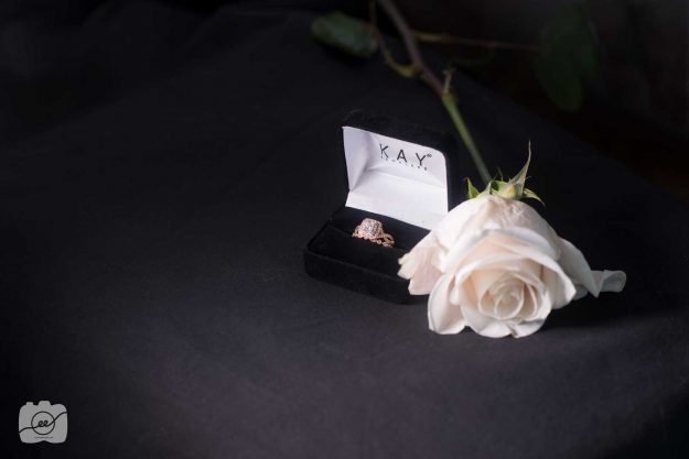
This shot is to showcase a wedding ring from Kay Jewelers that belongs to my dear friend Kaley. A black backdrop was set up and I had a friend hold a speed light to the side to light the ring and rose. Adding the rose adds a delicate, romantic feel which is key to getting people to engage with your product shot, no pun intended. 🙂
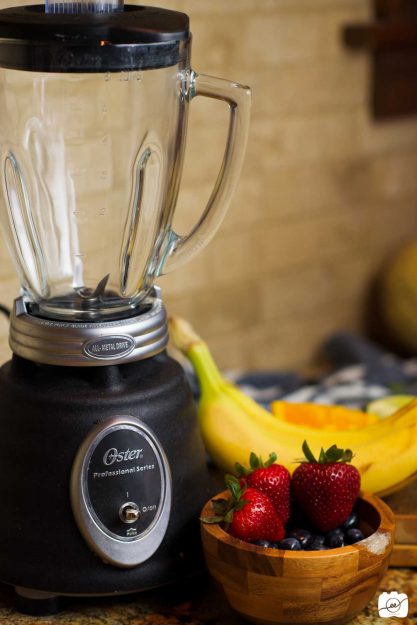
I sure love a fruit smoothie on a warm day. I love the depth of field variance in the photo. I think that is an important tip to incorporate into staging a food product shot. Have your main item in full, front focus and have the sub items softly fading into the background. I also like the texture of the backsplash in the kitchen. I had a continuous light for this shot but an open window/bright light source would work to get the right lighting inside your kitchen.
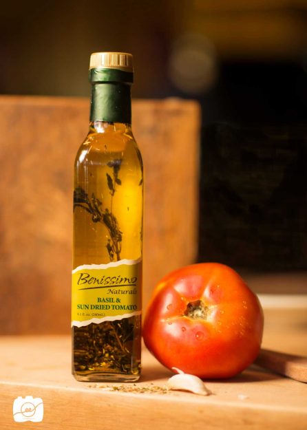
When I passed by this olive oil in the store, I immediately wanted to photograph it. I love the herbs inside in how they create texture and the design of the label. I wanted to incorporate a fresh tomato and basil on the cutting board to match the flavor of the oil. When you have a fancy looking product, it is best to be simple with the accompanying items. I used a continuous light from the side for this shot in order to get a warm glow inside the bottle.
Outdoor
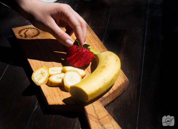
Even though this doesn’t really look like it’s taken outside, it is! There was a beautiful dark wood on the deck of a cabin we were staying at so I wanted the bright fruit to have a bright contrast against the dark background. I love the delicate slices and the way adding a hand makes the photo more lifelike and inviting.
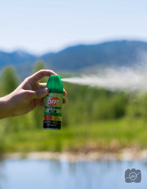
This is one of my favorite product shots, and it looks like it could be an ad in a magazine. I find the biggest thing that makes it stand out is the action of pushing the bug spray. We all know what it smells like and how it feels to be sprayed down before starting a hike in the mountains. Add some action to your next product shot! Take advantage of the bright sun to take your product shots since their eyes can’t squint! 😉
Now you have a few tips to take some fun indoor and outdoor product photography shots! Go out and stage something awesome! For some more tips and ideas head over to http://www.carynesplin.com/food-product/ to see some other examples!
How to create a mock up movie poster
Shhhh, I’ll tell you the secrets of how to create a movie poster!
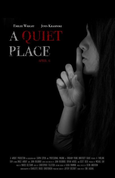
If you’re like me, you love a movie poster that piques your interest to see what the rest of the movie will be about. I recently saw the movie A Quiet Place and loved the intense silent story of a family who is being hunted by super-sonic hearing monsters. I looked up multiple versions of the poster and liked the dark colors, bold text, and eerie feel. I wanted to create a mock-up poster of my own that incorporated a few of the same elements.
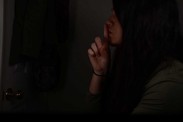
The most important thing in the creative process is brainstorming. I sketched a lot of different ideas and came up with an interesting pose for the photography shot and design layout. I set up my camera in my bedroom, on a tripod, and set a timer to take a self-portrait. These were my camera settings: f/20 and 1/120 shutter speed I also used a speed light to light part of my face. I changed the photo to black and white to create a more eerie feel.
Original picture
The next step in a process of creating a movie poster is to add the text. It’s no secret that the text can make a break a movie poster. There is the font, size, color, and placement that you need to think about. From looking at the original movie posters I noticed that they used a red and white serif font. They also added a distressed look to their font, so I decided to create my own in Photoshop. Check out https://blog.photoshopcreative.co.uk/blog/tutorials/how-to-make-a-movie-poster-in-photoshop-part-1/ to follow a step by step Photoshop tutorial to make a dramatic movie poster.
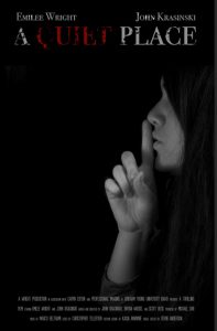
After having all of the elements, now it’s time to compose everything together. I went through a few variations trying to get a good placement of the title. I also downloaded the Movie Poster font in order to have the font at the bottom look like a real movie poster. Here is the progression of ideas after getting some feedback from friends:
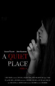
Here is the final mock-up movie poster:
Now you know how to create your own mock up movie poster! Shhh, be careful with who you share the secret with! 🙂
Little Objects
2.21.18
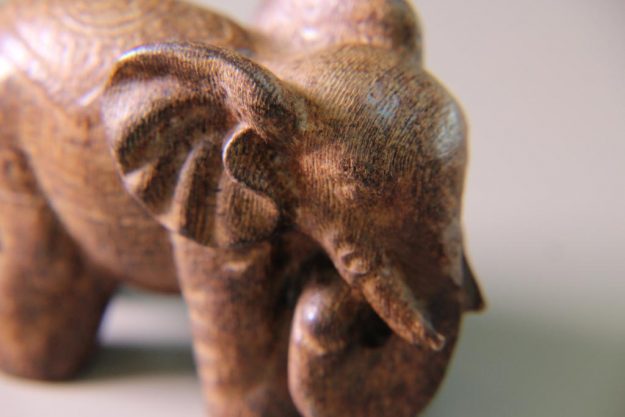
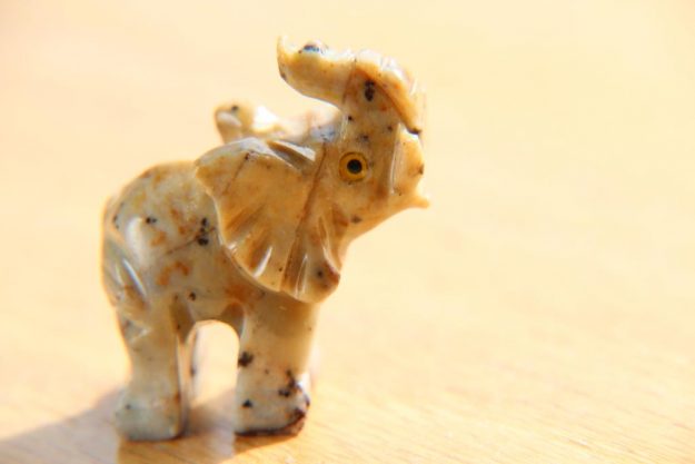
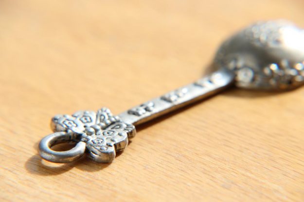
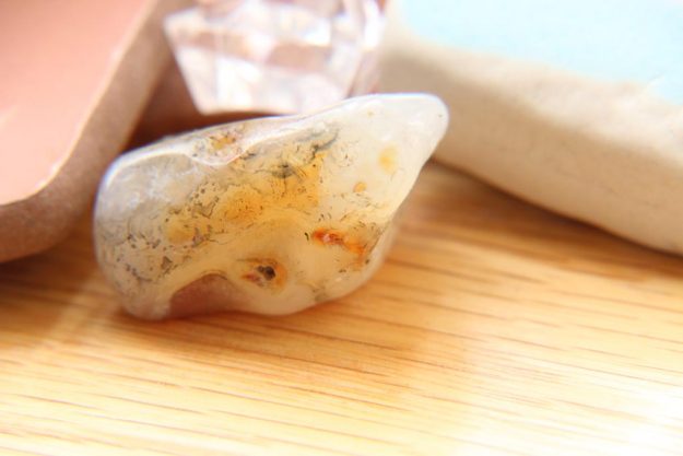
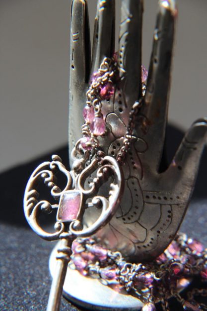
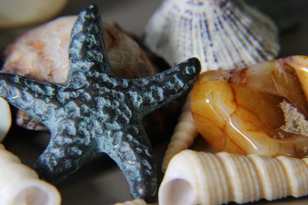
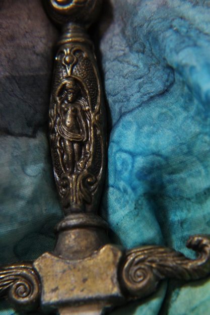
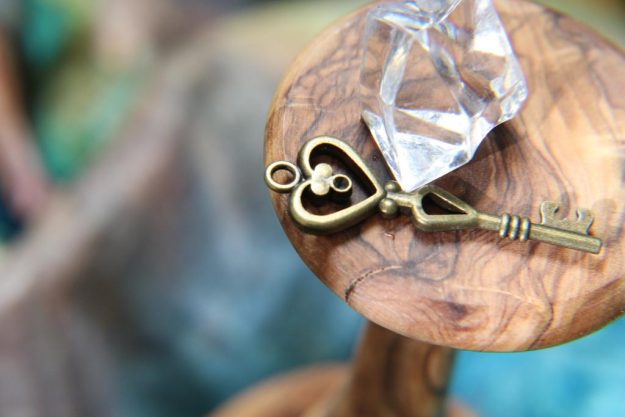
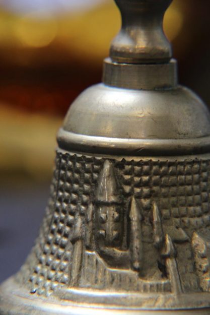
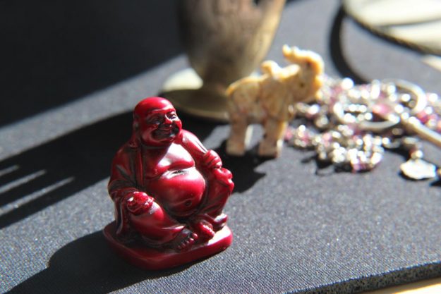
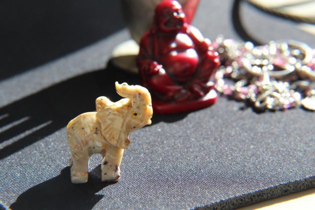
I have recently started learning about macro photography and it is so fascinating. For this post I focused on random objects. There are so many details I never noticed before by zooming in and getting a clear focus! Enjoy!
The Little Details
2.21.18
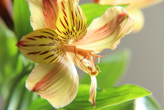
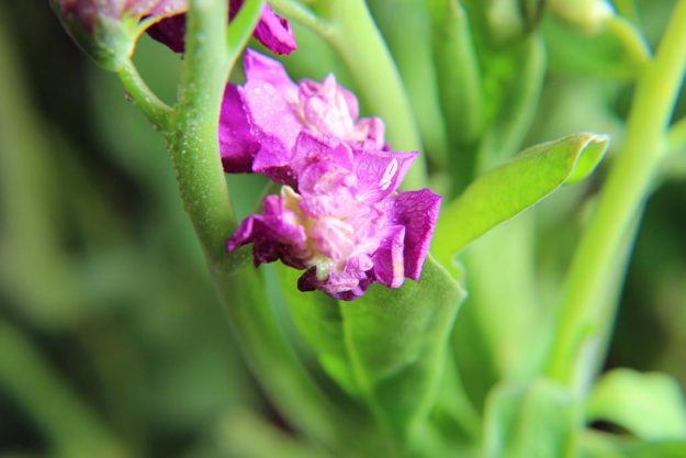
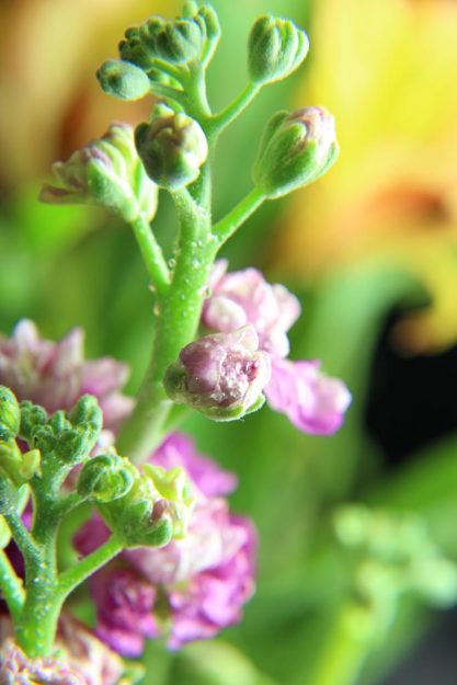
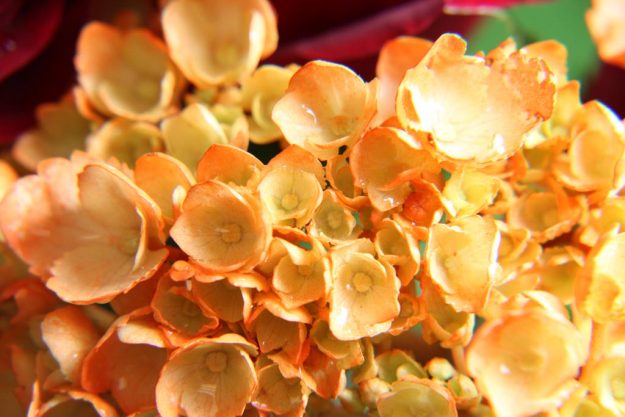
I have recently started learning about macro photography and it is so fascinating. For this post I focused on plants/flowers. I love how adding water drops can add detail and additional reflections of light! Enjoy!
Collete
2.11.18
Collete is a friend from college. We are in the same digital imaging class and we were learning more about auxiliary lighting and reflectors. I had fun being able to practice with her in the Ricks Gardens. It’s cool to see how different reflectors produce different lighting. She has such a sweet personality and she’s really talented with photography. Enjoy!
Maki & Taylor
1.28.18
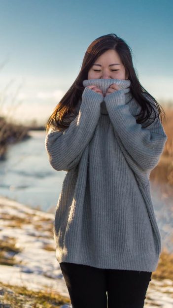
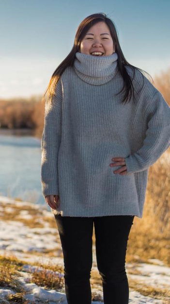
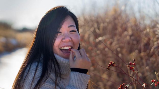
Maki and Taylor are two of my roommates from college. Maki is from Japan studying accounting and Taylor is from Wyoming studying about social work. We were driving around Rexburg, Idaho and found a cute little nature area and decided to take some pictures. I’m happy to have these two in my life. Enjoy!
Sariah
1.20.18
Sariah has been my roommate at college for two semester and I have loved getting to know her. She has the biggest heart. She always looks out for those around her and serves in the sweetest ways. She dyes her hair all the time and is always willing to paint your nails. She also is an amazing chef and has her own food blog. Check it out at: https://simplesecretsbysariah.wordpress.com Enjoy!
Boston & Bronson
12.23.17
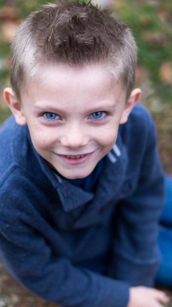
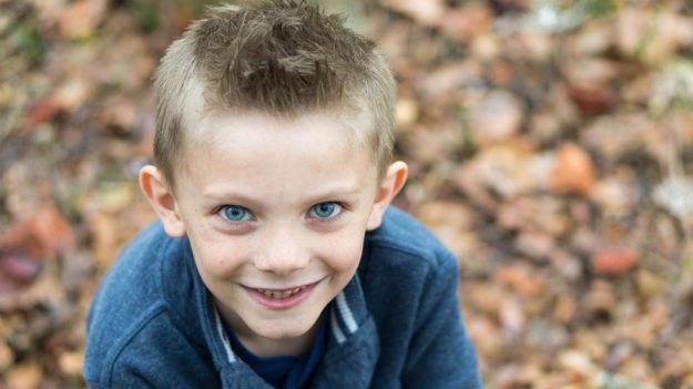
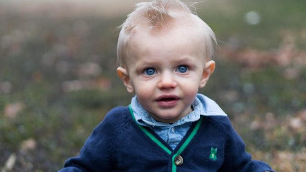
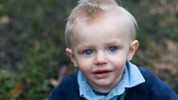
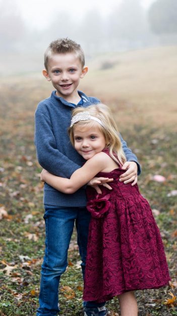
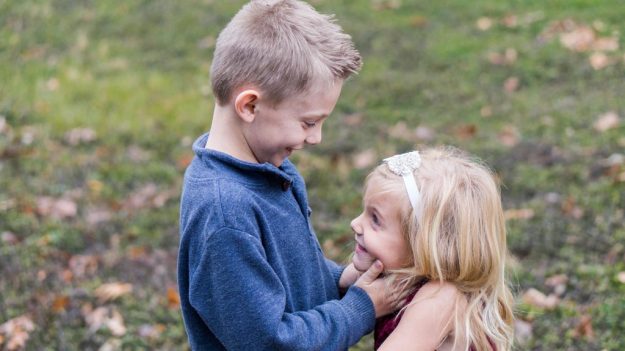
These two cute brothers are also my cousins. They have the brightest blue eyes I have ever seen. They love to play and laugh and I loved spending time with them this Christmas season. Enjoy!
Sweet Scotlynn
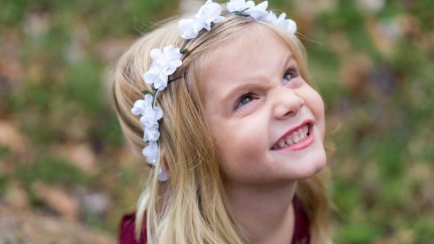
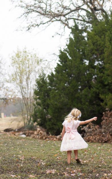
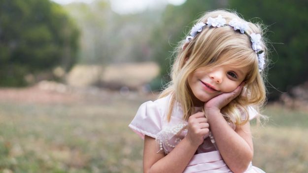
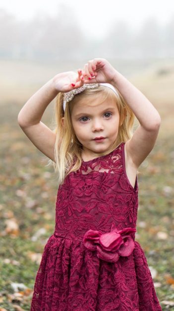
12.23.17
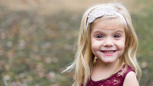
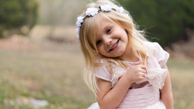
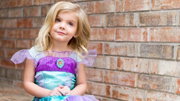
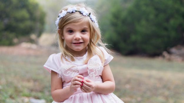
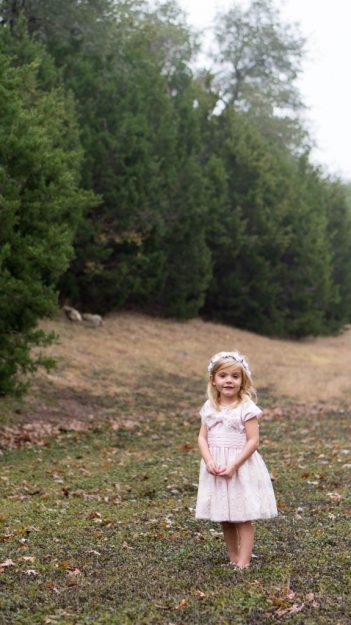
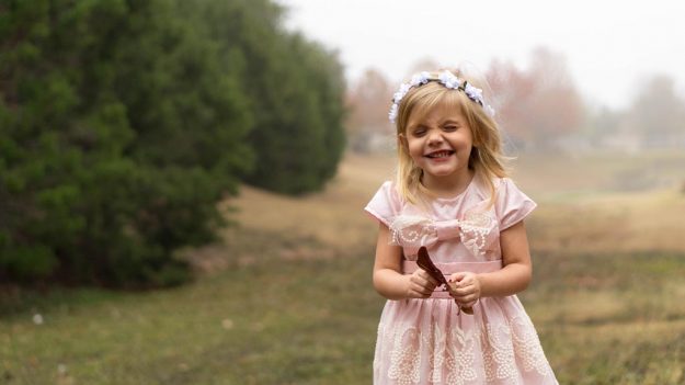
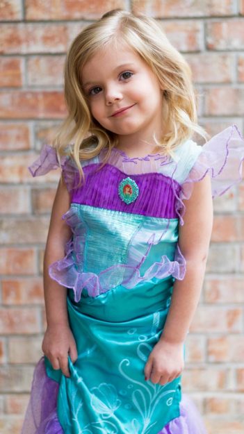
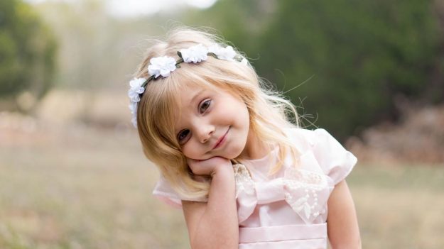
This was probably the most fun photo shoot. My little cousin Scotlynn is the sweetest little princess and I consider her one of my best friends. She loves to play dress up and play pretend. She is definitely one of the cutest girls I know, and I’m so happy to have her personality in my life. Enjoy!
Oregon
11.25.17
I went to Portland, Oregon for Thanksgiving to see my family. While at a park we took a few pictures. I love my cute little siblings (Haleigh, Macy, and Carson) and had fun with them over the holidays. Enjoy!
Tyler & Sariah
11.19.17
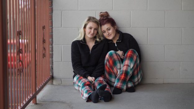
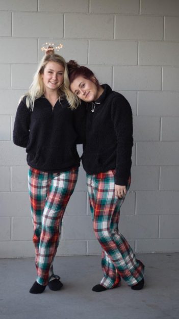
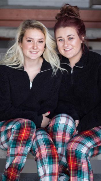
When you and your best friend buy matching Christmas pajamas why wouldn’t you want to take cute pictures with them? Tyler and Sariah are two of my roommates and I’ve had fun getting to know them. They grew up together and are basically models. Who’s excited for Christmas? Enjoy!
Megan & Ethan
11.12.17
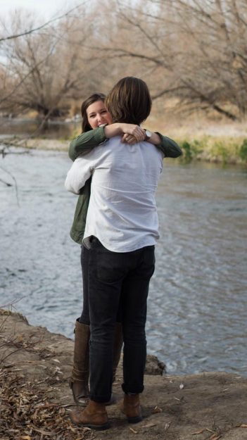
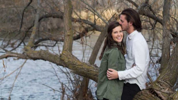
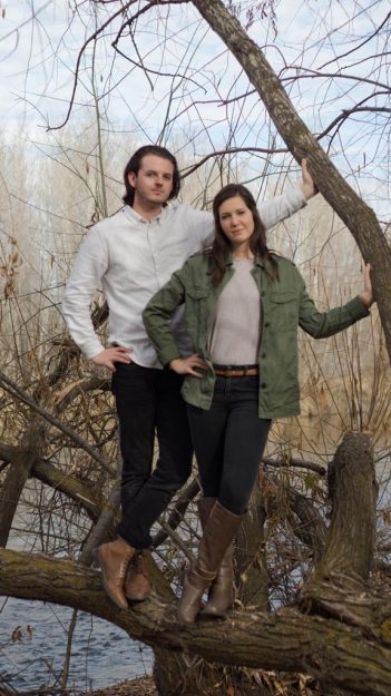
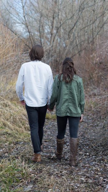
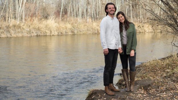
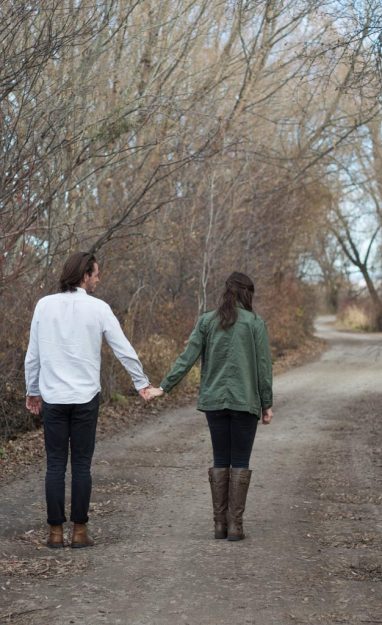
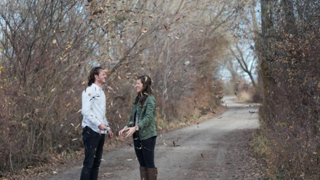
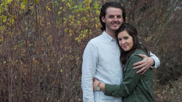
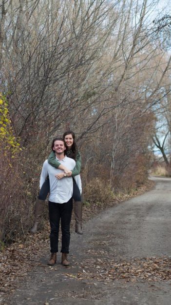
Megan has been my roommate at college for almost a year. I’m so grateful to have her sweet personality in my life. Ethan was her boyfriend in these pictures but now they are engaged! Yay! I’m so happy for them and I’m glad to be a part of their lives. We had fun taking some pictures in a nature park in Rexburg, Idaho. Enjoy!
Marissa
11.5.17
Marissa is one of my favorite people. She works hard and has such a great personality. We had so many classes together at college and got to go on a field trip to Jackson Hole, Wyoming together. Even though it was cold, I got some cute pictures of her as we explored around the beautiful scenery under the shadow of the Tetons. Enjoy!
Jasmine & Blake
11.5.17
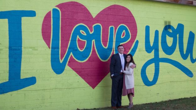
Jasmine was one of my roommates at college. She is so sweet and has the best style. Blake was her boyfriend in the pictures, but now they are engaged! Woohoo! They are a fun couple and I had a good time capturing some sweet moments they had together around Rexburg, Idaho.
The Jeanies
10.30.17
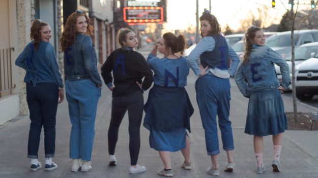
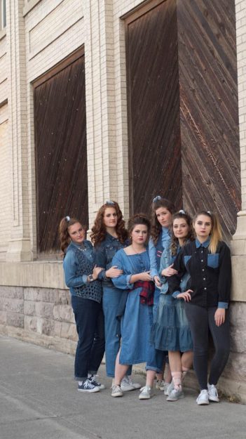
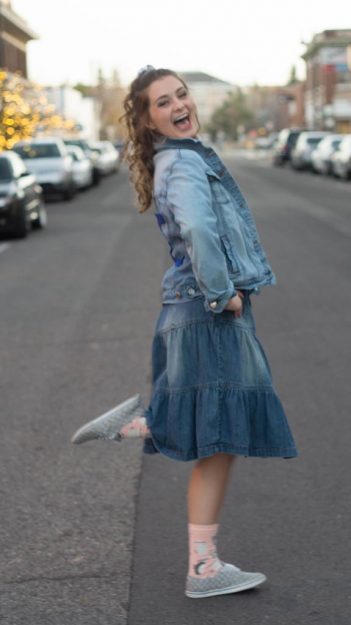
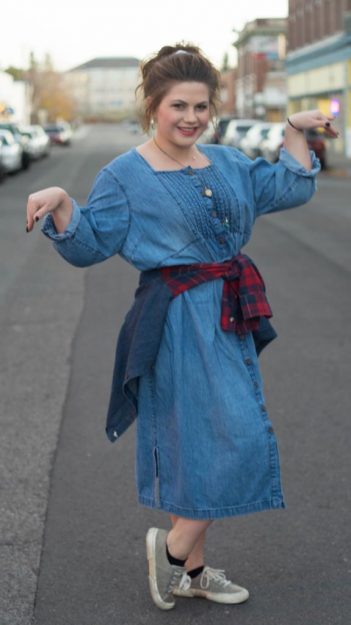
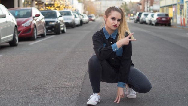
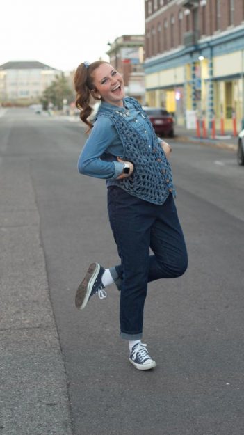
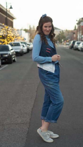
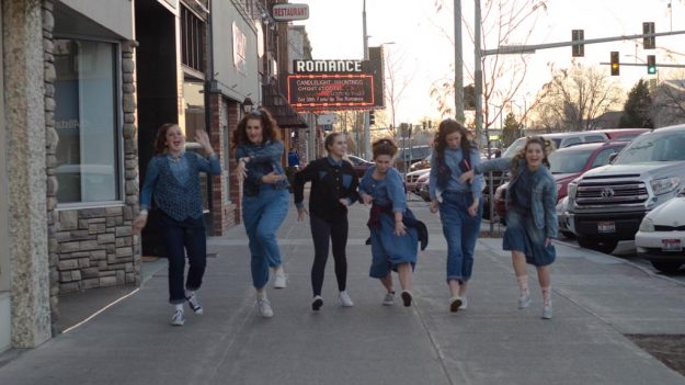
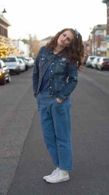
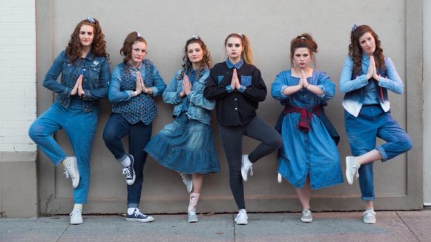
For Halloween, my neighbors asked my to take group pictures of them around downtown Rexburg, Idaho! They had the cute idea to dress up in everything jean material. They then went around granting wishes for everyone around them. Have fun seeing each of their fun personalities. Enjoy!
Katie & Courtney
11.18.18
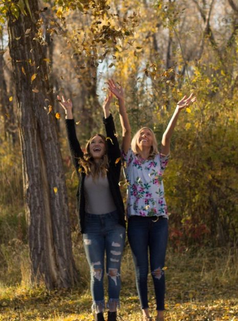
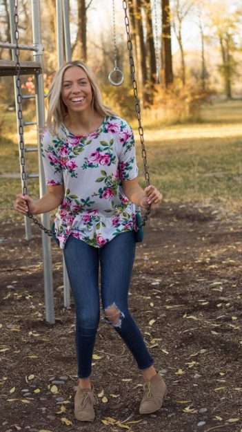
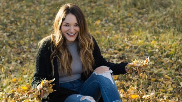
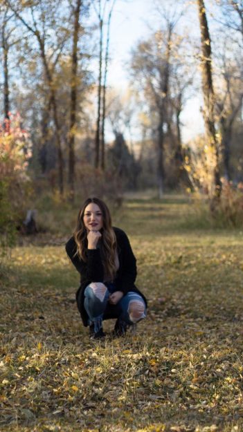
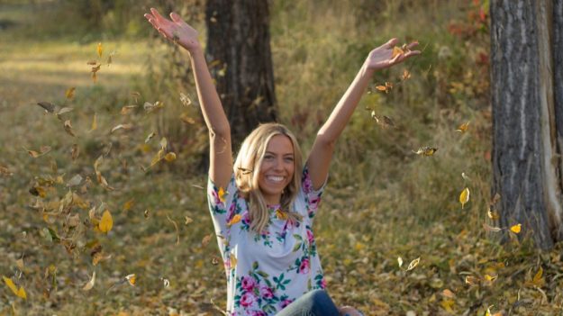
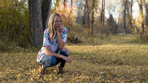
Katie and Courtney are friends of mine from college. The fall colors were beautiful so I asked to take pictures of these two in a nature park area in Rigby, Idaho. They are natural beauties so it made my job easy. We had fun walking through the nature, swinging on swings, and playing with the fallen leaves. Enjoy!
Madi & Konnor
9.16.17
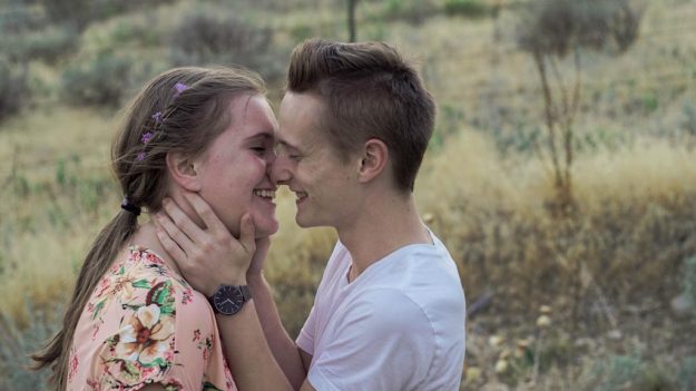
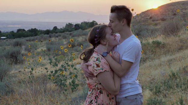
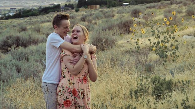
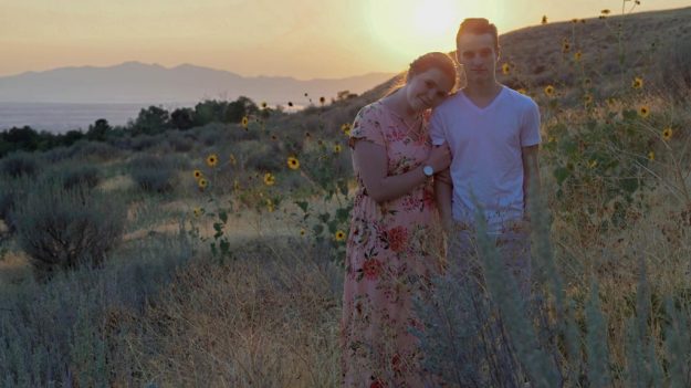
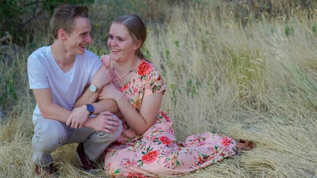
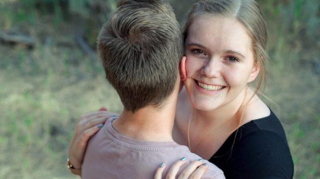
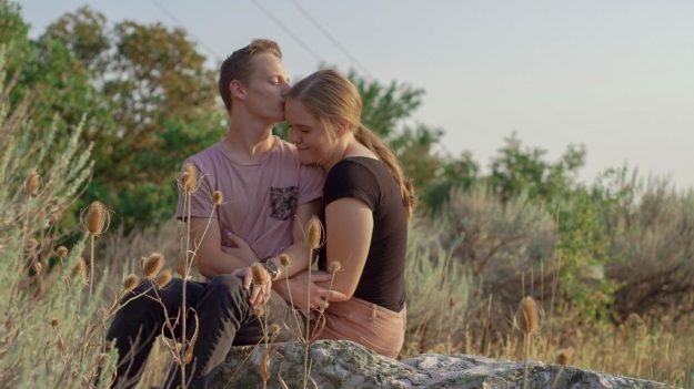
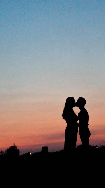
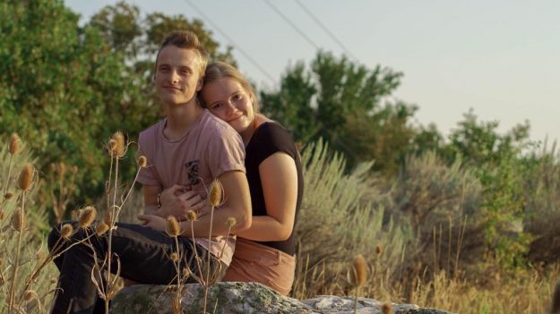
Summer lovin was the tale for these two. Madi is my sweet, beautiful cousin and Konnor was her boyfriend. This was my first couple session and it was fun interacting with two people. It definitely helped with cracking jokes to get some genuine smiles and laughter. We drove up to a mountainous area in Ogden, Utah and had fun as the light faded into lots of beautiful warm colors. Enjoy!
Beautiful Becca
9.25.17
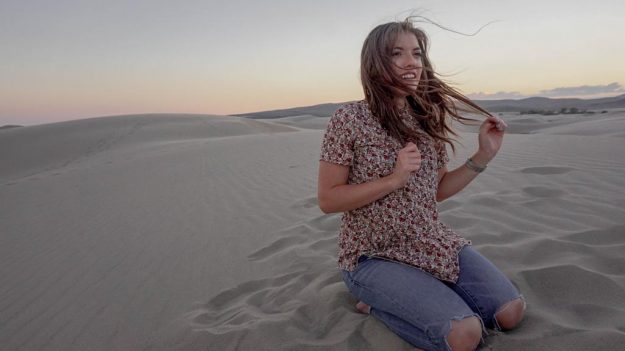
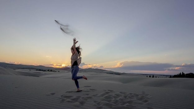
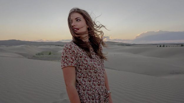
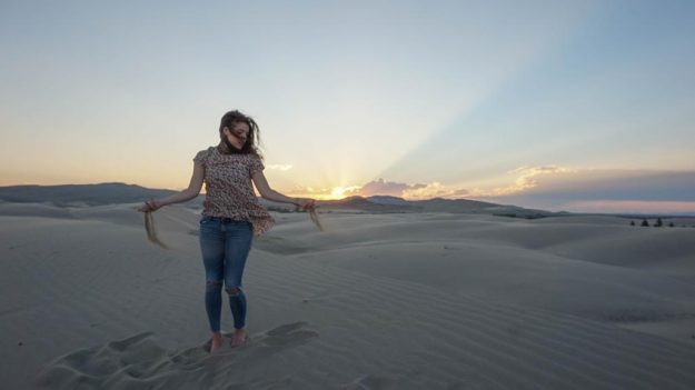
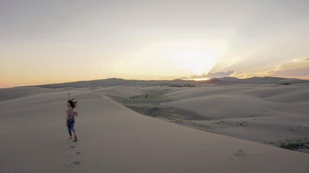
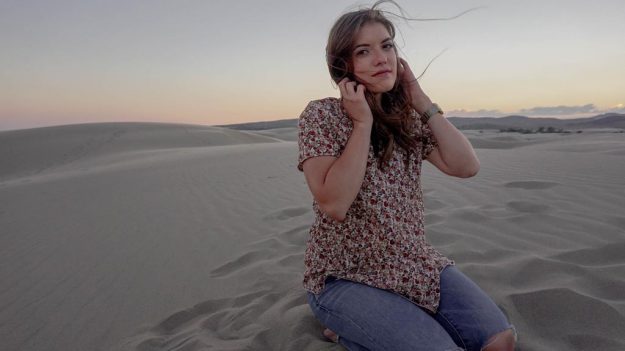
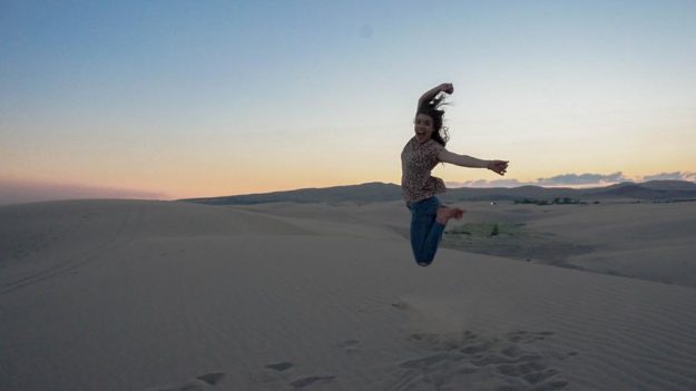
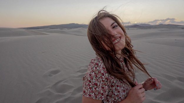
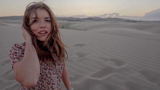
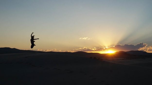
My sweet roommate Becca was my very first photoshoot at the end of 2017. I was beyond nervous. Thankfully, Becca is a natural model and basically did everything. I’m just grateful to have been there. She is one of the most caring people I have ever met with the most contagious laugh. We ventured out to the sand dunes in Rexburg, Idaho and captured some awesome moments at sunset. Enjoy!
