Steps to creating your own Nature Valley product advertisement
Step one: Identify your product of choice
Step two: Look up previous advertisements to gauge style and content
Step three: Find a way to uniquely incorporate your product to match the company’s style
Step four: Bring your image to life and add logo
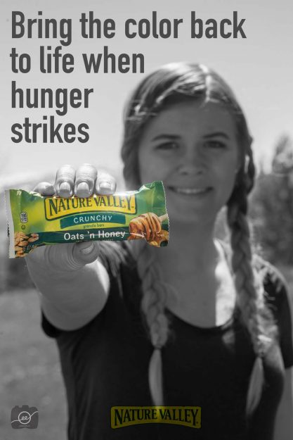
Here’s my advertisement:
After looking at previous advertisements, I saw that Nature Valley had a campaign of “when hunger strikes” and so I wanted to incorporate that into my ad. I made everything black and white and then masked the color back in to the bar in order to focus on how the bar bring the color back into your life when you’re really hungry. I also added their logo to the bottom with a soft light blending mode in Photoshop.
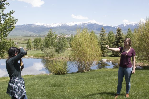
Here’s a picture of the set up:
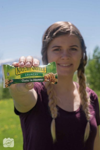
I wanted Kaley to look like she was going on an outdoor adventure so I had her hair in braids and placed her in front of a mountanous landscape. I had her extend the bar in front of her face so the product would be the central focus and then she would be a little blurry.
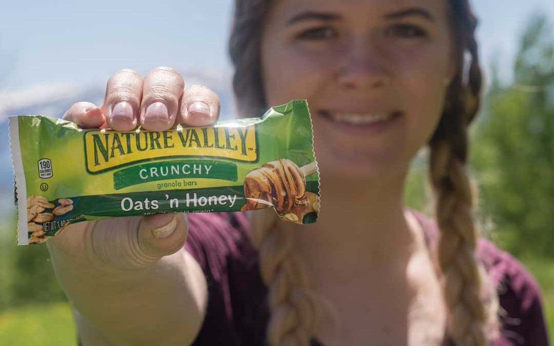
This was the original photo:
Sounds fun? Now it’s your turn to try and create your own product advertisement! Check out http://www.gerardosumano.com/stunning-advertisements-with-invisible-black-background/ to see another great advertisement example!
