UI App Design with Mockups
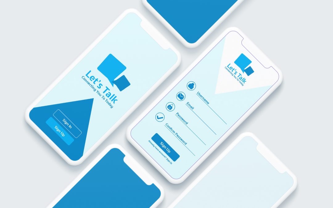
I have had a lot of fun starting the 100 days of UI challenge! One of the UI challenges focused on creating an app login and another challenge for a direct messaging design. Messaging apps are some of the most popular among cell phone users so I thought I would come up with my own platform called “Let’s Talk” which focuses on connecting you to today. I used this app idea for both design challenges.
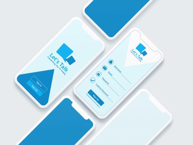
As I was brainstorming various icons and symbols of communication and talking with others I thought of speech bubbles. That became the logo or icon for my app login page. I used a blue palate of colors to keep things simple. As you can see in the process video, found at the bottom of this blog post, I was also able to create icons for the username, email, password, and password confirmation fields that the user will fill out in order to sign up for an account. It is important to keep things simple and to not draw too much attention and time away from the action of signing up.
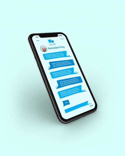
For the direct messaging part of the design, I wanted to pull some of the colors and elements from the Let’s Talk login design into the direct messaging design to keep things consistent and familiar for the user. I liked the interesting shape the speech bubbles made not being perfectly square or circle. I like having the personalized picture to match the person you are talking to at the top. It was also a fun touch to add the time the message was sent on the sides of each bubble. If you want to try out some UI App mockups for your own UI designs check out this website.


