UI Landing Page Web Design
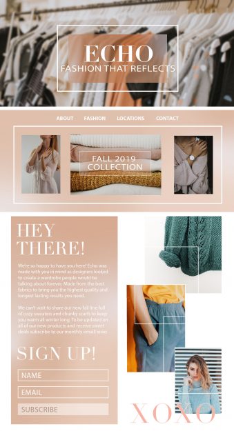
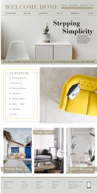
I have continued on the daily UI project and wanted to share some work from my day working on a few different landing pages ideas for three hypothetical companies who each have different audiences. I created a UI landing page for a clothing fashion store, a home furnishing store and for a corporate company.
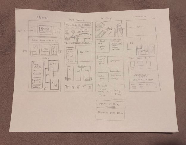
It’s nice having some sketches to work off of in order to help bring the vision to life rather than going in with no idea behind the design. Sketching doesn’t have to take up a lot of your UI landing page design time by using shorthand and not writing everything out. It’s just meant to give you a wireframe or placeholder for all of your content.
Here are the final three landing pages for the fashion, home furnishing, and corporate companies. Click on each one to view the landing page bigger if needed! Which one is your favorite? How could I make them better?
One of the things I’ve found help me most is recording my process of design. When I go back through and watch myself working it helps me to see how I can create things faster and what I can do better next time. Take a look at the following process videos for the work I did for the UI landing page web design hypothetical companies and let me know what you think! Which companies website would you most like to visit?
Process Videos
Here’s the link to the daily UI challenge if you’re interested in trying out a few projects!
Here’s a link to my UI profile designs to see more of my projects from this challenge.
